April 29, 2008
Farewell to Christine
With that being said, it is with sadness that we say farewell to Studio Calico Design Team Member Christine Middlecamp. We have loved every last detail of the layouts and projects she submitted for the Design Team Gallery and we will miss her stunning works of art. We wish her all the goodness she deserves and hope that she will continue to visit us frequently to share her life and art with her friends here at Studio Calico.
Christine, we will miss you and your precious baby Ethan!
Time For Another Challenge???
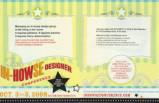
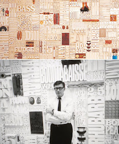
Moving on to the real reason I'm here today...I love this time of year, it really just brings about feelings of fresh creativity, doesn't it? Everything seems so brand new after a long grey winter. Sometimes, though, we all need a little jumpstart--so I thought I'd share one of my favorite sources of inspiration with you, HOW Magazine. You may be aware that it's a magazine for graphic design professionals...but the inspiration it gives me on a regular basis is well worth the cost and all the "technical design speak" that I don't know too much about.
From my latest issue I'm giving you an ad challenge, which when I saw it made me laugh a little because it's almost like a sketch challenge, too!! I hope you will take some form of inspiration and create a page, post it in the gallery for your chance at a RAK. On Sunday, May 4th, I'm going to pull a name out of a hat from everyone who posted a page based on this inspiration. I don't care whether you base your design on the colors, the design, the theme. I don't care whether you do one page or two, draw inspiration from one side or the other...I just want you to feel inspired and scrap a page you're happy with!
April 28, 2008
Challenge winner!
April 27, 2008
We apologize
Thanks so much for your patience.
Reveal Night, Reveal Yourself!!
Reveal night is super cool because it's the night that we meet a lot of new people!! Members just joining, people coming out of lurkdom for the first time and people that maybe don't post much otherwise. On reveal night we laugh. A LOT. The threads move pretty fast, but you shouldn't be scared, you can hop in anywhere!! Sometimes, we bring dates...as in our favorite movie star crush of the moment. My favorite moment is seeing what fellow design team members have done with the exact same items I got and marveling over their creativity and art processes, they. are. amazing.
If you're just joining us, although you need no formal invitation, I'm inviting you to come be a part of reveal night. I promise you won't find a better group of people to hang out with, it will make the staying up part easy!
If you've been to reveal night many a time, I hope you'll be joining us again...I have a little request for you on Reveal Night, I want you to dress up for the event!! Change your avatar and surprise us with your new look, make it funny, make it festive, make it Joyful (that's a pun in case you haven't noticed the zany-ness of Joy Madison's avatar). I can't wait to see you there!
Reveal Night. Reveals happen at Midnight E.S.T. tonight, Sunday, April 27th. Party in the forums whenever you sign in!
April 25, 2008
The Sharing Bag
We are all gaga over this hobby and I wondered how YOU got to this place, this deep in so to speak. LOL So, here are a few questions for you to answer...
1. How did you get started in scrapbooking? (If you are feeling really brave, link us up to your first layout!)
2. What about scrapping made you fall in love? ;) When did it become more than just putting photos on pretty paper?
3. What do you hope to "accomplish" with/through your scrapbooking? In other words, why do you do it?
Hope you will jump in and leave a comment with your answers...I look forward to reading them! Have a wonderful weekend...and don't forget about the April Showers challenge. ;) I'll post a winner next week.
April 24, 2008
Thought I'd share
April 21, 2008
April Showers Bring May Flowers
I've been thinking of a challenge to propose to you all weekend and today one finally popped in my head. :) It's been raining here all day yesterday and today. Heavy downpours mixed in with light drizzle and even brief bursts of sunshine. Typical spring weather I suppose and I was telling my kids about the old saying... April showers bring May flowers. This little phrase has been stuck in my head ever since and then I realized that it would make a great COLOR challenge!
So, the challenge is this...
Combine the colors of April showers with those of May flowers. The grays, blacks, charcoals of the showers with the bright bursts of spring colors like purples, pinks, yellows, greens. It's a wide open challenge....just have fun playing with the extremes of colors. It can be any topic, any design and doesn't have to have any flowers at all...just be inspired by the colors of the flowers.
You will have until next Sunday to upload your layouts to the Studio Calico gallery. I'll start a thread during the week where you can link us up to your creation and be in the running for a RAK. Have fun!
A Delightful Day
While waiting for Joanne, I also had the pleasure of meeting two of our other members: Laura Carter (samshands) and Robyn Lantz (robyn_l1). Unfortunately I didn't have my camera with me at the time, so I didn't get a photo, but I was so excited to chat with them a little bit anyway!
Before leaving the hotel I also met Christina Gill and some other gals from Willow Traders. Don't be surprised if you see some of our Studio Calico tees popping up somewhere!
So... after spending a little bit of time in the on-site scrapbook store (where there was more gorgeous Hambly than I have ever seen in my entire life), I whisked Joanne and her friend Sharon away to the Green Hills mall. It was for selfish reasons that I wanted to go there, but thankfully, I think they enjoyed it as much as I did. We started with lunch at Panera, where we talked a lot about Studio Calico and also about Sharon's stamp and scrapbook store in Buffalo, New York, where Joanne teaches classes.
The highlight of my trip (besides spending time with Joanne and Sharon) was our visit to Pottery Barn where I picked up the prettiest sunflower napkins and placemats for my first DIY home project. I will be moving in a couple of weeks and I can't stop thinking about how I want to decorate my charming little house! I am leaning towards a fresh palette of yellows and greens, so I thought these clearance napkins would be perfect for making a couple of homemade pillows.
I also found some gorgeous Cavallini and Co. bird paper at Papyrus, for another craft project. I can't wait to get started!
So... I'd like to thank Joanne and Sharon for such a delightful day! I look forward to seeing you both again!
April 19, 2008
Here they are...
April 18, 2008
Just an idea....or maybe two
- While on vacation, take a laptop and download your pictures nightly. Generally, you have a few free hours in the evening, and this is the perfect way to remember what you did that day by reviewing your photos, downloading them, and editing them.
- Also, if possible, have a "scribe" to take notes for you in a travel journal. My mom served as the perfect scribe because her handwriting is neat and she watched what I was taking photos of, then notated it in her journal.
- Finally, don't feel that you have to print every picture, or tell every story. It's impossible. Just pick out what is most meaningful to you and begin there.
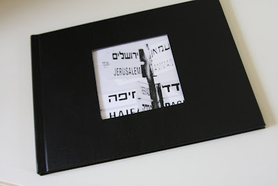
This is the cover of the 8x11" album. It is leather, and the base price is $25, but I added so many pages, that it ended up costing $50. The good thing about Walgreens, is that multiple copies are 25% off, plus they share a shipping cost.
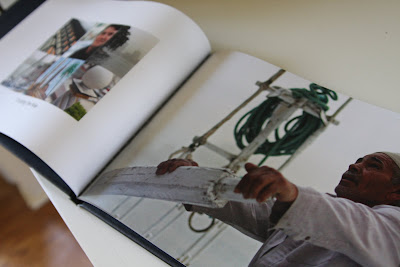
As you can see, the pages can be arranged how you choose, with multiple layout options. The page on the right, is a standard option at Walgreens, but the left is a layout meant for one photo. I liked the LO, but it wasn't an option to input 6 photos, so I created a single 4x6" blank file in Photoshop Elements, then input my photos in 2x2" squares, saved the file and uploaded it as a single photo file at Walgreens. From there, I was able to insert the photo as a single photo and get the look I wanted.
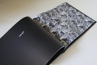
This is another example of a single photo LO. The LO with the camels is the exact LO as the man rowing the boat. Here, I created an 8x11" blank file and uploaded the camels accordingly. Also pictured here is an option to only have text on a page. I loved the look of blank space to capture this memory of the Beduins (nomads) asking us repeatedly (at least 989 times) if we wanted a camel to ride up Mt. Sinai. The only word they knew was "Camel?"
And, while we're on the subject of text only and using it to preserve memories, Celeste has a very cool challenge on her blog using this as inspiration.
Is this awesome or what? And, she's giving away a RAK!
April 14, 2008
Free Mini-Kit Promotion
April 11, 2008
my final post for the week...
(surprise, surprise)
there are still so many people out there who are afraid of it...or just aren't sure what to do with it. the answer is simple...
play!! on this layout from the January kit (my most fave one EVER...) i used it 3 different ways. here are a few ideas...
- underneath a title to highlight it
- to draw subtle attention to a clear acrylic embellishment
- to change up the color of something you want to use but isn't the right color
- to use around the edge of a page
- to switch up the look of chipboard
basically, i use it for just a hint of color. it's probably the cheapest way to spruce up a jillion layouts (averaging $1 per bottle, and you can use it over and over...a little goes a long way) and the color ranges are ridiculous as far as choices! i do like the Making Memories paints...they have less water so they are a bit thicker and dry faster. but i have probably 35 bottles of other brands that i turn to all the time as well. (Delta CeramCoat, Folk Art, etc.) one tip is to use a light hand when applying...it definitely lowers your chance of buckling your paper. more often than not i just take a foam brush (stock up whenever Michael's has them 15/$1.00...just bought $5 worth this evening since they're on sale!), dip it into the paint and dry brush wherever i want it. you can always go over it again with another coat if it didn't cover well enough the first time...but the more erratic/imperfect it is, the better (in my opinion, lol).
hope you may have learned a thing or two this week...i had fun posting! and don't forget that SNEAK PEEK NIGHT IS THIS SUNDAY!! the sneaks will post at MIDNIGHT EST, but the fun is guaranteed to start way before then.
enjoy your weekend!!!
April 8, 2008
go...RIGHT NOW.
i'll bet you $100 that while you may have used every 'R, S, T, L, N, E or A'...there is one thing that remains on every single sheet of letters.
numbers.
they are my nemesis. my challenge. my mission.
why include all of these numbers when an extra couple of 'E's' could easily have taken their place?? (i am notoriously short on 'E's'...am i the only one?!) so i am constantly trying to think of ways to use up the numbers, because it doesn't look like extra vowels are popping up out of nowhere.
so of course there needs to be an example, right??!!
well, here it is. again, another picture i've had of my daughter since last summer...never was sure what to do with it, but i would notice it every time i flipped through random photos of her. and then it hit me...
this is the look i got from her when we had one of those Mom-Daughter arguments a few weeks ago.
and anyone who knows me might also know that i'm a journaler. i wear my heart on my sleeve. i shoot straight from the cuff. i believe that without journaling, your work is missing THE most important element on a page/project. and i learned a really important lesson a long time ago from a dear friend that i have worked with for over 16 years...'not being able to say you're sorry is a huge personality flaw. especially when it comes to your children, because even though they will always be smaller than you doesn't mean that they have less feelings.'
and those words stuck with me.
and after our argument, and after we had both cooled down, i sat her down and talked with her. and then in typical Harper fashion, we both had a good cry, lol. so on this layout the numbers represent a reminder to myself that i need to take a step back and count to ten when our words get heated. AND, it's a reflection of my 'go-to' items once again...paint, punches, alpha stickers, ledger paper. (see how it all works together, lol?!)
but once again, i digress, lol.
so my challenge to you is to dig out those alphabets you've received in past Studio Calico kits and whip up something fabulous with the numbers you have left from them. any way you can think of. just use them...and post them at Studio Calico's gallery. i'll start a thread over there also for you to sign in and let everyone know that you joined in on the challenge. i'll give you until next Monday evening (4/14) to post your work, and then when it's all said & done, i'll pick a winner (or two...) for a RAK.
so what are you waiting for??
the countdown to the deadilne starts...now.
April 5, 2008
staples...basics...go-tos.
it's Nicole H. (brains32192)...and i am officially hijacking the blog this week!! i'm hoping to cover a few topics that are mucho importante to me...so make sure to check back.
first up: your style.
i have been asked several times...what's your style? and my answer is always the same.
i have no idea.
it's kind of like me...a mix of all kinds of good stuff, lol. a bit shabby, definitely clean, fairly linear and sometimes crazy. so i'm not really sure where all of that fits into the big picture, but i will say that once i recognized what my 'staples' were, i learned really quick to accept them...they make things simple for me. everyone has something they reach for time and again...
do what works for you.
if that means flowers and ribbons, go for it.
if it means cardstock and chipboard, so be it.
that isn't to say that you should only stick with those things, but when you're feeling overwhelmed, or your mojo seems to have taken a hike, take a step back.
reevaluate.
hit your stash for something familiar...something that feels right.
here are a few of mine...
- paint
- staples
- alphabet stickers
- punches
- tearing/distressing
- ledger paper
- kraft cardstock
so let's take a look at this layout i did this afternoon and see if any of that makes sense, lol. i've had these pictures of my sweet girlie Allison for several months. wasn't sure what to do with them, but knew that it would come to me sooner or later. and it did...today. i realized that she's growing so fast that i can't keep up...and that i didn't really understand just how fast it would go when i was a new mama. i didn't appreciate it. i just wished for sleep, milestones and contentment. and here i am today, and her 9th birthday is just around the corner...and where the heck did the time go?
but i digress, lol.
so as i was thinking about all of that, i literally just started pulling things out of my stash. no rhyme or reason, no plan. i am definitely not a sketcher...i have the hardest time with those. it started with the remnant of the Paper Source calendar page. and it ended with a page that, to me, said exactly what i was feeling today. and it's me...it has my 'go-to' items on it.
distressed paper/chipboard
staples
paint
punched photo corner
alphabet stickers
so in the end, i just want to remind you that we all get in a rut. we all struggle. so the next time that happens, reach for something familiar. something that just feels right.
one of your staples...your basics...your go-tos.
April 4, 2008
Friday Love
The gallery at SC is amazing and it's definitely a good place to be inspired. How many times have you seen someone do something so cool and wonder, "why didn't I think of that". I know I do.
I'm going to shine the spotlight on a Studio Calico member who's layouts always stun me. I love her use of "white space" and the way she works the decorative paper and embellishments from the kits is just too cool.
Here's a few of Melanie's layouts that I just *heart*
So here's my last personal challenge. Find a layout from the user gallery that you can't stop admiring and lift it. Be sure to give credit to the original layout when posting it to the gallery. Again, there's no time limit on this challenge. I'll post my Melanie lift to the gallery soon.
Thanks for hanging out with me this week! I had fun taking over the blog.
Enjoy the weekend,
Tina
April 3, 2008
odds and ends
Here's my personal challenge to you.
Use up those leftover pieces you've been holding onto from past Studio Calico kits and mix them with with some of your current favorites. Have fun with it. Make a collage, a few cards, a layout....whatever you want. There is no time limit on this challenge. It's just a little creative nudge :)