August 31, 2009
Monday Challenge - It's Back to School!
Joy and I have the blog this week and we are gearing up for back to school. Whether school just started or is about to start, we have all sorts of inspiration planned, even for those sans children.
Let's start with this week's challenge.
In honor of back to school, let's break out those school supplies.
The challenge this week is to create a layout, card, or altered project that includes:
the color red (you know, inspired by that apple for the teacher).
staples
journaling spot (in honor of note taking)
stars (for a job well done!)
You have until Saturday at midnight for this challenge.
On Sunday we'll draw a name for a $5 gift certificate to the Studio Calico store. Sound good?
Link your projects to this thread for consideration! Get to work! :)
August 30, 2009
Layouts of the Week
This layout is by Kathryn Bridgwater (kathyb) using the Jack & Jill kit. I particularly love the way she made the coffee stain stamp look like bubbles....and in a rainbow of colors, too!

This layout is by Stephanie Wheeler (livingroomfloor) using the Over the Rainbow kit. I just love that she featured Nashville, TN which is so close to Studio Calico headquarters!

These layouts have been added to your favorites more than any other layout in the SC community gallery for the week of 8/23-8/29.
Congratulations Kathryn & Stephanie! Because of this you have each won a $10 gift card to be used on any new purchase at Studio Calico.
Want a chance to win next week? Be sure to upload your projects to the SC gallery, and support your community by adding special projects that catch your eye into your favorites! It could be YOU next week!
Please note, winners are not allowed to win more than once in a four-week period.
Winners are not limited to those using Studio Calico kits.
August 29, 2009
Rub-On/Paint/Mist Tutorial.
i have a confession.
i LOVE rub-ons.
and...i LOVE paint.
and one day, i was working with the Over the Rainbow kit...and while i loved the rub-on that was included, the color didn't quite fit with what i had planned.
and i hated to let it go to waste, so i figured...hey! wouldn't it be cool if i could still use that rub-on, but not in that color??
and there you have it...an idea was born, lol.
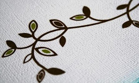
so to get started, here's what you need:
 now, i have to tell you...that adhesive eraser is one of my FAVORITE secrets. you get plenty of bang for your buck...and it lasts FOREVER. you can get one HERE, to ship with your next kit!!
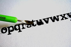
next, apply your paint. this is totally a preference thing...i tend to use a light touch, you can always go back if you think you need more.
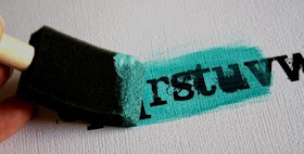
the paint will dry pretty quickly...so before it does, i run my finger over the top of the rub-on to remove paint that stuck to the top of the rub-on. remember...for this technique, we're aiming for the 'negative' image. if you don't rub the paint off of the rub-on, no biggie...you will have some extra paint on your adhesive eraser. but you also run the risk of paint schmearing where you don't want it when you rub with that eraser.

now here's the cool part...start erasing! it takes a firm grip on the eraser and some elbow grease. after all, technically, rub-ons are created to STICK, lol...not rub right off of what you just applied them to!
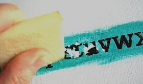
as you rub, you will notice some build-up of paint, rub-on and just general gunk on the edge of your eraser. fear not...just pick it off with your finger. if it's really stubborn? cut the edge of the eraser off with some scissors...there will still be plenty of eraser left for many rub-on adventures to come.
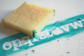
brush away the leftovers...and voila!!

i like to outline the negative image that's left to make it stand out a bit.

now, being that April is the Queen of the Mist (not the boat at Niagara Falls...that's the MAID of the Mist and an entirely different topic)...and knowing how many of our SC members have an affinity for mist...i thought, if paint works, mist should too right?
after misting...
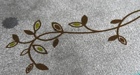
hey...what do you know?! i was right!!!
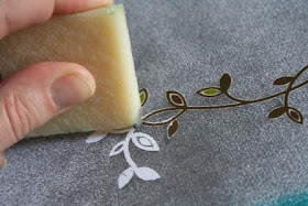
it's a beautiful thing.
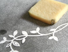
and you know how sometimes while trying one thing, another cool thing happens? check it out: the mist filled in my formerly 'negative' space from my experiment with the paint. cool stuff, i'm telling ya!!
- i find that 'solid' rub-ons look better. makes sense, right? it looks bolder and stands out a bit better when you're left with the negative. definitely use a more solid rub-on with the mist...and by solid i mean something not 'airy' and delicate. these 2 rub-ons i showed here are examples of what i would call a 'solid' rub-on.
- let the paint/mist dry COMPLETELY before attempting to rub!! failure to do so may result in the aforementioned schmearing.
- i didn't think to try it until i was typing this out, but how about using INK?? apply rub-on, use an ink pad on top of it and then erase...why not?!
if you have any questions...please don't hesitate to ask or just shoot me an email via Studio Calico. i've also started a thread HERE in case you just want to post your questions there. there really aren't many limitations to this technique...and you'll find yourself reaching for supplies that may have been in your stash for awhile, simply because they were the wrong color.
and any time we can revisit an older supply is a cause to celebrate, right?!
right.
:)
an update on the Alisa challenge.
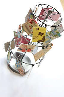 hey everyone.
just a quick note to share a pic of the ATC holder that was sent out to Alisa Henry's family...this is just a SMALL sampling of the ATC's that were made in her memory, and each one holds a quote from Alisa herself. the entire group of ATC's that were received was sent along, and i'm certain that her loved ones will cherish having her words so close at hand.
thanks to everyone who participated...losing a loved one is hard.
but knowing that they were loved helps to ease things just a bit.
miss you Alisa...still thinking of you.
August 28, 2009
Reveal Night Winner!
great giveaway, my favorite is boyfriend I think
thanks for the super chance
August 27, 2009 1:00 AM
Congrats on winning the prize pack from Cosmo Cricket. Please send an email within 24 hours to info@studiocalico.com to claim your prize.
Also, we've had an unclaimed prize pack recently. The original winner was given 24 hours and they did not respond, so the name has been redrawn for that prize.
The Making Memories winner is:
kiwithekreator said...
i'm drooling!!!
July 26, 2009 4:45 PM
Please send an email to info@studiocalico.com to claim your prize within 24 hours.
DT Gallery Reveal
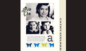
our Guest this month, the fabulous Cathy Zielske...i don't even know where to begin. i've loved her work for so long that i feel like i've watched her sweet daughter grow up, so no surprise that this one caught my eye. her graphic style will forever be a favorite.
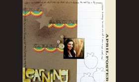
 April, April April...why must you mist? it makes me want to mist as well...yet when i do, i feel i fall short of the misting skills lol. love the handcut title...and the mist. (did i mention i love how you mist?!)
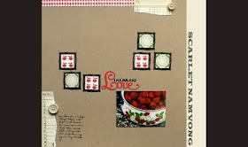
Scarlet...the frames caught my attention first, but it's the ripped pieces of the memo paper that make me smile.
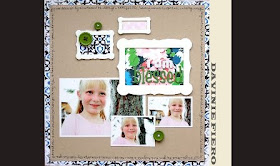
Davinie...love the placement of the pics vs. the frames...random, yet perfect. and your journaling sums up feelings that we have all had as mamas.
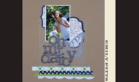
Emily...LOVE the subtlety of the Hambly kraft paper on the kraft cardstock. and how you used a sliver of the journaling tag to record the date alongside the photo.
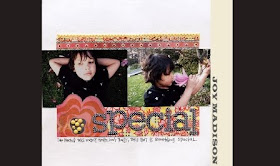
Joy...your sweet feelings about your boy always catch me. i love that you aren't afraid to use pink/flowers on his pages and how heartfelt your simple journaling is. proof that it isn't the amount of words, just what the words say.
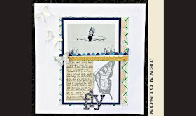
Jenn...oh, Jenn. i may be your number 1 fan...honestly. yours is the first gallery i check every month, and the one that always sticks in my head. this layout...this one right here...it may be my all-time fave of yours. the butterfly rub-on, the silvery stamped butterflies, the photo, the central title...ACK. i love it all.
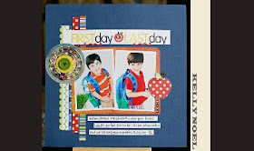
Kelly...LOVE your comparison layout. these are such a great way to keep track of subtle milestones that may otherwise go unnoticed.
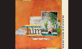
Maggie...LOVE all of the tidbits on this one. you have a knack for just the right amount of oomph to make a layout complete.
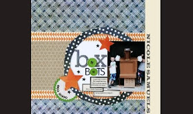
Nicole...i love this layout, but among other things...i love that you are bringing back the use of vellum!! i've noticed it on several of your layouts lately, and it makes me want to reach into my stash for a piece.
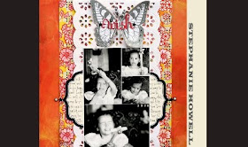
Steph...love how you cut down the die-cut p aper to run down the center of your page. and the butterfly used as the base for your title is perfection.
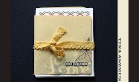
Tina A...your artsy style is always a treat, but you MUST show us more of this album. seriously...YOU MUST!!
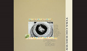
and last but vertainly not least...Tina C. your simple style + fantastic pics + straight from the heart words always = an A+ in my book.
 i think it's clear that we all ended up loving this kit...i fell in love with the navy blue and will heretoforth profess my love for any kind of frame April & Scarlet want to throw my way, lol. i also noticed lots of layouts with tender journaling about kids this month...maybe because all of ours are going off to school it's a reminder that our time with them is precious? not sure...but i enjoyed those the most this month for sure.
August 26, 2009
Reveal Night Giveaway

Want to win this fabulous prize from Cosmo Cricket?
Just leave a comment letting us know which is your favorite line: Boyfriend or Earth Love.
August 24, 2009
monday's challenge


you have until Saturday to get your creations in the gallery!
have fun! :)
Tina
let's make something.
Here's a fun, easy way to use them.

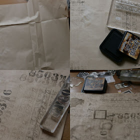 Keep stamping until you achieve a layered look that you're happy with. You really can't mess this up. Actually the messier, the better.
Here's the fun part....wad your stamped masterpiece in a ball. mash away. trust me. this adds to the beauty and makes the paper look old and textured. I do this about 2-3 times until it's all nice and wrinkly (is that a word?)
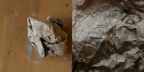 Smooth out the paper with your hands.
Run your Walnut ink pad lightly across the wrinkled paper. You can do this as little or as much as you like.
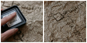 Next, take a couple different Maya Mists and spray in a few places. I've used Gold and Charcoal here.
Then, spray with a fine mist of water. It makes the Walnut ink sort of bleed and will start to look like actual walnut ink.
Let the paper dry.
At this point, you're left with a sweet looking piece of vintagey stamped paper. You can do whatever you want with it. I've covered boxes with it. I've scrapped with it. I've also used this paper as a book cover for a mini.
Boxes are fun and easy to cover. Who doesn't have a random little box lying around?
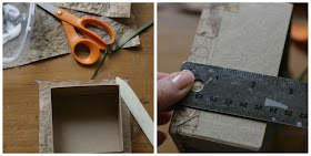
I was going to use decoupage glue but didn't have any handy. I did have fluid matte medium and it works wonderfully for this project. Cut your paper into pieces.
1 piece for top of the lid leaving a good amount of overhang to glue down onto the sides of the lid.
1 piece for the bottom with about a 1/2" extra all the way around.
2 long pieces for the sides of the box.
(the measurements will all vary with the box you choose to cover.)
Brush on your choice of glue evenly and press your cut piece of paper down. Smooth out with your hands and use a bone folder to brush down some of the creases and push out any excess glue.
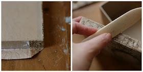 see the photo above on how to tuck in your corners. glue down all sides.
smooth with your bone folder.
I like to cut just 2 pieces instead of 4. easier and quicker.
It's nice at this point but why not do a little more distressing?
Add some white paint to the corners by using a old gift card. see photos below.
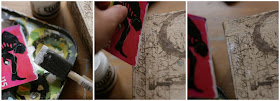
How about another stamp? I used Brick Red Distress ink and a special stamp I placed carefully on the edge.
:)
Tina
August 23, 2009
Layout of the Week

This layout has been added to your favorites more than any other layout in the SC community gallery for the week of 8/16-8/22.
Congratulations Diana! Because of this you have won a $10 gift card to be used on any new purchase at Studio Calico.
Want a chance to win next week? Be sure to upload your projects to the SC gallery, and support your community by adding special projects that catch your eye into your favorites! It could be YOU next week!
Please note, winners are not allowed to win more than once in a four-week period.
Winners are not limited to those using Studio Calico kits.
August 22, 2009
More 5 product challenge layouts
Emily picked out two further layouts from the entries to share with you all and here is what the girls had to say:
Stephenie Wheeler:
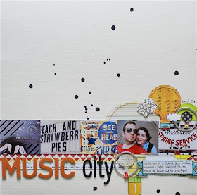
My thoughts: I will be honest, I'm not much of a challenge scrapbooker - I generally find that I am more a fly-by-the-seat-of-my-pants girl when it comes to getting crafty. I don't use sketches, I rarely scraplift, and I pretty much never plan anything before I sit down to work. So when Emily asked me to make a layout for this challenge, I will admit I was more than a little bit nervous.
I was told that I could use 5 products, a few of which I hardly ever use. I'm not really comfortable with paint quite yet, although I'm starting to use it more in my scrapbooking. I have a HUGE collection of embroidery floss, but I usually use it to embroider fabric - not paper. So I decided that this challenge would be a good chance to go in a different direction than I usually do. But before beginning my layout, I was pretty sure I wanted a few things - to use my pictures from our trip to Nashville from the previous weekend and to use some stuff from my overflowing Studio Calico kit collection.
The process: I am a typical one-page, one-photo scrapper. Every once in a while I'll use more than one picture, but because I love white space so much, I try to keep each picture small but still large enough to be important. I really wanted to include a few pictures from our trip to Nashville, so I picked five pictures that stood out, had a similar color scheme, and really caught the feeling of walking through downtown Nashville and taking random pictures. I wanted the pictures to be in a straight line, but I didn't want the pictures to be too flat, so I roughed up the edges to make them stand up a bit.
I tend to really like to use plain cardstock for my backgrounds, because I like to accentuate with patterned paper rather than using multiple patterns that fight, and while I really love the subdued look of mists, I had to use paint, so I thought I'd do some dripping, just to give a bit of pattern to the cream cardstock. I knew I wanted to use the cute Sassafras paper from this month's SC kit, but the whole sheet was much too bold for my taste, so I cut it up, using the balloons (with stitching!) as my main "embellishment." The flag cut-off border was a perfect page divider, the music notes were a nice touch since the page was about "Music City" and the stitched banner was the perfect spot for a little bit of journaling. I chose Thickers as my alphabet option, because, c'mon, who can resist? Finally, I used some empty tag frames for my metal, because I wanted to add some circles, and they were pretty much the perfect size.
Challenge afterthoughts: I am honestly, REALLY happy and surprised at how my page turned out. I was mainly afraid that only using 5 products would box me in, but turns out, it was easier than I thought to use just a few products and be really creative. Who knows? Maybe I'll be doing more challenges in the future ;)
Kristin Faust:
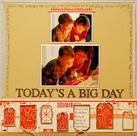
My thoughts: When I was asked to participate in this challenge I immediately said yes! However when I actually sat down to scrap, I realized that I next to never use paint or make a LO without buttons. I honestly wondered for a few minutes what I had gotten myself into! But once I decided on my products things started to move right along.
The Process: I knew I wanted to incorporate these Making Memories Metal Rims on my LO. When I realized that they looked a little like gifts I decided to pick these photos. I have a craft glue that dries quickly and clear that I used to adhere them. To make my, "gift boxes" I cut my pattern paper to fit the tag but instead of making them into tags, I adhered my paper first and then added the tag over the paper. It adds some neat dimension without adding a ton of bulk.
To make bows I first stitched around the rim and then threaded my string through my stitch. See Photo. My LO is bottom heavy so I added my paint and journaling around the top edge to add some balance. The stitched frame was an easy and fun accent that just added a nice finishing touch.
Challenge afterthoughts: I love these photos of my son and mom. I don't have a ton of photos of them together and I love how she is coaching him through blowing out his candles. She's always right there to lend a hand!
Emily asked if I might share mine and after blushing for a few moments I thought "why not?"
My Thoughts: 5 products? oh yes, bring it on. Limit me, threaten me, choke me.... I'm going to do this baby
The process: Paints, espesh the Adirondak dabbers are my absolute staple favorite product. So that was a steal to do; I slapped it on as the base to create a bold focus. It matched perfectly with the Studio Calico paper and so I layered a smidgeon of that on top. Black and white photos don't detract the focus of your colour scheme and this photo of my friend Dyan, that I took earlier this year, was begging to be scrapped. Next came the metally bit. Panic stations! Metal? I ransacked my jars of odds and ends and selected these book labels to add my title. I was so surprised how quickly it came together. Having alphas in the challenge helped and my red ones (my favourite ever scenic route alphas) created that crimson impact that I was craving. And finally, that stitched heart (swoon). I totally scored that idea from a Creating Keepsakes Magazine (Feb 2009) which I feel drew the whole layout together.
Challenge afterthoughts: In about 20 minutes flat I had a layout I was completely smitten with and I do feel it was down to limiting my supplies. And so my new layout creative formula goes like this:
crazy 5 product challenge+twenty minutes =best ways to use the minimum products for maximum effect ............ (ha! - Einstein, go and suck on your e=mc2)
Thanks, Emily :)
You can read the thread relating to the challenge and links to individual galleries here
Winner of Maggie's Giveaway...
 Kimberly said...
I love the "How To" posts. They are a great read and inspiration.
August 11, 2009 8:13 AM
August 21, 2009
Walk with me
Dancy Crazy was an odd shot of me on the beach during CHA. I think Stephanie Howell can take the credit for being the photographer or maybe it was Nik Harper or possibly Nic Samuels? I can't truly recall, I was too busy having a happy dance on the Pacific ocean edge.

The papers used on this layout came in the form of 6x6 sheets form the kit - those funky little Making Memory numbers just melted my heart. I wanted to make really good use of them and I cut them into strips to make these groovacious little rolls. Rolling paper is not new or rocket science. I'd seen a card on two peas a long time ago using this technique and I so wish I had taken down the name of the designer so that I can attribute the inspiration - sorry, if you are reading mystery rolly paper girl! After I had cut the papers into strips, I lined the reverse of them with double sided tape and simply rolled them up. I made a LOT of those rolls and I distinctly remember being on a very tight deadline to get this layout finished that in the end I almost wanted to poke my eyes out with them out of sheer deadline panic. Im so glad that I didn't in the end.
I spritzed the top right of the white cardstock with blue mist using a butterfly as a mask. Misting is tricky for me sometimes and I worry about having to waste a sheet of precious 12x12 cardstock. But it worked on this occasion and the layout slowly began to take form. Using leftover strips of the papers, I layered them in staggered fashion on the left of the layout, adhered my photo a'top then used the stripey paper to edge the right. Then came the rolly papers bits in line to match with strips to the left.
The rub-ons were not really calling my name at this point of the process and somehow, when I was flicking through my supplies , the rub-ons slid on the layout and it was like a eureka moment. I cut them to fit the gap and rubbed them all on, adding those beautiful little pink gems on the flower heads to finish.

There isn't a great deal of journalling on this layout, in fact most of my layouts are not speckled with my thoughts and words. Im simplistic and straight to the point on most of them but often, if there is heartfelt messages related to the story I hide my journalling in an envelope tucked behind the layout in the album. I'm really trying to be more open but because I produce a lot of public layouts I'm quite shy about it. Reyanna, however, singled out one of my other Aug DT layouts on the SC message boards by delighting that I had indeed journalled for all to see and I hadn't really given a thought about it until she highlighted the fact.
 So maybe next month I might splurge a little bit more from my heart and share with you all.


