April 30, 2010

Reveal Night Winner!

The winner of the 6x6" Pink Paislee paper pads is...............

Brittney
said...

I'd use them for both! So many possibilities!

April 26, 2010 8:33 PM


Please send an email to info@studiocalico.com with the following information:

  • Name
  • Address
  • Subscriber? y/n
  • Prize: 6x6" Pink Paislee Paper Pads
  • Contest: Reveal Night Giveaway


A quick share

for the Punch It! Challenge. Remember these are due by tonight. I'll draw a winner tomorrow! Here's what I did...


I used some Anthology papers with some odds and ends from Granny's Cupboard and a bunch of buttons from my stash. My punch of choice for this page? It's photo labels, of course! LOL I keep using that dang punch! It's perfect for a little embellie and so fun to use with text paper. :)

Be back tomorrow with a winner!

Friday Inspiration...1st Edition.

this is the first of TWO Inspiration installments for today...and who better than our May Guest Designer, Jennifer Johner to provide us with something to get us revved up for National Scrapbook Day?!?!

honestly, i'm not quite sure where to start. i have been a HUGE fan of Jennifer's for the longest time, and i just think she is crazy talented. in this layout here, she combined both HomeFront and Anthology to document a fun photo of her little guy. (this one makes me smile, because my daughter STILL loves tub time, and she will be eleven in a few weeks, lol!) let's try to break it down a bit... i think the quality that i am most envious of in Jen's work is her ability to use lots of little details without making it look over the top. my personal taste runs a bit on the 'clean' side...yet i love lots of details. her work combines both of those elements and hits the mark every. single. time. the FabRip ruffled at the top of the page, the random Anthology Stickers floating about, the mix of the Anthology and HomeFront alpha stickers...sigh. each one a perfect addition that adds to the page without distracting from the message.
here in the detail shot, i love how she punched the FabRip with a heart punch before removing it from it's backing...and added the random 'H' stamped with the Noah alphabet for fun. again, little bits and elements that add to the fun of her page without distracting from that cute photo and her words. (side note: i am a big fan of journaling on lines drawn with my ruler...you will rarely see a page of mine where i have handwritten journaling and NO lines. i LOVE how she kind of free-handed her journaling lines...i will definitely try that!)

so there it is.
my profession of love for Jen's work.
please check her blog HERE...and her Studio Calico gallery HERE (just click on her image).
both are DEFINITELY worth your while!
and thanks Jen, for providing us with so much inspiration this month!!

April 28, 2010

Granny's Cupboard Gallery Highlights

Have you had a chance to oogle the new gallery yet?! It's amazing. These ladies blow me away every single month with their creativity and eye for design. I finally had some time to go through the whole gallery (it takes a while!) and I picked a favorite from each designer to share. Here goes...

First, our guest designer. I love what she did with the chipboard bubbles. I don't know exactly how she got that effect, but it looks awesome! And those itty bitty butterflies? So cute!


This layout by April jumped out at me right away. Look how she painted the bubble chip and used it to house all sorts of little bits. And those fun photo booth pics randomly shuffled in there are perfect.
Celine's row of colorful photos mixed with the red doily paper drew me in right away. Her stamping with the doily stamp is gorgeous too!

Davinie's "Egg Time" layout feels so springy and happy with those strips of paper. Love how she used border punches on some and mixed the flowers/buttons/odds 'n ends in there too. Beautiful!


This layout of Emily's is FABULOUS. I love how she used all the K and Co. diecuts. And the photos...so fun. This just rocks. :)


Jenn's layout scores bonus points for having such a cutie as the subject. ;) But beyond that I love this one for the colors, the way she used the paper flowers, and really the whole dang design. Gorgeous!


So, who else thinks Joy is supermom right now? A brand new baby, three other big kids to juggle, and she knocks this kit out of the park with loads of fabulous baby pages. LOVE! This one was my fave.... look at that little bee?! And Jovi... precious!


Kelly's beach layout makes me want to hit the sand and surf! Love the circles, the title work is amazing, and the photos are Kelly's trademark gorgeous-ness. Perfect.


I couldn't resist picking this one in Kimmi's gallery. The grays and blues and pinks all combine to make a gorgeous page. Her layering is amazing too!


Laura's simple page makes a huge impact. Look at the teeny pics and goodies she included in the bubble chip. Wow!


Lisa's use of the SC paper makes me wish I had more left over so I could lift this idea. I LOVE how she stitched around the paper cut outs. The whole design is awesome.

Love that Maggie used a pink frame on a boy page. Love how she mixed the cloud stamp with the cloud chip. Love the journaling all up the one side. Love!

Look at this beautiful mama/daughter photo! And Nik created a beautiful page to match! She totally rocked the die cuts here...LOVE it!


I am so intrigued by this page of Sasha's. It's one of those layouts that you can just study and study and STILL find new details to take in. Wow.


I love the hand cutting Steph H. did in this layout. It's something I thought of doing with that paper, but didn't dare. She made it look amazing. Love the mix of b/w and color photos and of course all her journaling. I'm inspired!!!


Stephanie W. mixed so many cool elements on this layout. I just keep looking at it and finding more bits to love! So lovely!


How stunning is this maternity pic? I wish I looked that good at the end of my pregnancies!!! Love the quilted paper and the way Susan used it here. The colors and mix of patterns is beautiful!


I loved this layout by Tina as soon as I saw the thumbnail on the slide show! The red title, the bits of paint, the die cut use... fabulous.


How cute, cute, cute is Waleska's page with that little tree?! Ahhhh! So creative and clever! Definitely a lift-able idea!


Phew! I think that's it. :) I hope you were able to see something you loved in each of these layouts too. Sometimes hearing what someone else liked about a layout can cause you to see something in a totally different way that you had before. Thank you DT for being so talented and inspring!!!

April 27, 2010

National Scrapbook Day at Studio Calico.


hey everyone...you DO know what this Saturday is, right?
IT'S NATIONAL SCRAPBOOKING DAY!!
the day we have to celebrate our favorite hobby...and the best part is that we have fun ways lined up to enjoy it with you all, even though we may be far away.
from 10am to 7p (EST), we have hourly chats scheduled with the Design Team. we are pairing up to chat about anything you'd like...the new Kit, the new Punches (good gravy, they are AMAZING!), Glee, WHATEVER YOU'D LIKE!! when the list is complete, i will update and post it here so you can come on if you have a specific question for someone. then again, we'd love for you to stay all day!!

Each of us is hosting a Challenge...WITH A WINNER OF A $10 STUDIO CALICO GIFT CERTIFICATE for each challenge! here is a list of what everyone has in store...so you can print out some pics and get ready ahead of time if you'd like!

Challenges:

Each DT Member will be posting more info on their personal blogs regarding their specific challenges...so feel free to click on the links to the right for more details on each.


Did i forget to mention that we will be repeating the giveaway we did last year where TWO lucky people will receive a 6-MONTH STUDIO CALICO SUBSCRIPTION for FREE??
check back for more details!!
looking forward to spending time with you all this Saturday!!

April 26, 2010

Punch it.

It's Monday! And phew... I'm just finding some time to sit down and really type up this blog post. It's been one of those days. Anyone else? Nik and I are your friendly blog hostesses this week and we thought we'd challenge you to use something near and dear to many a SC'er's heart. PUNCHES. And not just any old punches....one or two (or however many you purchased!) of the NEW punches that April stocked in the shop last month. You can find them here in case you need a reminder! ;)
Here's a couple of my sneak peeks that show two of the new punches.... photo labels (second pic) and double embossed dotted lace (which is a mouthful! why not just call it big scallop?)


So, it's that easy. Just use one of the new punches on a project, upload it to the gallery, and then link us up on this post. You only have until Friday night for this one since come Saturday there will be a whole bunch of new challenge for NSD and I don't want this one to get forgotten in the midst! So get busy and share your creation with us for a chance to win a SC gift certificate. :)

Reveal Night Giveaway

Want a chance to win all three of these paper pads by Pink Paislee?

Simply leave a comment here, let us know if you would use these for card-making or layouts.

April 25, 2010

Layout of the Week


The layout of the week is brought to you by Piradee Talvanna (piradee).
Each week, the layout in the gallery is linked, so you can add it to your favorites easily.


This layout has been added to your favorites more than any other layout in the SC community gallery for the week of 4/18-4/24.

Congratulations Piradee! Because of this you have won a $10 gift card to be used on any new purchase at Studio Calico.

Want a chance to win next week? Be sure to upload your projects to the SC gallery, and support your community by adding special projects that catch your eye into your favorites! It could be YOU next week!

Please note, winners are not allowed to win more than once in a four-week period.
Winners are not limited to those using Studio Calico kits.

Sunday Sketch


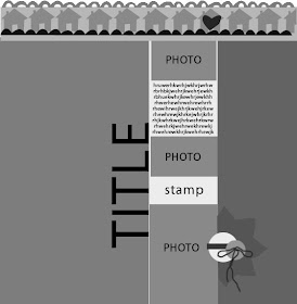
The sketch this week is based on a layout by guest designer, Cindy Liebel. Normally, we picture the sketch and layout, however her layout was picked up for publication, so this week, it's time to use your imagination!

The photos are fitted in the middle column sized 2x3, 2x3, and 4x3, along with a journaling block. A vertical title is placed to the left of the column. This layout can feature large areas of white space, or large areas to showcase your favorite patterned papers. It's up to you!

As always, link your layouts to this thread by Saturday. Two winners will be randomly chosen on Sunday to receive a $5 gift card to Studio Calico. Please note: SC kits do not have to be used to participate.

Sunday Sketch Winners

by lindam


by Kimber-Leigh

Congrats to the Sunday Sketch winners! Please send an email to info@studiocalico.com with the following information:
  • Name
  • Contest: Sunday Sketch
  • Prize: $5 Gift Card

April 24, 2010

I LOVE bags

Hello everyone!

I'm a girl.And I LOVE bags. I mean, I'm addicted to them. I must have about 40 different bags at home. Everywhere I go on vacation, I NEED to come back home with a new bag, which drives my man crazy! :D

Today, I wanted to show you some favorite from 3 of my favorite companies (bags and other cute stuff).

Oilily

yeah that is a hot air balloon BAG! :)
I've got this bag that I use as a camera bag :)


Fossil


Aren't you inspired by the designs? the patterns? the fabrics?

Desigual

I've got this bag too :)


Now, don't tell your husband I showed you this, ok? :)

c

April 23, 2010

Member Spotlight: DIVINEYUKO

This week's member spotlight is a fresh face at Studio Calico.
Her layouts always capture my attention with bold detail and fun photos of her cute children. I also love her asain journaling. :)
I asked Yuko a few questions. Here's what she had to say.....
1. What 3 items can you not live without?
*Photograph that stimulate my creative energy
*Papers that activate my brain system
*KOKUYO Dot Liner : My favorite adhesive


2. What's inspiring you right now?
*Beautiful Figure skater: Johnny Weir!

3. What's your favorite Studio Calico kit?
*I just began subscribing in Feb and it was a blastto have everything I needed in a pack! which was"Baker's Dozen"


4. What are you listening to right now?
*Loving The Weepies, Lisa Hannigan and Aqualung. (Ido listen to GAGA too;)!)

5. Any guilty pleasures?
*Right now I am correcting and tasting every kinds ofJapanese Sake based Apricot Liquor that areavailable. They are so... addictive!


6. Choose a layout that best represents you as a scrapbooker.
This photo is my all-time favorite and with love ofthe Basic Grey's signature vintage taste paper as abase I added little details such as little swirlstamp, metal book holder, little flowers, tiny tagand so on. I cherish my memory and the story behind the photomore lively with these little details. This is why Ilove Scrapbooking;)!

Thanks Yuko!
Happy Friday Everyone!
Tina

April 22, 2010

Insider Tips - dye your tags using Maya Mists!

Hey everyone! :)

You know how much my Maya Mists? Well, I wanted to show you a new way to dye paper tags : I think you might like it! :)

We're going to make a layout and this is what I used for my layout :

Simply choose a cardstock that is the same color as one of your favorite alphas and glue all the letters, words, sentences you want onto your cardstock (you probably want to cut the cardstock first before adhering all the chipboards, otherwise might be a pain to cut afterwards).


Grab your kraft sheet, 2 tags and 2 small zip lock bags.


Spray Maya Mist in each plastic bag (one color per bag).


Open and put one of the tags inside a plastic bag. Use your finger to make the ink move onto the tag.


Use your heat gun to dry each tag.

Once your tag is dry and ready to use, you can also fold it and put it back into the same color bag.

All the wrinkles will get bolder and darker because of the ink. Use your heat gun to dry again.

You can use your tags the way you want. I like to use them as a new way to focuse on the photos.


Extra item I can't live without and that I used for this layout :
Enjoy!
Céline