May 31, 2010
Documentary Blog Hop
Nice work!
You're here at the starting point of the Documentary Blog Hop.
Here on the SC blog, we're giving away the entire collection to one lucky winner. Simply leave a comment here letting us know what you plan to document this summer. Do you have a fun trip planned? Are you visiting relatives? Or are you relaxing in your own backyard? Whatever it is, just leave a comment on this post before midnight EST tonight for a chance to win.
For more chances to win plus inspiration using the line, visit each of the blogs listed below. There's lots of great layouts and techniques to see, so hop to it!
challenge : scrap a summer photo
Hello, Studio Calico friends! =) Kelly and I are hosting the blog this week, and we are planning on bringing you a week of summertime inspiration. We're winding down the long Memorial Day weekend here in the US, which unofficially kicks off summer. School is almost (or already!) out, the weather is getting warmer, and we're spending more and more time outside.
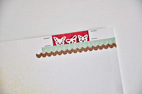
(partly sunny + rec league,oa word stickers, tiny attacher, turquoise mist, large monarch double punch, photo label punch)
I made this page for the Partly Sunny gallery (and while the main kit has sold out, there are still add-ons available!)- the photo was taken less than three weeks ago. I love seeing how each season impacts our everyday routines - since this photo was taken, the jeans and long sleeves have been packed away and my boys are in full time shorts and sandals mode. Homework has been traded for sprinkler time, and the late nights are no longer a novelty. We're in full on summer mode.
Our challenge to you for this week is an easy one - scrap a summertime photo. Whether it's recent or an older shot, get a little piece of your summer captured on a page. Once you've finished your page, link it up on this thread and let us see it. We'll close the entries at midnight EST on Saturday, and draw a winner for a $5 gift certificate for everyone's favorite shop on Sunday. I'll be back with my summertime page later this week!
May 30, 2010
Reveal Night Winners!
And the winners of the Crate Paper collections go to:
Savannah O'Gwynn - Brooke Collection
J. Hickey - Pink Plum Collection
Bree - Paper Doll Collection
Please send the following information to info@studiocalico.com to claim your prize by 6/2.
Savannah O'Gwynn - Brooke Collection
J. Hickey - Pink Plum Collection
Bree - Paper Doll Collection
Please send the following information to info@studiocalico.com to claim your prize by 6/2.
- Name:
- Subscriber? y/n
- Contest: Reveal Night Giveaway
- Prize:
Sunday Sketch
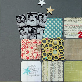
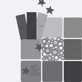
The sketch this week is inspired by me (April)! I love working with grids, mainly because they're quick and easy, but sometimes they can get boring, right? So on this layout, instead of using a square photo to fit in the upper left block, I used a grouping of photo-booth photos. You could use any small photos.
My journaling is located in the lower left block, but there's plenty of room anywhere here to journal or add a title, so have fun!
Be sure to link your layouts to this post by Saturday. 2 winners will be chosen on Sunday for $5 gift cards!
My journaling is located in the lower left block, but there's plenty of room anywhere here to journal or add a title, so have fun!
Be sure to link your layouts to this post by Saturday. 2 winners will be chosen on Sunday for $5 gift cards!
Sunday Sketch Winners
The layout of the week is brought to you by Marie Holmstrom (sockergrynet).
Each week, the layout in the gallery is linked, so you can add it to your favorites easily.
This layout has been added to your favorites more than any other layout in the SC community gallery for the week of 5/23-5/29.
Congratulations Marie! Because of this you have won a $10 gift card to be used on any new purchase at Studio Calico.
Want a chance to win next week? Be sure to upload your projects to the SC gallery, and support your community by adding special projects that catch your eye into your favorites! It could be YOU next week!
Please note, winners are not allowed to win more than once in a four-week period.
Winners are not limited to those using Studio Calico kits.
Partly Sunny Favorites
I completely forgot that I was supposed to blog yesterday. I'm really sorry. I went hiking in Boulder with the family then we had friends over for swimming and kabobs. It was a delightful day, completely void of any thought that I had a job to do! So I hope that perusal through the Partly Sunny gallery will make up for it. :)
Also I'd like announce the winner of Sasha's rub on challenge, it's Rimna! Please send your information to info@studiocalico.dom stating you're the winner of Sasha's Rub on Challenge for the week of May 24. Congrats! Here's her layout:
And now the DT gallery favorites, through my eyes. I decided to go backward through the gallery this time. So enjoy!
I had a hard time picking a favorite from Waleska's gallery this month, they were all fun and happy, but I think this one won because of the banner. I love how she stamped underneath it and then added the fabric swatches over top. And those faces? How could you not smile at them?
Not Tina's typical style, but it is totally fitting for the topic she journaled about here. I think that's why I love it. Her journaling is absolute joy on paper. Everything on this page has a reason of being there. Love how she chose her title too, it's a fun way to use the strip.
I wanted to pick Airplane Alert for my favorite, just because I loved it in Susan's sneaks, but come on, how can you not laugh and smile at that picture? I thing Susan's happy selection of papers and embellishment perfectly highlight an adorable baby. :)
I love the way Steph W. captures her 6 years with her sweetie. A fun way to look at things that can seem so day to day. I love hwo she used the MM flowers, the perfect little touches to a beautiful layout. And the paint and stamping balance so nicely with the K&Co paper lace, pretty.
Hee hee, Steph H. made this before she knew about twins and I think that's part of the reason this one is my favorite this month. I just LOVE the stamped starbursts around the circles, brilliant, but the journaling is the best part. Well, that and how she turned the 8 into an S. Um, cool.
I love how Sasha took a couple of different papers and used bits and pieces of them to compliment the Jenni Bowlin Coredinations paper. What a fun finishing touch to add the stitching. I love the "Impossible Nothing" she added with the MS punches. Very cool.
By no means is this kind of layout unique. Lots of scrappers have captured whole season on a page before, but the way Nicole S. has designed this one is so beautiful. Her strips of paper between the photos and the center so nice and clean allow the photos to shine.
This one by Nicole H makes me giggle for a couple of reasons. First, I'm at the bottom of the technology latter as far as it comes to phones. And I know when I some day convert as she has, I'll be the EXACT SAME WAY. Secondly, it's green. Could that be any more perfect? I also LOVE the look of the bubbles punched cardstock over the striped MME paper from Front Porch. Lovely.
Bright colors popping against the fun Cosmo Coredinations is one of the things that I loved about this layout, but then I noticed the green stitching and that won me over Maggie!
See how easy it is to bring momentos from your life into your scrapping? I adore how Lisa used the tag from her son's birthday/mother's day trip to a cupcake shop in her layout. It's front and center, but doesn't take away from the fabulous photos. Great way to use that stamp too!
I love how Laura can capture so much in such few supplies. Her stitching and type always pull me in to study. and then she does the cute little heart over the top of the yellow and it just makes me smile.
Yep, I was right. I knew I'd love this one by Kelly. The colors just POP on the dark cardstock and combined with those hilarious pictures of Brady, well this one went into my favorites pile pretty quickly. I love how Kelly used the banner stamp too.
Although she had a bunch of masterful layouts in her gallery this month, I REALLY LIKE Joy's idea. Pre-make a summer fun album and fill it in as you go. What a clever idea for capturing your summer before it slips away. You can tell this is a momma who's good at planning ahead. Since summer officially starts for me this weekend, I'd love to slap something together, now i have a template to copy. :)
Always one for her happy combinations of paper and color, Jenn did not disappoint this month. I love how sh used the cloud paper tucked into all her strips of color to represent a rainbow. Beautiful!
I knew when I saw her sneaks I'd like this layout. I was even more pleasantly surprised! the way Davinie brought in the fabric swatches with the Jillibean flowers from Front Porch makes this layout sing of summer.
Celine's album was so beautifully put together, I really loved how she combined the green/yellow/browns in the kit and made a fun album about her friends.
This alphabet set was the reason I bought Front Porch as my add on this month. I love how April took hers a step up and colored them. It's absolute genius! And what a fun look at her 9 years of marriage, congrats April and Greg!
Finally we come to Mou Saha's gallery. I love Mou's style, probably because we're both inot handwriting your journaling. It always pulls me in on her pages. I love the perspective on this photo, and the planes are just fun.
May 28, 2010
Member Spotlight : Michelle Alynn Clement
Hi everyone! I hope you're having a great Friday so far :) This week, I'm shining the spotlight on Michelle Clement! She goes by MichelleAlynnClement on the forum, and while being new to Studio Calico, has been a constant source of inspiration to me and I know many other SCers :)
Let's get to know her better!
Where do you go for inspiration? Any site you would like to share?
I have a few usual daily reads, blog-wise, that never fail to inspire: Elsie Flannigan, Kara Haupt, Mandi Johnson, Rachel Denbow, Rachie's Place, Freckled Nest, The Dainty Squid, Danielle Thompson, Wild Olive, Helen Dardik, Dottie Angel, The Black Apple and about a kabillion more! lol. I like to go to these, and then hop around to other blogs from them, too - it never fails to make me want to get creative! My other fix is flipping through the magazine section (mostly art/illustration and craft magazines) in a local bookstore with a favorite coffee, and then a trip to my few favorite thrift shops. Or flipping through 'Uppercase' magazine or the Studio Calico gallery!
How would you describe your style of scrapping?
think it's a messy, distressed, sometimes-a-little-crazy style. I pay attention to lots of little details using splatters and sewing, and use lots and lots of layers! Also, I've been known to just stick a whole pack of buttons on one page, sometimes, and I go nuts with the walnut ink, often. I love a mix of bright colors & vintage, the most!
How many layouts on average every month?
Ah! It fluctuates on my busy-ness, of course, and right now it's only about 5-10 per month.
Are you a morning or night person?
I'm definitely a morning person! Happy as soon as I wake up, with a coffee in my hand (although it's so nice to sleep in once in a while, I always feel like I have no day left when I do!).
Coffee or tea?
Coffee, all the way! I'm addicted to Mocha's, and anything Starbucks Christmas. Yum! I have at least 2-3 cups everyday, it's just so yummy!
Three current favorite from your own gallery.
Five years down the road . . .
I will be just about to graduate design school with a degree (fingers crossed on going back to school!), and will be successfully running a small design/paper goods/indie business on the side. I will have accomplished a lot of my list of secret creative dreams. I will be looking into buying a separate studio space. I will own a rad loft with hubby and have a new lil boston terrier pup. I will have travelled to Europe with a backpack for more than a few weeks. I will have still be super-happy!
Can't get enough of Michelle's goodness? Visit her Gallery!
Thank you Michelle for answering my questions :)
May 27, 2010
To bide your time
Reveal is HERE! we have just a few more hours until you get the see the DT gallery. Subscribers have already had a chance to purchase their kits, so until then, I thought I'd share my favorite DT sneaks with you. Don't forget to enter yourself into the fabulous drawing for Crate Paper, see post below.
Kelly always comes up with the happiest color combinations. And if I'm reading the title right, I really want to see this one!
Had to go hunting for Tina's, but dang, it was worth it. I can't WAIT to see this one tonight. I love buttons, LOVE buttons, and to see them all together like this, oh goodness! And that "Today" stamp again. :)
Joy did a tutorial on this cute circle a couple of weeks back. This one just makes me smile. What a fun way to add texture!
I have to admit I was a bit frightened of this AC paper, but ended up loving it's bright sunshiney feel. I think Celine loved it too. She made a mini this month, I'm excited to see it.
I may have a thing against using banners myself, but they come looking like this, dang they are cute! And love love love how Nic turned the stamp into a sun. That's just happy.
Steph H, expectant mother of twins, puts the coolest papers together. I love how the Crate looks with the OA.
Jenn has a collage of lovely here. I can't wait to see the full versions later tonight.
Totally fun how Nik used the Donut Punch to anchor her title, I look forward to seeing the rest of this one, it's just a great mix of things!
Davinie's color combination is what drew me in. And the "today" stamp looks to be an all time DT favorite, I think a lot of us used it.
Call me intrigued Sasha. Call me intrigued!
Fun flippy banner using the banner stamp in Rec League and the fabric swatches. Brilliant combination Waleska!
Lisa misted the Basic Grey paper and gave it a whole new look. I'm loving how she used the Basic Grey sticker strips too.
I think the way Susan combined the alphas on this is truly stunning. There's an alpha from Picket Fence and one from Front Porch.
See, it's that cute "Today" stamp yet again! I love the happy colors Maggie put together here.
Reveal Night Giveaway
Boy, do we have a wonderful giveaway today! Three chances to win Crate Paper's newest releases. Just leave a comment here letting us know which is your favorite and we'll draw a winner for each tomorrow.
May 26, 2010
Tutorial : Update Your Earrings
Hey everyone! Sasha here, reporting live from hot and humid Singapore!
I love costume jewellery, I know a lot of us do. So today I'm gonna share how I updated one pair of my old earrings. Super easy to do, I am now wondering why in the world did I not do this earlier? :)
Then I did the same with the other earring, added some blings and voila! Got myself a 'new' pair of earrings. Now I am gonna look for more old earrings to 'refresh'! I really hope you'll try this :) Fun, trust me. Just don't worry about perfection, and you'll enjoy this. :)
I love costume jewellery, I know a lot of us do. So today I'm gonna share how I updated one pair of my old earrings. Super easy to do, I am now wondering why in the world did I not do this earlier? :)
First I got my pack of Rub On out, and also the pair of earrings I was gonna play with.
I cut the design apart to make sure they'll be where I want them to.
Then I rubbed one scalloped part onto the earrings.
There will be parts of the rub on sticking out of the earrings, just use your fingers to smooth them to the back of the earrings. Please pay no attention to the messy background. I have been shopping and shopping and didn't spend my time organizing the new stuff, that's why they're all piled up on the table, leaving me to work on a 12 x 12 space.
Then I did the same with the other earring, added some blings and voila! Got myself a 'new' pair of earrings. Now I am gonna look for more old earrings to 'refresh'! I really hope you'll try this :) Fun, trust me. Just don't worry about perfection, and you'll enjoy this. :)
May 25, 2010
I Spy Anthology
I love seeing Studio Calico's paper lines out there in other online galleries I frequent. How people mix and match the lines with other manufacturers always leaves me thinking, "Why didn't I think of that!?!" I thought I'd share some of those layouts with you today. Each artist is linked to their gallery so you can go and explore more!
This layout by Tay created using the FabRips, the labels, Aperture, and the letters cut from Typo. I love the combination of the Cosmo Tiny Alphas with the Aperture paper, they perfectly compliment each other.
crafty.kari's hodge podging of elements caught my eye, but I absolutely LOVE how she used the Month Stamps, filled in the April to date this layout. Cool idea. She also used the label stickers, hand cut the flowers from the Bouquet paper, and it appears that she used the Tiny Attacher.
*Kristine* worked Anthology beautifully here. I love how she clustered around the photo using the label stickers, fabRips, and the flowers made from Compilation complete with leaves cut from the journaling cards. And putting everything on my favorite Lithograph paper makes the fun title using the blue alphas look like it's almost floating. I love how she did that!
Mou Saha's layout starts on the herringbone side of Bouquet, and adds a bunch of other little bits from Compilation, Lithograph, Typo, Aperture, and Periodical. I love that she uses a tiny horizonal strip of the fabRips just under the photo. It's a nice bit of texture. She tops it off with a couple of well placed stickers from the label stickers sheet.
Julie S used the alpha side of Typo so well, it's classy against the soft feel of layout. I love that she used the journaling card just for the rose, it's so elegant, and fits perfectly here. And she was so brave to rip it up! The button rubons add another classy look. It's fun to explore this page!
lainalamb worked with the label stickers and fabRips,, showing how little bits can be perfect!
georgia keays layered Compilation, Lithograph, and Periodical then used bits of the fabRips to make a mannequin. How cool is that? I love that she based it all on the fabric sheet. It's a nice soft look.
helpmeronda's title balances perfectly with some strips of the yellow side of Lithograph, which snuggle up nicely against the blue side of same paper. Don't you love how versatile double sided papers are?
Make sure you keep loading your Anthology layouts to both our member gallery and other online galleries. And if you link products, it makes it even easier for us to find and feature here. Thanks to all those who's projects were featured today!