February 27, 2009

Here are your random numbers:

858 1219 428 1148 1114
256 778 400 917 573
482 1140 203 927 1232
35 603 247 205 859
1 474 954 230 568
148 125 521 575

Timestamp: 2009-02-28 05:12:23 UTC

Below are the 29 winners of the Ali Edwards stamp sets. Please email info@studiocalico.com with your name/address/prize within one week and we'll ship your prize.

  1. lori said...

    waiting for excitement and joy....I'm feeling little like Christmas....just saying.....:))

    February 26, 2009 11:01 AM

  2. Cassi said...

    *sung to the tune of "I'm So Excited"
    I'm so excited, and I just can't hide it. Ali E's designs are awesome, and boy I like 'em!

    February 26, 2009 1:25 PM

  3. Jenni said...

    Oh, these kits looks so yummy! I can't wait to see the full reveals!!! Love those cute stamps too!! Such a fun giveaway girls!

  4. Roz said...

    How exciting a chance to win something, please add my name to the draw

    February 26, 2009 3:26 PM

  5. Leslie Herbert said...

    Can't wait until tonight! thanks for having a great giveaway!!!

    February 26, 2009 6:42 PM

  6. McMcKenzie said...

    Love it all, as usual!!!! ;)

    February 26, 2009 7:40 PM

  7. Gretchen said...

    Can't wait for the reveal and what a fun giveaway!

    February 26, 2009 8:58 PM

  8. Jenny S. said...

    Thank you for this wonderful giveaway. What an amazing opportunity!

    February 26, 2009 6:37 PM

  9. Val said...

    oh wow what fun!

    February 26, 2009 9:57 PM

  10. Lalunatique said...

    It could be me..... Please.....;)
    Can't wait for this reveal !

    February 27, 2009 8:47 AM

  11. Mariangeles M said...

    Love your stuff!!

    I hope I'm one of the winners :o)

    February 27, 2009 9:39 AM

  12. Miranda said...

    Oh how we would love to add these to our collection
    so exciting to have the chance to WIN 1 of 29
    thanks for that chance
    Ali's designs are great.

    February 27, 2009 9:43 AM

  13. Keely said...

    Sign me up for some free stamps! :) Have a good weekend!

    February 27, 2009 9:09 AM

  14. Kathy Reid said...

    Pick me! I want to win. I love stamps and I love Ali.

    February 27, 2009 10:02 AM

  15. Amber Reed said...

    Would LOVE to win!!! Yeah!!

    February 27, 2009 10:25 AM

  16. wolfe said...

    Very fun!!! This would make my day.

    February 27, 2009 10:22 AM

  17. Ann said...

    Can't wait to see them all! Love 'em.

    February 27, 2009 10:26 AM

  18. Barbara in NC said...

    How exciting! Thanks so much.

    February 27, 2009 10:41 AM

  19. Shana Tehrani said...

    Hi--would love to win! Good luck on the Reveal!

    February 27, 2009 12:36 PM

  20. Anonymous said...

    OOOO Pick me Pick me!! ha :) actually would love to win your giveaway. thanks a bunch.
    Tracy Johnson VA

    February 27, 2009 1:45 PM

  21. luv2stamp2 said...

    This looks awesome! Love Ali's stuff!
    Jeanne in Denver

    February 27, 2009 1:45 PM

  22. scoborn said...

    How exciting!!! Thanks so much!

    February 27, 2009 2:38 PM

  23. RAMASYL said...

    A source of inpiration your blog!
    And reagent in more! Still

    February 27, 2009 2:52 PM

  24. DanaK said...

    What an incredible giveaway. It's so generous of you.

  25. Paula said...

    wow I never knew this site existed! Now it's bookmarked. Thanks to Ali E!

    February 27, 2009 7:24 PM

  26. susanne said...

    would love to win :) hint, hint!!

    February 27, 2009 8:12 PM

  27. Wow! What a generous giveaway. Hope I am one of the 29. Many thanks in advance.

    Janie R.
    Moorhead, MN
  28. hint_of_lime said...

    this is exciting.
    great stamps.

    February 27, 2009 10:45 PM

  29. Can't wait to see what you've got hidden in your sleeve. A very cool giveaway!

    Shelley

    February 27, 2009 11:03 PM


Spotlight on Keisha Campbell

Keisha is the guest designer for March and I can't wait to see her projects!

I have been a fan of hers for as long as I can remember and anyone that visits her blog is sure to be captivated not only by her amazing scrapbooking talents but also my her awesome photography skills!

Plus, I have had the privilege of getting to know her through emails the past couple of years and she is as sweet as they come!
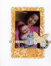
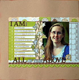
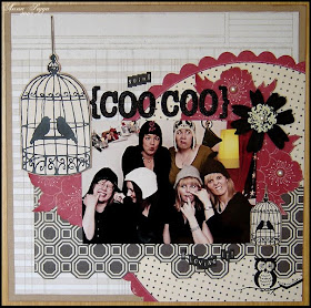
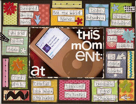
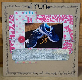
I took the liberty of grabbing a few of her layouts off of her blog to share with you. I am sure you will be inspired by her as I always am! I just love her use of white space and the way she uses circles on a lot of her layouts. I am always drawn right in and even though her layouts look fairly simple at first glance, there is always just the right amount of detail and interest to keep me captivated and wanting more!


Love ya Keisha! Thanks for sharing your talents with us this month! Be sure to check out the gallery to see her projects!! The big reveal is tonight!!

February 26, 2009

Reveal Night Giveaway!!!

To enter to win this stamp set, simply leave a comment on this post. The 29, yes, that's right, I said 29 winners will be announced after reveal on the 28th.

Also, if you are entering to win, it's a good idea to sign up to receive updates via your Google Reader or the Feed-burner to the right. We've had several unclaimed prizes and want to make sure you know you've won.

February 25, 2009

Scrappy Decor

I'm always so amazed by those who can so easily create cute things for their homes with scrapbook supplies. For me, scrapbooking is photos and layouts...honestly, most of the time it's torture for me to do even a mini-book. Sad, I know, but it's just totally outside my comfort zone. ;)
With the whole handmade Etsy craze though, I've been totally inspired to try to create more things for my home with the things I have here on hand in my scraproom. So many times I will see something on Etsy or in a cute little shop and think "Hmmmm, maybe I *could* make something like that."

Anyhow, I wanted to share something that I created for my HOF entry last year. The inspiration came from a t-shirt with a tree on it that I saw at the Fossil store. Instead of leaves, the tree had little buttons printed everywhere. I *knew* I had plenty of buttons, so I went home and made my own little button tree on canvas. It was super easy to do...I just used a sponge w/blue paint and a little water to paint the "sky" background, painted the tree trunk, added the buttons and used AC Thickers and rubons for "There's No Place Like Home". (except, yeah, I definitely forgot the apostrophe on the actual project...oops!)

So, try something different...you never know how it might turn out! This is actually hanging in the hallway between the boys' bedrooms and everyone who comes over comments on it and asks where I got it. Who knew??! If you've made something fun for your home recently, I would love to see it!

February 24, 2009

Inspired by the Internet

A sweet friend who is visiting Arizona right now emailed me last night and asked me where I go around here for inspiration. And you know what is funny, I didn't have a great list of places for her!! With a busy schedule and 4 little ones and my scrapbooking assignments and my photography business, I don't usually venture much further than my local Walmart and Target! :)

It got me thinking.... where do I go for inspiration??

And I realized that the biggest "place" I "go" for inspiration is the internet! I mean who needs to pack up the kids and go out when I can sit here in my p.j.'s and find more inspiration than I could ever ask for!

So, since I wasn't much help to my friend today, I thought I would try to make up for it by sharing my favorite inspiration websites with you today! (Note: I have too many faves to list in one post so let's call this round 1... and these are all in random order.)


I can always find a TON of inspiration here.... like these amazing works by rachael taylor.
LOVE all of her designs and the colors. Amazing!!


This gal is also amazingly talented and I am ALWAYS inspired when I stop by to check out her latest creations. The recycled books/albums she makes are to die for!! I fell in love with this one. Click on the link above to see the inside of the book. You will be in awe!!


Another favorite site with all sorts of inspiration. I loved this image they found at Homes & Gardens in their post about orange and turquoise.


And last but not least is Poppytalk Handmade. I don't even have an image to share because it was impossible to choose something. Everything about their site is pure eye candy... from their blog header, design and posts to their email newsletter they send out. You will just have to trust me and go check it out!


Well, that's it for this round. Happy surfing!

I would love to know what your favorite inspiration sites are so please leave a comment and share!! It's always fun to find a new site to bookmark!!

February 23, 2009

Fortune Cookie Gallery Spotlights

Happy Monday everyone! I hope your week is off to a fabulous start! I thought I'd start the week off highlighting some of my favorites from the Fortune Cookie Gallery. I don't always have as much time as I'd like to look and comment on all the amazing work in the gallery, but I do take a peek every now and then. Here are three of my faves from Fortune Cookie.

vtuppgirl's awesome "Change" layout...totally digging the simple design and the detail of those little pearls on the tree branch!

akaliz's most wonderful home decor project...LOOK at all those amazing details!!
erin b's fabulous "my silly love" layout...check our her stamping skills and don't you just adore the way she cut out the title?!

Here's to a great week...have a good one everybody! :)


Publish Post


February 22, 2009

January layout challenge winner!

LeslieD. said...

Here's mine. I loved the challenge and especially the long deadline!!
http://www.studiocalico.com/forums/galleries/show/7789


Thanks for playing along Leslie! Thank you to everyone who played along! Email your address to info@studiocalico.com for your Footnotes add-on.

I'll be continuing this challenge all year on my blog so I hope you'll try again next month!

:)

February 21, 2009

it's all about style.

so as we close a week of blogging that focuses on journaling, i thought i would highlight a few more members...and i decided to show some examples of my favorite kinds of journaling. (please click on the link for each layout to view up close and see the journaling...)

the first is lists.

now, i love to use numbers on my pages...and by making a list on a layout, it gives me an easy way to use up the ones that are always included in a set, lol. so here are a few examples...

Kristii made this beautiful layout about her husband...and by using a list format, it was easy peasy to do. the hard part?? picking only four things!

not only did Greta use a ton of pictures on this one, she was able to document her entire month of January 2009 by doing it 'list-style'...and she was able to enter Davinie's challenge at the same time!!
now, Fevvers here?? she is a girl after my own heart...she appears to love numbers and lists just as much (if not more!) than i do!! so many people are terrified of an all about me type layout, but by using the list format to help her along, this one came together perfectly.


ok...moving on to another favorite of mine: the 'In Depth' layout.
this style shoots straight from the heart. you put yourself and your feelings out there...without holding back. while you're writing it, you just may shed a tear or two. and that is perfectly fine...because to take that leap and put exactly how you feel down on paper can be very difficult. but the end result is something that means an awful lot to you...and also to the person you're journaling about.
now ScrapAlly here posted this to the SC gallery way back in September. but you know what?? it's been on my mind since i read it, all those months ago. that seems like a pretty good indicator of 'in depth' journaling...and when i decided to do this post, i knew this layout had to be featured.


Lulu tapped into some of her own feelings about her son growing up...a feeling most of us moms have shared at one point or another. i love that she journaled to her son here...not just about him. her layout is a reminder that we need to get those thoughts down while they're happening...even if they make us face our own fears/feelings.


if you've spent anytime at SC, surely you know that Samshands is always wowing everyone with her journaling. i remember her mentioning once that she felt it was a fault to always be so wordy when she journals...but to that i say, 'ROLL WITH IT SISTER'!!! if you can get your point across with 1 sentence, more power to you, lol. but if words are your thing, and you consistently make layouts like this one that touch someone browsing through the gallery, then type away.


ok...now moving on to a subject that i think is often forgotten about.
heritage journaling.
i love to make layouts with old pics. they remind me of how good life is when you're a child and how far your family may have come over the years. it really should be muy importante to all of us...i mean, how important is it to know who we are and where we've come from? the answer?? very!!
now, i honestly was trying not to feature anyone twice, but this one by Samshands makes me tear up every single time i read through it. maybe it's because it's just so genuine. or maybe it's because i find myself in the same boat as Laura...a daughter who lost her father before he got to know his grandchild. it may just be the great title...who knows?! but it is a perfect example of making a heritage page even though the topic is strictly about 'what ifs'.


anyone else remember this awesome layout from Kirsty's 'Iconic' gallery? here is a great 'heritage' page that simply features a favorite photo from years ago. it's striking without even needing journaling.

a few from my own gallery...
this one from last month shows one of my all-time fave pics of my Dad and i. is the journaling about how we always went to the county fair every August and rode the merry-go-round? nope. this photo of us, with his arm around me...protecting me, reminds me of just how safe i felt when he was nearby. an important thing to remember, and something i wanted to jot down.


my Mom and Dad on their wedding day...now, i wasn't there, lol...so i asked my Mom to tell me about that day. and what she told me is exactly what i wrote down for this layout...simple, but poignant. she didn't go into details about who came, what they received or what kind of cake they had. she simply remembers how very happy they were to be starting their life together...a sentiment that i thought was worth more than any other detail she could have shared.


if you have a sibling...how often have you journaled about him/her? i know i don't have very many projects about my younger brother, but i intend to rectify that in the future. he is way too important to me to not document all of the crazy times we've spent together while growing up...and this little mini book is just the tip of the iceberg. (plus, i had a blast looking at this old photo of me on my first prom night, lol)

so let's review.
  • list style journaling: makes journaling a snap, uses up numbers and looks fun, lol.
  • in depth journaling: allows you to pour your heart out...or maybe share something with someone that you would have a hard time saying face to face.
  • heritage journaling: perfect way to document your past...and the past of those close to you for future reference.

all very different styles, yet each one valuable.

Emily and i have had a blast encouraging everyone this week to start embracing their journaling...so i'll just leave you with a little quote that sums it all up.

For me, words are a form of action, capable of influencing change.
- Ingrid Bengis


February 20, 2009

Funny Stuff

This could be considered everyday journaling in some households, but I love to feature the funny stuff that my kids say in my pages. Writing that just now made me think maybe I should scrap some of the funny things that I've done, or things that make me laugh... Anyway, back to the topic. When I think of funny, there are a few scrappers here at SC that immediately come to mind. They just have the knack of telling a story that can make me laugh. So with further ado, here are some ways to do funny:

You can tell by her avatar that Karen (naturemomm) is one funny lady. Perusing her gallery confirmed it for me. When I asked her what her process was for capturing the funny, she responded with the following:

For me, my best pages come from real life moments that I take the time to jot down, like the coffee pot page. It was something I wanted to document, so I took the photo on purpose to create the page. Not that the sentimental, "my kids are so sweet and my dh is so thoughtful" thoughts aren't great to document also, but the everday, funny, things just seem to scrap themselves! The writing flows just as if I were retelling the story to a friend while chatting. And these kinds of pages never cease to get a chuckle whenever someone looks at the scrapbooks.


I think if you click on the picture, it will open a bigger version and you can read the journaling just fine that way.

Another gal that always manages to bring a smile to my face is Denise, although I still call her Nicoda... She's very in touch with her funny side and uses it for good. Here's what she said about adding humor to your pages:

I am journaling challenged. It is the one part of every layout that makes me struggle, but I do it. I do it, because of peer pressure and because I know at some point someone will want to know the story behind the photos or what I think/feel about them. Since most of my layouts are for my nephews and niece, I know my side of the story will be different from their mom and dad's. I want them to know they weren't always pain in the behinds despite what their mom and dad say. Well, I am kidding about that part a little. I journal, because I want them to know that they are loved and that l enjoy every moment with them - even when they chase me with toads.


I think those nephews and niece are pretty lucky kids. Head over to Denise's gallery, you'll find quite a few great examples of humorous pages. I was going to highlight this one, but when I saw "Selective Hearing" I changed my mind. How could I not love a lift of my work? :)


And I tried really hard not to double peg any one scrapper for this week's blogging, but I think a post on funny without mentioning Gillian (justg) would just be wrong. Especially after what happened to her today concerning Starbucks. I know we'll be seeing a layout based on her thread.

This layout cracks me up, not only because of the picture, but how Gillian did the journaling. Like Ally said, "I think when you look up the word funny on dictionary.com, it links you to anything that g does - layouts, blogging, she's so very funny."


And justem, well again I'm sorry to double peg, but Emily definitely has a way with the humor. Read this and see if you agree:


Last double peg Hera captured a great photo and the words that make you crack a smile:


I put out a call for others that thought they had some funny layouts, I was happy to get such a wide variety of links to funny. kathyb's gallery definitely made me smile a few times, but she wanted to highlight this layout about her son. I love how kids see things! You'll have to go check out her layout called "Work" as well. I had to smile when I read the journaling.

Journaling says:
Chocolate Tomato Sauce=brown sauce! As your mother I love watching you grow and learn, desperately trying to make sense of the world we live in. We had fish and chips for dinner in town. You were looking at all the different sauces, asking "what that?" I said brown sauce and you said, "No mommy, it's chocolate tomato sauce!"

saracicle's link got an actual laugh out of me. I love it when we can see the humor in an otherwise frustrating situation. Thanks for the smile Sarah!


LaBelleMichelle
's Ode to the LBD was a funny look at the numerous pictures she found of herself wearing the same dress. You have to admire the thrifty nature of college life!
You'll have to click on the link to see the entire album, but here's the cover page.


Sometimes all you need to crack up is the picture.

Anna Sigga pointed me to this layout as an example:


And Elisa linked me to this as another example:


And finally, even if you claim not to be funny in your journaling, you can add funny to your life in the form of cards. Loved this one by Ally(scrapally), who claims not to be funny.

Server Problems

Please bear with us as we work out a server issue. We upgraded our RAM since to ensure proper functioning of the site for Reveal, which has caused the site to be variant throughout the day. We should have the problem resolved shortly.

February 19, 2009

Adding Journaling To Your Design

I would apologize for the picture heavy post, I was only going to have four examples of how to use the journaling as a design element, but I kept finding more and more great ideas, so I am including them all, without apologies because I've got a lot of wonderful advice from SC members who know how to add journaling to the overall design. I asked some of the designers why they did what they did journaling-wise and I love the answers each of them gave. So without further ado, here's some of my favorite examples:

Starting off with justem, I can always tell one of her layouts in the gallery just from the thumbnail. Oh what I'd give for her fabulous consistency! For this page, she used strips to journal on, but she split them up into the separate little boxes, it's a fun look that allows her to get a lot of information on the page, but keeps it from looking like TOO much.

Here's what Em says about her process:
i have no insightful thoughts... ;) but i guess usually the hardest part of my layouts is the journaling. everything else comes much easier to me. so if i can find a way to use the journaling as part of the overall look of the layout, rather than just an afterthought, i do that. otherwise, it usually ends up like i have a finished layout and have to find a place to shove the journaling...

Next I have a page by julie k. It's a scraplift she did for just g's DT challenge. She pulled from Steph's amazing layout "Terrified," but totally made it her own. My favorite part was the journaling around the picture. That's a technique I use often, it's just nice a compact that way!


Another similar example, but taken in a totally different direction, is the layout by newer member missy. i didn't even notice her journaling the first time I looked at this, it's that much a part of the design. If you can't find it either, don't look for the typical straight lined journaling...

Here's how Melissa explains her approach:
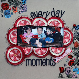
I am not a writer and I do not enjoy journaling, at all. I have been scrapping since before my oldest was born and he is almost 8 now. In those 8 plus years, I have learned that journaling is important. Photos tell a story, but sometimes not the entire story. Journaling could be just a date, names of the people, a story, a description that illustrates and enhances the photo(s) or whatever I need it to be. When I first started journaling, I would create my page and then just stick the journaling in a blank space on the page. Sometimes it would be on a journal block, but in those early days mostly it was just written right onto the base of the page without any thought to design. These days, when I create a page, I usually start with the photo, then think about my journaling and even write it down on scrap paper. While I am designing and creating my layout I am always thinking about how I want my journaling placed. Since, I don't always want what I write to take center stage; I have found that merging it with my design often works great. This also keeps journaling from looking like an eye sore. The most often way that I incorporate my journaling in my layouts is to make it look like a doodle that outlines an element that already exists on the page. You can see what I am talking about in my layout, Everyday Moments. I try to make my journaling part of the design elements to keep the design flowing and to give it a polished, finished look.
The journaling reads...
everyday moments are the best! Gigi, Harrison and Jackson hanging out on a Sunday afternoon, while Papa and I clean the house. February 15th, 2009


MandieLou
's layout highlights another way to do the journaling around something. I love that she included the journaling, then went around the layout, creating an outline design with her text as well.

And Mandie explains why she did what she did:
I don't know if I have a really good explanation for why I used it that way. The layout is about me running on the treadmill to try to lose weight. I just thought it would be fun to include some of my favorite running songs around the outside as kind of a snapshot of music I loved in 2008. Writing it around the outside let me include that info in a more interesting way than just listing it in the journaling under the photo.


This technique that Shanz used always makes me smile. Nicole talked a little about it in her post on titles, but I wanted to point out another example. Shannon interspersed different her handwriting with letter stickers to create both her journaling and her title. FUN, isn't it?

Shannon's answer for why she journals in this style made me laugh, I loved her honesty:
I wouldn't call myself an avid journaler. I generally use only a few sentences to get my point across. Sometimes the title comes first, sometimes the journaling, and sometimes the journaling is the title! :) I just have the need to create and include my observations!


And finally, there's Lisa (bluestardesign). I'm a little biased since I get to scrap with her every once in a while, but I think she really has this design thing down. She's got a lot of examples in her gallery of adding journaling strips, which can become an element of design on their own, but this particular layout caught my eye because it's not the typical journaling box. And therefore, it adds a bit of design in my opinion.

Lisa tells it this way:
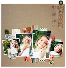
On most of my pages, I wait and add the journaling last, just fitting it into the space that remains. Which is why you'll see a lot of journal strips on my pages - they can be adapted to fit just about anywhere. Of course, they don't always work ;) On the "Poser" page, I really tried to make journal strips fit somewhere amongst the photos, but they just didn't look right. So I opted to do a skinny column of journaling in the upper right instead. It gets the journaling on there and also adds a graphic element.


If you've made it all the way to the end of this post, I commend you! And now I challenge you to try a layout and make your journaling a part of your design in one of these clever ways. Have fun with it. When I use this journaling technique, I always end up loving the look. It's harder than writing a few lines when you are done, but it's worth it.

Go Green Challenge Winner!!

The random winner was Rachelleann!!!

Congrats! Send me an email with your address to joy (at) madisons (dot) com

February 18, 2009

any way you like it.

journaling.
don't be afraid of it.
for so many people, the thought of putting their thoughts on paper terrifies them.
REALLY terrifies them.

maybe it's because i'm a sentimental, sensitive fool who talks alot, lol...but for me, journaling is not only usually the easiest part of a project for me, but more often than not, it's the whole reason for starting one.

and i think that maybe people put too much pressure on themselves about getting it 'just right'.

but my motto has always been...'if you write it down as if you were speaking it out loud, you can't go wrong and it will sound like 'you' every single time'.

i promise.

and that doesn't necessarily mean that it has to be the same way every time either.

a few examples...

this layout about my husband and i takes on the 'what if?' format of journaling. i mean honestly, we've all wondered what may/could have been about a situation at one time or another...so if you find yourself thinking that way, jot it down. this one is an example of what, to me, is probably one of THE most important things to journal about...the not-so-full-of-sunshine situations. i'll be the first to admit that i struggle with different things everyday, and if you don't journal about the rough stuff, how honest are you being with yourself? added bonus: it can be therapeutic, lol.
ahhh...one of the easiest ways ever to journal: random thoughts running rampant, lol. think of this as one of those 'say the first thing that comes to your mind' kind of games...choose your topic and just start writing.


this one kind of ties a few theories into one...a story, random thoughts, a memory and a therapeutic element all rolled into one. nobody said you have to stick with just one format, right?!


if you know me at all, you know that i LOVE to scrap older pictures. my daughter is almost 10, yet this picture is from when she was only 3. and after her telling us this past Christmas that she no longer believes in Santa, i found this photo and it honestly made me cry. every mom has been there...it's a huge deal when that happens, right? but rather than use a current picture of her to talk about this exchange between us, i thought this one spoke volumes about the issue. sometimes some of your best journaling may have NOTHING to do with the picture you use...so don't restrict yourself when it comes to that.


quotes? words of wisdom? phrases, sayings and nuances? i know i want to remember them...and to ensure that i do, i have a million scraps of paper laying on my desk of tidbits my family has said over the years. maybe it was something that made me laugh...or cry...or something that just made me beam with pride. whatever it is, if i ever get stuck, a prompt is just across the desk if i pick one of them up.


this one is an example of your title being part of the journaling like i mentioned yesterday.


i think if you ask 100 scrappers to do a page about themselves, probably 98 of them would panic. the other 2 just might think to document a quality about themselves that is characteristic without being too revealing...pretty sneaky, eh?!


so there you have it...a few examples to hopefully get you started. there are lots of online sites to get you out of your journaling rut if you need it as well...Journaler's Junction and the Design Experiment are two off the top of my head.
remember...if you get stuck, sit down and talk out loud to yourself. seriously. nobody will know any different, and if you take a few notes while you're doing so, you're sure to end up with some words that are guaranteed to get your story across.
which is what it's all about, isn't it?


February 17, 2009

(en)titled.

i know that one of the roadblocks that i hear people talk about quite often is the task of assigning a title to their projects. now, while i have no definite resolution to this problem, i have noticed a few layouts from our Member's Gallery that incorporate some of my own tricks...so i wanted to highlight them.

this page from Waleska shows the easiest title ever...and often the most effective. let your words serve not only as your title, but as your journaling. sometimes this trick works just perfectly...as this layout shows.being creative with your titles doesn't necessarily mean only the words you choose, but it often has to do with how you use those words. Linda Sobolewski 'framed' her journaling with her title...and draws you into this layout by doing so.
another clever and easy peasy way to come up with a title...let an embellishment to the talking for you!! Denise (Nichoda) used a pre-printed tag from a kit to spur this page along...and it was also a great jump start for her journaling.


giniew used another favorite trick of mine...she highlighted a single word in a product that she was using to enhance her title. then she cut the paper out just right so that it was prominent on the cover of her mini album.


now, sometimes a BIG BOLD title is just what you need...as shown here by gluestickgirl (Lisa T.). her title not only draws your eye immediately, but it stresses the fun of this page.


Kimberly saw the potential of one of her Studio Calico stamps as a title all by itself...


luna 0720 chose to use an embellishment as the prominent part of her title...another trick to use if you're ever stuck!


i'll often also read back through my journaling and pick out a word or two that kind of sums up my feelings and use that as my title...sometimes plopping the title right in the midst of your journaling can really get the point across.
bottom line?
all of your projects have a story.
but it's often your title that supports that story.
so don't sweat it...and before you know it, your titles will be jumping right off of your pages.
:)