Starting off with justem, I can always tell one of her layouts in the gallery just from the thumbnail. Oh what I'd give for her fabulous consistency! For this page, she used strips to journal on, but she split them up into the separate little boxes, it's a fun look that allows her to get a lot of information on the page, but keeps it from looking like TOO much.
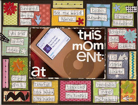
Here's what Em says about her process:
i have no insightful thoughts... ;) but i guess usually the hardest part of my layouts is the journaling. everything else comes much easier to me. so if i can find a way to use the journaling as part of the overall look of the layout, rather than just an afterthought, i do that. otherwise, it usually ends up like i have a finished layout and have to find a place to shove the journaling...
Next I have a page by julie k. It's a scraplift she did for just g's DT challenge. She pulled from Steph's amazing layout "Terrified," but totally made it her own. My favorite part was the journaling around the picture. That's a technique I use often, it's just nice a compact that way!
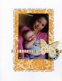
Another similar example, but taken in a totally different direction, is the layout by newer member missy. i didn't even notice her journaling the first time I looked at this, it's that much a part of the design. If you can't find it either, don't look for the typical straight lined journaling...
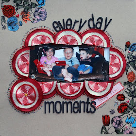
Here's how Melissa explains her approach:
I am not a writer and I do not enjoy journaling, at all. I have been scrapping since before my oldest was born and he is almost 8 now. In those 8 plus years, I have learned that journaling is important. Photos tell a story, but sometimes not the entire story. Journaling could be just a date, names of the people, a story, a description that illustrates and enhances the photo(s) or whatever I need it to be. When I first started journaling, I would create my page and then just stick the journaling in a blank space on the page. Sometimes it would be on a journal block, but in those early days mostly it was just written right onto the base of the page without any thought to design. These days, when I create a page, I usually start with the photo, then think about my journaling and even write it down on scrap paper. While I am designing and creating my layout I am always thinking about how I want my journaling placed. Since, I don't always want what I write to take center stage; I have found that merging it with my design often works great. This also keeps journaling from looking like an eye sore. The most often way that I incorporate my journaling in my layouts is to make it look like a doodle that outlines an element that already exists on the page. You can see what I am talking about in my layout, Everyday Moments. I try to make my journaling part of the design elements to keep the design flowing and to give it a polished, finished look.
The journaling reads...
everyday moments are the best! Gigi, Harrison and Jackson hanging out on a Sunday afternoon, while Papa and I clean the house. February 15th, 2009
MandieLou's layout highlights another way to do the journaling around something. I love that she included the journaling, then went around the layout, creating an outline design with her text as well.
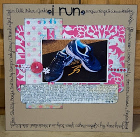
And Mandie explains why she did what she did:
I don't know if I have a really good explanation for why I used it that way. The layout is about me running on the treadmill to try to lose weight. I just thought it would be fun to include some of my favorite running songs around the outside as kind of a snapshot of music I loved in 2008. Writing it around the outside let me include that info in a more interesting way than just listing it in the journaling under the photo.
This technique that Shanz used always makes me smile. Nicole talked a little about it in her post on titles, but I wanted to point out another example. Shannon interspersed different her handwriting with letter stickers to create both her journaling and her title. FUN, isn't it?
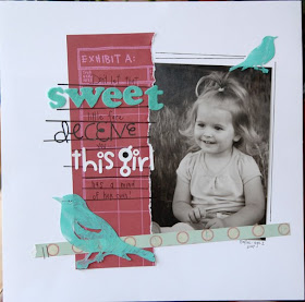
Shannon's answer for why she journals in this style made me laugh, I loved her honesty:
I wouldn't call myself an avid journaler. I generally use only a few sentences to get my point across. Sometimes the title comes first, sometimes the journaling, and sometimes the journaling is the title! :) I just have the need to create and include my observations!
And finally, there's Lisa (bluestardesign). I'm a little biased since I get to scrap with her every once in a while, but I think she really has this design thing down. She's got a lot of examples in her gallery of adding journaling strips, which can become an element of design on their own, but this particular layout caught my eye because it's not the typical journaling box. And therefore, it adds a bit of design in my opinion.
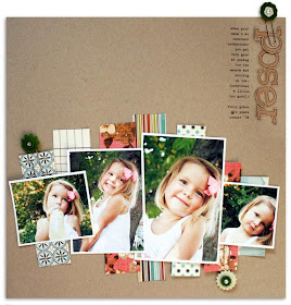
Lisa tells it this way:
On most of my pages, I wait and add the journaling last, just fitting it into the space that remains. Which is why you'll see a lot of journal strips on my pages - they can be adapted to fit just about anywhere. Of course, they don't always work ;) On the "Poser" page, I really tried to make journal strips fit somewhere amongst the photos, but they just didn't look right. So I opted to do a skinny column of journaling in the upper right instead. It gets the journaling on there and also adds a graphic element.
If you've made it all the way to the end of this post, I commend you! And now I challenge you to try a layout and make your journaling a part of your design in one of these clever ways. Have fun with it. When I use this journaling technique, I always end up loving the look. It's harder than writing a few lines when you are done, but it's worth it.

wow, i love these LOs that you've featured! seriously awesome stuff here!
ReplyDeleteI just love all the amazing inspiration - here is my take
ReplyDeletehttp://www.studiocalico.com/forums/galleries/show/7809
Thanks for the grat examples!!! I'm going to try the skinny column journal, really loved it!
ReplyDeletewow so many new journaling techniques to try with awesome samples. Thanks for the inspiration Emily. - hera
ReplyDeleteWonderful layouts.
ReplyDelete