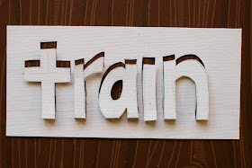
When I saw the cover image for the book Paper : Tear Fold Rip Crease Cut, I was captivated. I'd seen other paper art using images cut out of a sheet of paper like this and had been toying with how to apply it to a layout, and this was my answer. I set out to use the idea of a title cut out of the paper but still attached.

At first, I wanted to do the title directly out of the background paper, but as I experimented with it, I had trouble getting it lined up exactly how I wanted it. After playing a bit, I decided to cut the title from a block of patterned paper, and then back it with a contrasting color. Having the letters standing at a 90 degree angle from the background was completely impractical, so I settled on folding the letters back over towards the page and attaching them with popdots. Here's some photos from a few different angles so you can get a better idea of the finished product :


And now, here's how you do it. =)

Start by drawing a baseline on my piece of paper, and then handwrite your title with plenty of room between the letters. You'll want to draw lightly - I've done it darker so that it shows well in the photos.

The next step is to make your letters into bubble letters. Channel your junior high self. ;) All that doodling in class wasn't for nothing!!

Take your craft knife (I used the Fiskars fingertip craft knife, but I'm linking you to the MS one in the store - I've heard good things about it as well!) and cut out your letters. DO NOT cut the letters where the meet the baseline - you need to leave that attached. Go slow - you've only got one shot at this. =) Once you've cut them out, carefully fold the letters towards you.

Draw a second baseline, 1/4in below the original. Extend each of your letters down to that baseline.

Carefully cut down to the second baseline and fold the letters up.

Now you'll need to erase all of the pencil lines - the baselines and outlines of the letters. Fold the letters back along the first crease that you made, and then add foam adhesive to each letter to help hold them in place. You can add a contrasting color behind it, for a dramatic look, or layer it over paper that's the same color for a more subtle effect.
If you give this technique a try, please link me up - I'd love to see what you do!!

Thank you! Your blog post will be advertised on the DigiFree Tutorials search engine today (look for timestamp: 07 Nov [LA 04:00pm, NY 07:00pm] - 08 Nov [UK 12:00am, OZ 11:00am] ).
ReplyDeleteoh my word, lisa! that title is incredible! wow!
ReplyDeleteoh my word, lisa! that title is incredible! wow!
ReplyDeleteThis is one of my very favorite layouts of yours!! Thanks for the tutorial!!
ReplyDeleteGenius I tell ya!!! Love it.
ReplyDeleteI saw the shapes cut out like this in Anthro ... loved the look but never crossed my mind to do this in a layout! Truly awesome!
ReplyDeleteVery cool! Thanks for sharing!
ReplyDeleteI LOVE THIS!! I am totally going to work this into a layout as soon as humanly possible. What a fabulous idea!!
ReplyDeleteSUPER COOL! Gotta try this!
ReplyDeletetotally cool girlie! thanks for sharing your technique.
ReplyDeleteI love the idea! Can't wait to try it out myself. Thanks for sharing!
ReplyDeleteLisa, this looks amazing. I'll definitely be giving this technique a try. :) Thanks!
ReplyDeleteg
NICE!! i want to try this! what a fab tutorial, and a great way to use what's already there, instead of going the obvious route. THANKS!
ReplyDelete