I have had several comments about one of my layouts for the Studio Calico gallery this month using the Joyland kit, so I thought I'd do a quick tutorial on how to create interest to your pages without spending extra money.
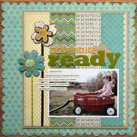
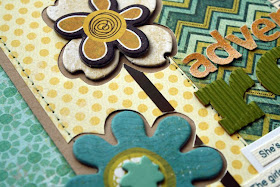
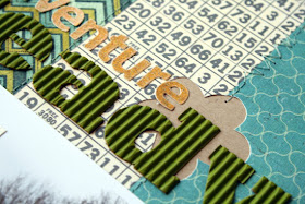 When creating this layout, I thought it was starting to look too simple, so wanted to come up with something to add detail and extra texture to my design. Because of the way I had layered my strips over kraft, and then the kraft was layered over the Crate paper scallop, I thought it would be fun to do something that revealed more of the kraft cardstock that was framing the layout.
To share this simple technique, I wanted to recreate it making a card.
To make this card, trim your card base. In this case I trimmed a 4 x 5.25" card. So, trim your cardstock at 8 inches wide by 5.25 inches tall, and fold it in half.
The blue piece was trimmed at 3.5 x 5 inches tall.
On my layout example I traced the chipboard shape I wanted to use in my design, but for this card I decided to try something a little different.
I chose a floral shaped chipboard shape and traced it on the blue paper, making sure the traced image was larger than a second chipboard image that I intended to incorporate into the design.
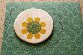
I then trimmed outside the pencil line. You do this to make sure there is a space between your shape and the patterned paper. You also won't have to worry about pencil lines if you trim that shape outside the marked area.
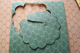 I just stabbed a hole in the center of the flower with my scissors and trimmed.
This leaves a fun floral negative on my blue patterned paper:
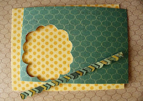
To dress up my card further, I trimmed a thin strip approximately 1/4-1/2 wide with a scallop on one side.
I layered this thin strip on the left side of my card base, and placed the blue pattern to the right.
Layer the chipboard piece you wish to use right in the center of the negative floral image. I dressed mine up with some bling. I then added part of a Jillibean Soup border sticker for a flower stem, stitched around the perimeter, and added some alphas for the sentiment.


Adorable! I'm totally diggin' the negative looks lately!
ReplyDeleteYou're a genius Davinie!!
ReplyDeleteI love this!! I really does add alot of interest!! I will have to remember to try this!!
ReplyDeleteVery cute!
ReplyDeleteWhat a great idea! I have some of that very same paper for the Design Team I am on and now I hope I will remember this little tidbit while I am doing it!!!
ReplyDeleteThis is a great idea!
ReplyDeleteFabulous idea! LOVE this gorgeous layout.
ReplyDelete