Emily picked out two further layouts from the entries to share with you all and here is what the girls had to say:
Stephenie Wheeler:

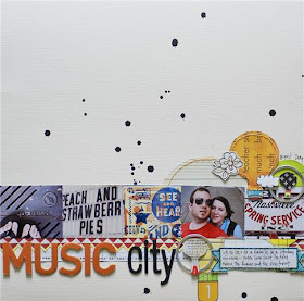
My thoughts: I will be honest, I'm not much of a challenge scrapbooker - I generally find that I am more a fly-by-the-seat-of-my-pants girl when it comes to getting crafty. I don't use sketches, I rarely scraplift, and I pretty much never plan anything before I sit down to work. So when Emily asked me to make a layout for this challenge, I will admit I was more than a little bit nervous.
I was told that I could use 5 products, a few of which I hardly ever use. I'm not really comfortable with paint quite yet, although I'm starting to use it more in my scrapbooking. I have a HUGE collection of embroidery floss, but I usually use it to embroider fabric - not paper. So I decided that this challenge would be a good chance to go in a different direction than I usually do. But before beginning my layout, I was pretty sure I wanted a few things - to use my pictures from our trip to Nashville from the previous weekend and to use some stuff from my overflowing Studio Calico kit collection.
The process: I am a typical one-page, one-photo scrapper. Every once in a while I'll use more than one picture, but because I love white space so much, I try to keep each picture small but still large enough to be important. I really wanted to include a few pictures from our trip to Nashville, so I picked five pictures that stood out, had a similar color scheme, and really caught the feeling of walking through downtown Nashville and taking random pictures. I wanted the pictures to be in a straight line, but I didn't want the pictures to be too flat, so I roughed up the edges to make them stand up a bit.
I tend to really like to use plain cardstock for my backgrounds, because I like to accentuate with patterned paper rather than using multiple patterns that fight, and while I really love the subdued look of mists, I had to use paint, so I thought I'd do some dripping, just to give a bit of pattern to the cream cardstock. I knew I wanted to use the cute Sassafras paper from this month's SC kit, but the whole sheet was much too bold for my taste, so I cut it up, using the balloons (with stitching!) as my main "embellishment." The flag cut-off border was a perfect page divider, the music notes were a nice touch since the page was about "Music City" and the stitched banner was the perfect spot for a little bit of journaling. I chose Thickers as my alphabet option, because, c'mon, who can resist? Finally, I used some empty tag frames for my metal, because I wanted to add some circles, and they were pretty much the perfect size.
Challenge afterthoughts: I am honestly, REALLY happy and surprised at how my page turned out. I was mainly afraid that only using 5 products would box me in, but turns out, it was easier than I thought to use just a few products and be really creative. Who knows? Maybe I'll be doing more challenges in the future ;)
Kristin Faust:

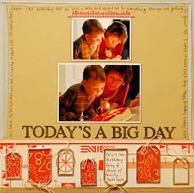
My thoughts: When I was asked to participate in this challenge I immediately said yes! However when I actually sat down to scrap, I realized that I next to never use paint or make a LO without buttons. I honestly wondered for a few minutes what I had gotten myself into! But once I decided on my products things started to move right along.
The Process: I knew I wanted to incorporate these Making Memories Metal Rims on my LO. When I realized that they looked a little like gifts I decided to pick these photos. I have a craft glue that dries quickly and clear that I used to adhere them. To make my, "gift boxes" I cut my pattern paper to fit the tag but instead of making them into tags, I adhered my paper first and then added the tag over the paper. It adds some neat dimension without adding a ton of bulk.
To make bows I first stitched around the rim and then threaded my string through my stitch. See Photo. My LO is bottom heavy so I added my paint and journaling around the top edge to add some balance. The stitched frame was an easy and fun accent that just added a nice finishing touch.
Challenge afterthoughts: I love these photos of my son and mom. I don't have a ton of photos of them together and I love how she is coaching him through blowing out his candles. She's always right there to lend a hand!
Emily asked if I might share mine and after blushing for a few moments I thought "why not?"
My Thoughts: 5 products? oh yes, bring it on. Limit me, threaten me, choke me.... I'm going to do this baby
The process: Paints, espesh the Adirondak dabbers are my absolute staple favorite product. So that was a steal to do; I slapped it on as the base to create a bold focus. It matched perfectly with the Studio Calico paper and so I layered a smidgeon of that on top. Black and white photos don't detract the focus of your colour scheme and this photo of my friend Dyan, that I took earlier this year, was begging to be scrapped. Next came the metally bit. Panic stations! Metal? I ransacked my jars of odds and ends and selected these book labels to add my title. I was so surprised how quickly it came together. Having alphas in the challenge helped and my red ones (my favourite ever scenic route alphas) created that crimson impact that I was craving. And finally, that stitched heart (swoon). I totally scored that idea from a Creating Keepsakes Magazine (Feb 2009) which I feel drew the whole layout together.
Challenge afterthoughts: In about 20 minutes flat I had a layout I was completely smitten with and I do feel it was down to limiting my supplies. And so my new layout creative formula goes like this:
crazy 5 product challenge+twenty minutes =best ways to use the minimum products for maximum effect ............ (ha! - Einstein, go and suck on your e=mc2)
Thanks, Emily :)
You can read the thread relating to the challenge and links to individual galleries here

thank you so much for finishing up the challenge this week kirsty! and thanks for sharing your work as well. i'm really so impressed at the talented designers who took the same five products and made completely different layouts! it's been fun to see them all :)
ReplyDeleteOh, I love the DYAN layout. Wonderful.
ReplyDeleteThese look AMAZING, Ladies! Holy cow, I'm inspired! Just wow! :D
ReplyDelete