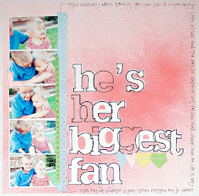
I am a bit reluctant to share my layout for this week's challenge. Like I said earlier, this was a tough one for me. I really LOVE my patterned papers with a big capital L and O and V and E.... and I also love adding a few (or more) little pieces of "this and that"... whether it is brads, rhinestones, metal embellishments, trinkets, gadgets, whatever.... I just always seem to add a few of those types of things as my finishing touches and my layouts don't seem complete without them. I guess it is like the accessories to an outfit for me... kind of like how I feel not completely ready without earrings.
But alas, I did refrain and I resisted the very strong urge I had to "finish" my page by adding a few little "things." So, here it is... my layout that uses nothing but cardstock and photos. I altered the cardstock with mist and a marker and also used some punches. I used the negative part of a set of cardstock letters to trace the title. Then I put the positive pieces for the letters on top of most of it before I sprayed the mist. This kept some of the letters white and then let the others (that weren't covered) get sprayed with the mist. (hope that makes sense! :) )


I added the punched hearts and stitched them in place, a couple of strips of paper and the photo corner.... then I did my journaling and I was done. I have to say that I like how quickly it came together and I do like that the focus is on the photos and the story ........................................................................................................................................................................................
However, I can't promise that a few little things like buttons or brads or what-have-you's won't somehow sneak their way onto the page before it finds its way into an album. Shhhh... don't tell anyone ok? Cause then I would be in trouble for cheating!

there's nothing to be ashamed of with this LO! it's absolutely gorgeous. love your misting
ReplyDeleteI like it just the way it is. very clever idea for the letters; I'll have to try that.
ReplyDeleteI also find it hard to leave well enough alone! But this LO is truly beautiful as is. It's been a long while since I've seen something original that makes me sit up and say "WOW!" Just love that misting technique with the chipboard. I'm definitely trying this.
ReplyDelete- Kathy
love it just the way it is :)
ReplyDeletelove how simple it is.....very creative
ReplyDeleteI, more often than not, keep adding and adding till i create a monster
I love the idea of the misting technique for the title. I was wondering how you did it. Like to try it 1 time. I won't tell if you add something ;)
ReplyDelete