Hi again!
How are your challenge layouts coming? I admit that mine isn't quite done yet but I will be back tomorrow to share it! Most likely it will be later in the day or even tomorrow night! (just a heads up.... and also to give you a little more time to get yours done in case you are running behind as well!)
Today I want to share a tutorial with you on using paint and mist (two of my favorite mediums) to create a custom journaling spot on a layout.
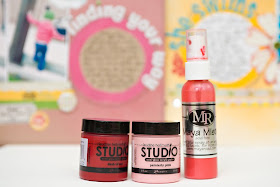
I used this technique and process on my "She Swims" layout from the September Kit gallery. It was pretty easy to do but it made a big impact and I have had a lot of people ask questions about how it all came together.
I decided to create another layout with the same technique and basically the same layout. When you come up with something that works I say don't be afraid to recreate it and follow the same basic guide on other layouts as well. And as you can see by my finished layout, just by changing up the colors and embellishments, you can get another layout that is unique in its own ways (even though it is basically a lift of the first one).
1. Cut a circle out of some scrap cardstock and set up the basic layout of your page. I always print my photos and then I decide how I want my page to flow so that I know where I want to place the mask before I start misting. Again I wanted to follow the same basic idea as the original layout so I set my page up like this.
The cardstock circle will be the mask. After you set up the page go ahead and remove the photos before misting. I always place my page in a cardboard box like this so the mist doesn't get all over the table or floor.
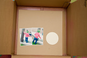
2. Hold the circle in place with your finger and spray pink mist over it. I used the bubblegum pink color this time and I sprayed it quite heavily. I use light spritzes and continue to add more and more until I like the color and saturation.
4. Choose your paint color. I didn't have the exact color of pink that I wanted so I mixed some red and pink together to get the tone I was after. I used Claudine Hellmuth's Studio paint in painterly pink and dash of red.
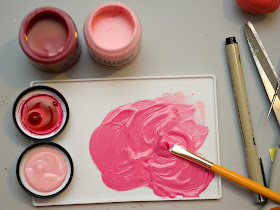
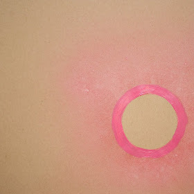
5. Use a smaller paintbrush to paint a circle around the edge of the circle on your page. I paint a few coats to make sure it is nice and dark and so that you can see a difference between the paint and the mist. You also want to make sure that you paint on the outside of the misted circle (not on the inside) or you will make your space for journaling quite a bit smaller. You can see here that I painted right over the mist.
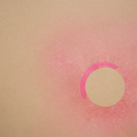
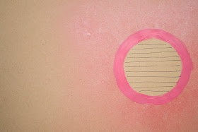
6. Use a black fine tip marker (or any color that you prefer) to draw your journaling lines inside of the circle. You can space your lines as close or as far apart as you like, depending on how much you have to say. I just freehand draw the lines but if you are particular you can use a ruler as well. Personally I like the hand drawn feel I get when it isn't quite perfect.
7. Add your photos, title, embellishments, journaling etc to complete the layout!
Again, you can see that I copied a lot of the ideas from my original layout - the placement of the title around the circle, the strips of paper underneath the photos, etc. - but it still feels like a layout of its own because of the different colors, different photos and different story that it tells. You can also see that I flip-flopped the whole design and placed the journaling circle and photos on opposite sides.
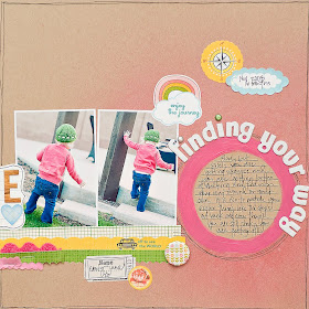
You can use this same technique with other shapes and also different sizes depending on how much journaling you have. You could use a square, a label shape, a heart, etc... anything goes!
Happy misting and painting!! Maggie


i love it thank you for the tutorial!!!
ReplyDeleteI absolutely love that technique and will be trying it soon.
ReplyDeleteThank you! Your blog post will be advertised on the DigiFree Tutorials search engine today (look for timestamp: 20 Nov [LA 04:38pm, NY 07:38pm] - 21 Nov [UK 12:38am, OZ 11:38am] ).
ReplyDeleteTerrific. I love this idea/technique.
ReplyDeletelove this maggie - i'm going to have to try it soon!
ReplyDeleteWhat a cool technique! Thanks for sharing.
ReplyDeleteLOVE this tutorial!! TFS!
ReplyDeleteBrilliant--can't wait to try it!!
ReplyDeleteCute layout! And great technique!
ReplyDeleteWow - thanks for that! I was a bit intimidated to try this, but i'll certainly try now.
ReplyDeleteWhat sweet, sweet layouts!
Great tutorial & a beautiful LO :)
ReplyDeleteBoth layouts are adorable! Can't wait to try this. :)
ReplyDeleteThanks for the tutorial!!
ReplyDeleteI love this tip! Thanks!
ReplyDelete