Gooooood Morning, chickadees!
That's right, it's time for a challenge!
Tina and I are hosting the blog this week and we decided to ask you to scrap with holiday supplies...but to make a layout that is NOT holiday related. any themed holiday products will work, no matter what holiday. Any project will do. Layouts, cards, you name it.
the three layouts below use Christmas products in a non-Christmasy way.
the polka dot patterned paper and tape are both from the making memories "mistletoe" line.
flowers and chipboard alpha are from holiday lines...making memories mistletoe and basicgrey eskimo kisses.
red patterned paper from basicgrey eskimo kisses line and chipboard holly from cosmo cricket.
I'll be playing along with you! The winner will receive a five dollar SC gift certificate.
Layouts are due midnight EST on Saturday...post them in the gallery and link them here or on the thread i start on the message board.
Happy Creating!!
xoxo
s
November 30, 2009
November 29, 2009
Orchestra DT Gallery...caution, these will make you want to scrap.
Hi all!! After a whirlwind shoping weekend, I am just now getting to sit down and wander through the newest Design Team gallery...and I have to say, seeing these makes me want to run over to my desk and play!! Here are the layouts that caught my eye...
Our guest this month, Karla Dudley, blew me away with this one. The contrast of that black paper against the soft colors in the rest of the layout just wowed me...and I love how she used just a wee bit of that die cut paper. Ok, any time that someone uses the entire alphabet on a page, I'm pretty much sold. But then April went and SEWED each of those letters AND added the awesome border of pins at the top...done deal, my friend. YES!
Davinie's project speaks volumes to me. After hearing a bit about how these photos came about, I am inclined to do the same...and I love that she made something she can leave out year-round.
Emily...you know I'm a sucker for some paint splatters...this is GORGEOUS!! AND you filled in the stamped title with paint??!! You rock.
Joy was able to capture her feelings about her holiday visit to Mt. Vernon, even though they wouldn't allow photos to be taken...love that. I love when people find ways to convey their thoughts without necessarily using a photo specific to that event.
Jenn...your poor boy, lol (although secretly, I'll bet he loves having two older sisters that smooch on him). The fact that you worked all of those papers into a cool border at the top blew me away.
I love Kelly's mix of photo sizes here...and how a few of the elements are askew. great use of that glitter frame as well to house the journaling.
I am a sucker for grey...love it. So this layout from Lisa's gallery jumped right out at me, AND the sewing is amazing (as usual!). The mixed typed/handwritten journaling is way cool as well.
Cool misting? Check. Just the right amount of tidbits? Check. Darling picture? Check. Maggie, this one is an all-time fave of mine!!
I always love how Nicole S. uses products to make unique looking elements on her pages. The repeated circles and tilted banners somehow imply motion, which is just too cool.
The layout of the week is brought to you by Betsy Sammarco (pharmgirl).
Each week, the layout in the gallery is linked, so you can add it to your favorites easily.
This layout has been added to your favorites more than any other layout in the SC community gallery for the week of 11/22-28.
Congratulations Betsy! Because of this you have won a $10 gift card to be used on any new purchase at Studio Calico.
Want a chance to win next week? Be sure to upload your projects to the SC gallery, and support your community by adding special projects that catch your eye into your favorites! It could be YOU next week!
Please note, winners are not allowed to win more than once in a four-week period.
Winners are not limited to those using Studio Calico kits.
November 28, 2009
Reveal Night Winner!
And the winner of the Photo Calendar by Tina Aszmus is........
Please send an email to info@studiocalico.com to claim your prize.
paint + stamps challenge winner!
Thanks to all of you who participated in our paint + stamps challenge this week! I love how versatile these supplies are, and you all put your own twist on it. I put all the names in a hat and drew the winner - *drumroll please*
HANNA!! - please email info@studiocalico.com and they'll hook you up with your prize code. =)
Nik managed to sneak some time after her Black Friday shopping to make this gorgeous canvas. Isn't it beautiful? I absolutely adore the color scheme, and the little stamped couple. Nik painted her background and the big heart, and edged some of her other elements in paint.
The boy and girl are framed by the label stamp from the April kit - one of my fave SC stamps because it's so versatile.
I love the label sticker tucked in amongst the vintage papers, and the baker's twine tied around the key is a nice touch.
My project is quite a bit simpler - a friend of mine inspired me by making some gorgeous Christmas tags last week, and I'm suddenly obsessed with making my own. For these, I pulled out some scraps from my December kit, as well as the Cosmo Cricket chipboard from the Strings add-on. There are so many elements on the sheet and I knew I'd never use them all on pages, but they are perfect for quick tags! I sprayed each tag with turquoise mist, then added a typed sentiment, a variety of stamps stamped with Broken China distress ink. I finished them with some other bits of paper and embellishments and stitching, and edged each tag in aqua paint.
Even though the challenge is over, I hope we see more paint + stamps on layouts in the gallery. It's a wonderful way to add something extra to almost any project. Check out the stamps in the shop - you might find one that you *need* to have shipped with your December kit. ;)
November 26, 2009
Baker's Twine Tutorial
This post has been rolling around in my brain for 6 months now. I wanted to do a tutorial, but couldn't think of anything to do. Someone suggested Baker's Twine as a tutorial topic, but I was like, baker's twine, what can you actually tutorialize with baker's twine. But then I thought about my lists I make...I thought maybe I could come up with 50 uses of baker's twine. My brain pooped out after 13 scrapbooking related uses, but I hope this list inspires you!!
1. Let's start with the most basic. Wrap the twine around a piece of paper or a card. With this card it holds on a tag, but I've also just done it for fun :)
2. If you look at the bottom of that bow there is a "bead" (its actually two red 1/2 pearls stuck together) Use the twine to let something hang free off your project. A bead, a tiny bell, a tag?
3. Use the twine as photo corners on a layout or a card. I sewed these in, but you could just wrap the corner too.
4. Hang a little banner off of baker's twine and hang it from a card or layout! I left mine free hanging, but you could glue your pieces down too!
5. Sew with twine! I used a scrap as a mask to make the outline of this frame.
6. Use twine in the holes of a button!
7. Tie a bow with baker's twine around something. Here I used it to "hang" these mittens!
8. Make a twine frame around a photo. Here I stapled the corners with a loop for a decorative look! Thanks to Glue for this idea!
9. Make a Baker's Twine flower. Put two fingers together and wrap around about 10 times. Tie middle of the loops you made with another piece of string. Put a brad in the middle (this isn't easy...just work it through carefully)
10. Write with the twine. I love this idea that I first saw from Lisa Dickenson's "eleven" layout. I wrote lightly in pencil. I used a glue pen and glued one letter at a time! It seems to be holding well.
11. Wrap a chipboard letter with twine. This is an interesting look for a title, or just a monogram card!
12. Here's another way to frame your photo with Baker's Twine. I wrapped the twine around brads at the corner of the photo and tied on the side.
13. I've always loved the idea of things having two lives and being able to remove elements from layouts. By using the twine to hold down this tag, it makes a cute card. After you send it your friend can use the tag as a bookmark!! Genius, eh? You could use this technique to hold down a pretty gift card too!
Hope this "tutorial" inspires you to use up your Baker's Twine, or to start a new obsession :) Although I only used the red & white in this tutorial, I own like 7 colors of the stuff, its totally addictive. Check out the Studio Calico shop for all the colors we sell!!
November 25, 2009
Reveal Night Giveaway
Want to win this fabulous calendar by our very own Tina Aszmus?
Simply leave a comment on this post telling us what you're thankful for this year.
These are some of Tina's favorite photos, taken up in the wonderful state of Alaska. What I love about this calendar is that it's the gift that keeps on giving all year long (Thank you Clark Griswald). Seriously though, once you're done with the calendar, trim it off and put her amazing photographs in a frame. They're high-quality and priced just right to give as a gift this holiday season (hint hint) but there's a limited number, so I wouldn't hesitate if you like it.
member inspiration : home front
Since it's a holiday week, Nik and I are altering the usual blog schedule a bit - I'm bringing you member inspiration today, rather than on Friday. So take a break from your turkey day prep to get a little Home Front inspiration from the best member gallery on the planet. =)
It's been so exciting to see Home Front turn up in stores (ask for it at your local store, or find it online at twopeasinabucket.com, amillionlittlethings.com or stopandscrap.com), and even *more* exciting to see projects featuring it show up in the gallery here! I've chosen a few to share with you - keep your eye on the Home Front gallery to see more. =)
Bike ride by Waleska - Such a fun design - I adore the circle. I love how she cut out "bike ride" to use as part of her title and how she edged along the design of the red paper.
Home by Ann-Marie I love that she started recording her home before it was even there. =) The detail of the outlined houses with the house number written on one is brilliant, and that Maya Road chip houses are a perfect accent to the Home Front patterned paper.
Grandma's House by Betsy I love all the journaling on this page - so many memories captured. I'm also in love with the photos of her Grandma's house - what a gorgeous building! Betsy mixed some Home Front paper with her Marketplace kit, and they look beautiful together.
Birthday Card by Penny - How sweet is this card? I love the Home Front paper paired with one of the SC designs from the March kit - they go together perfectly. And the design of this card is simple & perfect - I think I might have to lift it!
Sweet Baby by MandieLou - Who can resist a good baby page??? I adore these pics of her little guy, and the layered scallops are a fun way to add dimension. I love the lamps cut from patterned paper as an accent, and the layered label stickers are a fun detail.
I hope this inspires you to cut into your Home Front papers and post something to our gallery - I'd love to see more! =)
November 23, 2009
Weekly Challenge. PAINT + SC STAMPS = happiness.
Happy Monday everyone...it's Nik Harper here, sharing the blog this week with Lisa (you know...Glue!!). we married two of our favorite supplies to come up with our challenge this week...
here's the formula:
paint
+
Studio Calico stamps
________________
creative nirvana!!
that's right...any way you can use BOTH paint AND a Studio Calico stamp on your layout/card/project, we want to see it! ( just a reminder...it has to be a NEW layout/card/project.)
here are a few of my tried and true ways to flash some paint on my work...
i used the Carter stamps for my title here, but you could easily use the Story Time alpha stamps and fill them in with paint...just grab a tiny brush and your fave color of paint.
ahhhh...that journaling stamp is still a fave. i used the Stampin' Up! mini ink pads and plopped several colors on my stamp before using it...notice the journaling lines are 3 different colors (yellow, red, orange)? then i grabbed my favorite blue paint of all time, Sky by Making Memories, and swiped the edges of the Maya Road envelope flap.
here i stamped across some punched circles and borders...and i rarely use a photo that isn't edged in paint. in fact, i can't remember the last time i did a layout without paint on my photo edges. i always print them with a white border, but swipe on a touch of color for fun. on this one, i also tried something fun with my paint + rub-ons...use the rub-on, and then grab that tiny paint brush again and fill in the white space between the rub-on and the edge of your photo.
now, upload your NEW layout/card/project to the SC gallery by Saturday evening...7pm EST, and Glue and i will pick a winner for a $5 coupon in the SC shop.
looking forward to seeing what you all come up with...show us what you've got!!!
November 22, 2009
The layout of the week is brought to you by Kaori Watanabe (chelseavyn).
Each week, the layout in the gallery is linked, so you can add it to your favorites easily.
This layout has been added to your favorites more than any other layout in the SC community gallery for the week of 11/15-11/21.
Congratulations Kaori! Because of this you have won a $10 gift card to be used on any new purchase at Studio Calico.
Want a chance to win next week? Be sure to upload your projects to the SC gallery, and support your community by adding special projects that catch your eye into your favorites! It could be YOU next week!
Please note, winners are not allowed to win more than once in a four-week period.
Winners are not limited to those using Studio Calico kits.
Challenge - My Take and a Winner!!
Thanks to everyone that joined in on this week's challenge! I am glad you had fun with it! I know I did! I love using lots of different patterns on one page.... Usually I have so many favorites from the kits each month and this makes it easier because then I don't have to choose just one or two! I can use them all! :)
My tip for using lots of different patterns on one page is to use small doses of each pattern. This helps to keep them from getting too crazy and overpowering the layout completely. I also like spreading the patterns out like this or at least leaving a little room in between each one because it gives them each room to breathe and allows each one to stand out on its own!
There are lots more great ideas in the layouts that everyone did for the challenge. I especially love the grids that many of them used to line up the patterns in. Some used grids of squares and others used random grids where each piece was a different sized rectangle. I seriously found some great ideas on every single layout so be sure to go and check out each one. Just scroll down to the initial challenge post and then go into the comments to click on the linked layouts! Thanks for all of the inspiration ladies!
I created a layout with no photo for this challenge. I really wanted to just focus on recording some of the things I am grateful for right now. I wasn't quite sure what direction I was going to go with the challenge and then the idea popped into my head to punch lots of different circles and then simply write the things I am grateful for around each circle. So, it ended up being a list but not in a traditional list format which makes it kind of fun and whimsical!
So, now onto the winner of the challenge. I drew the winner at random and it is:
Too much fun - and so many great papers from the kits to choose from. Here's mine:
http://www.studiocalico.com/forums/galleries/show/16854
November 18, 2009 10:39 AM
Congrats Penny! Thanks again to all who played along!
November 20, 2009
Tutorial - Paint and Mist
Hi again!
How are your challenge layouts coming? I admit that mine isn't quite done yet but I will be back tomorrow to share it! Most likely it will be later in the day or even tomorrow night! (just a heads up.... and also to give you a little more time to get yours done in case you are running behind as well!)
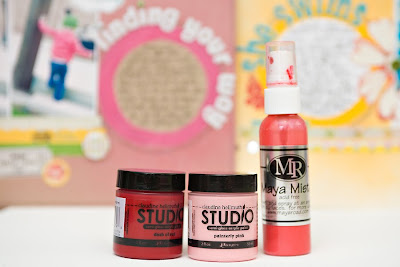
Today I want to share a tutorial with you on using paint and mist (two of my favorite mediums) to create a custom journaling spot on a layout.
I used this technique and process on my "She Swims" layout from the September Kit gallery. It was pretty easy to do but it made a big impact and I have had a lot of people ask questions about how it all came together.
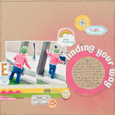
I decided to create another layout with the same technique and basically the same layout. When you come up with something that works I say don't be afraid to recreate it and follow the same basic guide on other layouts as well. And as you can see by my finished layout, just by changing up the colors and embellishments, you can get another layout that is unique in its own ways (even though it is basically a lift of the first one).
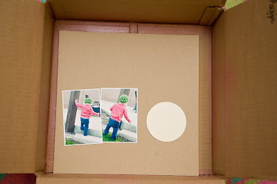
1. Cut a circle out of some scrap cardstock and set up the basic layout of your page. I always print my photos and then I decide how I want my page to flow so that I know where I want to place the mask before I start misting. Again I wanted to follow the same basic idea as the original layout so I set my page up like this.
The cardstock circle will be the mask. After you set up the page go ahead and remove the photos before misting. I always place my page in a cardboard box like this so the mist doesn't get all over the table or floor.
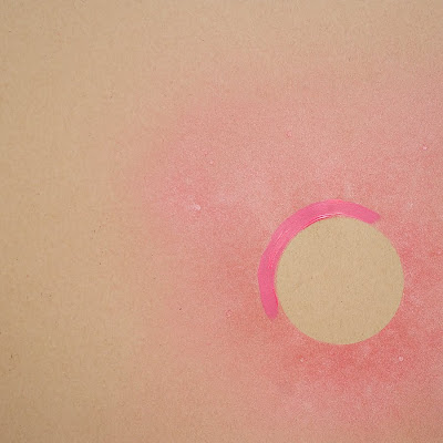
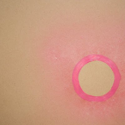
2. Hold the circle in place with your finger and spray pink mist over it. I used the bubblegum pink color this time and I sprayed it quite heavily. I use light spritzes and continue to add more and more until I like the color and saturation.
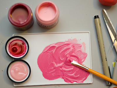
4. Choose your paint color. I didn't have the exact color of pink that I wanted so I mixed some red and pink together to get the tone I was after. I used Claudine Hellmuth's Studio paint in painterly pink and dash of red.
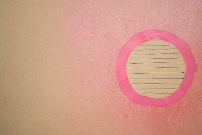
5. Use a smaller paintbrush to paint a circle around the edge of the circle on your page. I paint a few coats to make sure it is nice and dark and so that you can see a difference between the paint and the mist. You also want to make sure that you paint on the outside of the misted circle (not on the inside) or you will make your space for journaling quite a bit smaller. You can see here that I painted right over the mist.
6. Use a black fine tip marker (or any color that you prefer) to draw your journaling lines inside of the circle. You can space your lines as close or as far apart as you like, depending on how much you have to say. I just freehand draw the lines but if you are particular you can use a ruler as well. Personally I like the hand drawn feel I get when it isn't quite perfect.
7. Add your photos, title, embellishments, journaling etc to complete the layout!
Again, you can see that I copied a lot of the ideas from my original layout - the placement of the title around the circle, the strips of paper underneath the photos, etc. - but it still feels like a layout of its own because of the different colors, different photos and different story that it tells. You can also see that I flip-flopped the whole design and placed the journaling circle and photos on opposite sides.
You can use this same technique with other shapes and also different sizes depending on how much journaling you have. You could use a square, a label shape, a heart, etc... anything goes!
Happy misting and painting!! Maggie
Subscribe to:
Posts (Atom)
Very cool calender :) i am so thankful for a healthy year! With a few scares to the emergency room with my son, all is well with my family :) I am so thankful for that!
November 26, 2009 12:05 PM