October 31, 2009

Pop Dot Examples

Thanks for playing the Pop-Dot Challenge with use this week!!

Lisa and I both participated in the challenge along with you all:) Here's our examples:


I love how Lisa popped up all of her little circles. From what I spy MOST of this layout can be made from the November kit.


I used the foam tape and popped up several bits of this little card ALSO using left overs from the November Kit.

We both used that same paper from October afternoon for our examples! Great minds think alike!

Thanks to everyone for participating in our challenge this BUSY week. There were lots of great entries! I used random.org to pick a winner and the winner is Cari (cskuse) Cari send an email to info@studiocalico.com and let them know you won a $5 GC from the blog!

Tutorial: Layering Mists by April Foster

By now, most of you know my love of misting. Originally, I misted mainly with single colors, but more recently, I've begun experimenting with several colors on a layout.

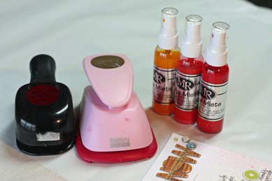
For this tutorial, I used the YEARBOOK KIT plus the following supplies:
  1. Cream, Bubblegum, & Cherry Maya Mist
  2. 3" & 1.5" circle punches


Maya Mist tutorial from studio calico on Vimeo.

browsing the YEARBOOK!

As you wait patiently for Marketplace to arrive, hows about we take a trip through Yearbook?

I browsed back through all 20 pages of Yearbook's gallery, and SO SO many layouts jumped out at me. Here are a few of my FAVS!!

I love how Beth Ann used the Boyfriend line with this layout...perfect storytelling with nice details!

I love how Jill used the SC paper in this layout! Her photo is great and the bright colored paper and embellishments help tell the story!

Oh my!! I LOVE this layout so so much. The colors are perfect for this vintage photo of Valerie and her dad. {btw: I'm SOOOO into that owl!!}

How can you resister this adorable layout by Leslie? The title is so great for that look. I really love the whole background of SC paper and the AC stickers are a great finishing touch!

Another irresistible photo and layout! ArlaMo's little is just too happy for words! I truly love the simple!

I pretty much love everything that Chris does. This layout shows off her awesome handwriting, and adorable daughter perfectly. I love how she opened up the envie like that, and I think I spy a strip of SC edging (the red.)

I love how Keshet embellished this plaid Sass paper! The butterflies are a great addition too!!

I know Ally thought she wouldn't even USE this piece of paper, and then used it right away. That's how creativity works sometimes! I love how she cut this down to 8.5x11, BRILLIANT!

I love all the bits that Nichole used on this layout. The envie is so cute peeking out, and I love the posies on there. Who can resist the Kraft? Not me!!!

October 29, 2009

insider tips

I wanted to talk a little today about the mini album that I made using the wood veneer in the Bazaar add-on. When I first got my kit, I wasn't sure what I wanted to do with it - and then my husband came to me with a folder of odds and ends that he had collected on his weekend trip to San Francisco at the beginning of the month. He had flown out for his cousin's wedding, but was able to do quite a bit of sightseeing in the 2 days he was there. I knew his photos plus the tickets, postcards and brochures that he had held on to would make a great mini album.


I started by cutting the veneer in half. I used a craft knife and a ruler - first I used the knife gently, to score the veneer, then I applied more pressure and cut the rest of the way through. I was a little worried about whether or not I'd be able to punch holes in it for the binder rings - but it was no problem. I used a 1/4in circle hand punch from Fiskars, and it went through it easily. It *did* get stuck on the punch, but I was able to carefully pry it off without breaking the veneer.


I pulled together some photos from his sightseeing and the wedding, and resized them to fit in the album. The veneer measured 4x6in once I'd cut it in half, so I sized my photos so that the longest vertical was 3.5in and the longest horizontal was 5.5in. I printed them and then stacked them in the order I wanted to put them into the album, and then cut kraft cardstock to the size of each photo. I masked off a circle on each piece of cardstock and sprayed them with different colors of Maya Mist (I used red, turquoise, avocado and silver). I used yellow thread and machine stitched around the circles, and then added a punched circle of patterned paper to the center of each one.


I stacked the photos with the kraft cardstock that matched, and then punched holes in each ones that lined up with the ones in the veneer. Then it was time for the fun part - customizing each page. I added a typed label and brad to the title page, and added extra photos, stitching, bits of patterned paper with typed descriptions and memorabilia to the other pages.


Once I'd finished a cardstock page, I glued it to the photo that it matched. I punched holes in the wedding save the date and part of the program and added them into the album as well. I have some things that are too big to fit in the album that I'd like to add - I'm thinking of adding a couple of my leftover Maya Road envelopes from Yearbook to hold them.


I love the format of this album because it's no fuss - you don't have to worry about all of your photos being the same size or orientation, you don't have to worry about what to do with your memorabilia, and you don't have to worry about actually finishing it - each page has basically the same design, so you're not making a lot of decisions. It's so simple you could put it together in an afternoon, and can be customized to fit almost any occasion. I've always considered myself a little mini-challenged, but I might be trying more after this. I hope you'll join me!

October 28, 2009

my marketplace favorites

So. Marketplace went live last night. I LOVED this kit. In fact, there was quite a bit of gushing from the design team over the November kit - and I think it shows. I love how each designer takes the kit and makes it her own, and it never fails that i sit and think "how did she think of THAT??" as I page through the gallery.

I was up for the reveal last night and did a quick peek through all the galleries, but saved my seriously browsing for this morning, once my big kids were off to school, I had a diet coke in hand, and I had convinced the littlest to watch Curious George. Something as important as picking my favorites takes concentration. ;)


First up, November's guest designer, Jen Jockish. I love the bright houses, and the simplicity of the color blocked bottom. The wee birdie perched on top of the photo is the perfect finishing touch.


This page from April just makes me happy. I love the stamping on the photo. I love the use of the negative from the Sassafras chipboard alphabet. I love the detail of the arrow and buttons. but for some reason, the way "love" is lined up and stitched along the top just makes my day.


The background. AH, the background. Love the negative stars, love that one's backed with the striped paper. The house and tree on the labels is the perfect finishing touch to Celine's layout.


That yummy May Arts ribbon against the veneer is a beautiful combination - and Davinie takes it another step by adding the border punched patterned paper underneath. Gorgeous. And she made those scarves! Too cool.

I loved Emily's brilliant use of the SC exclusive paper for her title - the stitching is divine. This is a beautiful, classic 2 pager, with all the right details. And Emily is too cool for pulling old pics from her files - I really need to do this, too.


I didn't think I was going to pick this one as my favorite - but the more I look at it, the more I know that it is. It's so soft, so pretty, and it just *feels* twirly. I love the lightness. Perfect.


Okay, I'll admit I giggled at the photo. It's nice to know I'm not the only one to whip out the camera when my toddler breaks out the tears. I love Joy's sweet photo against the calm, balanced background. The scattering of punched flowers is the perfect embellishment.


Oh, the PHOTOS. Love. So sweet, a daddy and his boy, just hanging out. I love the warm and cozy colors the Kelly pulled together to finish this off. She totally pulled the feeling from the photos into the rest of the page.


I went back and forth on a favorite for Kirsty - but in the end, this one won. I LOVE how she used the sewing machine. LOVE. And then the little scattering of embellishments near the title did me in, and I had to pick this one.


Those photos!! And the way Maggie cut the SC exclusive paper. Brilliant. Add in the scattering of yellow hearts and the yellow flower at the bottom and I'm in love.


I'm a sucker for circles. I love how Nicole H layered the border punched strips and alphabet border stamp over the circles. And the subject matter is just awesome, along with the photos.


I loved this mini from Nicole S, our new mama of 4. So much texture and color, and every page is perfectly finished. The leaf transparency layered over the veneer is divine.

I adore how Stephanie has kept up with monthly layouts as Sadie grows - I really wish I'd been better about this! These photos totally capture that toddler spunk, and the Sassafras flowers are a wonderful pop of color to her calm color scheme.


I love the layering of the photos, and I love the little grouping of bits and pieces. The journaling is beautiful, and I love how the colorblocked background balances out all of the funky embellishments near the photo.

I still have lots of November's kit left, and now that I've gone through the gallery, I'm totally inspired to play with it some more. And i *really* can't wait till it's in all of your hands, so that I can be inspired by you as well. =)

Reveal Night Winner!

Congrats on winning the fabulous prize pack from Elle's Studio:

Blogger Claire Williams said...

I love decorating my tree, and remembering all the stories behing where I bought each ornament. Then going to my parents' house and helping decorate their tree too!

Great giveaway x

October 27, 2009 5:52 AM


Please send an email to info@studiocalico.com within 24 hours to claim your prize.

Delete

October 27, 2009

Inspiration Tuesday

Tuesday is Inspiration Day on the Studio Calico blog! This week when I was thinking about inspiration...I started getting all freaked out that I hardly thought about my kids costumes for this weekend. I know, "Bad Mommy." We've talked about Pippi Longstocking for my oldest, but I'm just not sure about the two youngest at all. I started looking through flickr.com for some inspiration. Here's some of my favorite finds:


I love this "paper pirate" idea. She mader herself a pirate costumes out of newspapers! Such a cute idea!!!


Okay, so none of my kids could pull off this costume, but HOW CUUUUUUTE IS IT?

Any fairy costumes are high on the the list of my 4 year old...or a princess. I love the autumn fairy crown...YUM!!

This is a do-able costume for my video game obsessed little buddy.

This is super easy, and I already have most of it at my house....hmmmmm.

Or really, we could just all go with swine flu chic ;)

Do YOU have any quick/easy ideas for me??

October 26, 2009

Reveal Night Giveaway


Want to win these Fabulous Goodies from Elle's Studio?

Just leave a comment about your favorite holiday tradition.

For me, it's always opening stockings first. No matter what there was enticing us under the tree, it's always been a tradition to open our stockings first. Another tradition associated with the stocking is that it usually contains some socks and underwear.

challenge : use pop dots

Happy Monday, all!! Joy Madison and I are hosting the blog this week. It's my first time, and I'm excited to share a little inspiration with you. =)

When I started to think of a challenge for this week, I still had Emily's texture challenge in the back of my mind. Which brought me to one of my favorite scrap addictions as of late - foam adhesive. I went the longest time without using it, and now I find myself reaching for pop dots every time a page needs a little extra oomph.

I love them under punched shapes :


(page here)

I love them under photos :


(page here)


(page here)

I love them under stamped images :


(page here)

and I love them under stickers and small embellishments :


(page here)

I'm not the only one that loves them - here's a cute example from Emily Pitts :


(page here)

and one from Kelly Noel :


(but i can't show you the whole page - it will be in her gallery with the november reveal!)

So - my challenge for this week - break out the foam adhesive. Add a little dimension with some pop dots. Make a page, make a card, make whatever strikes you - then post your links to the thread on the message board. The challenge will end on Saturday night, midnight MST. The random winner gets a $5 gift card to use at Studio Calico, any way you'd like! I'm hoping to join you in this challenge and make a new pop dotted project - it'll be posted later this week. Happy scrapping!