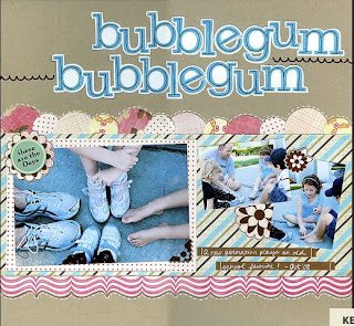
I am excited to show you my 2nd lift of Kelly's inspiring layout.

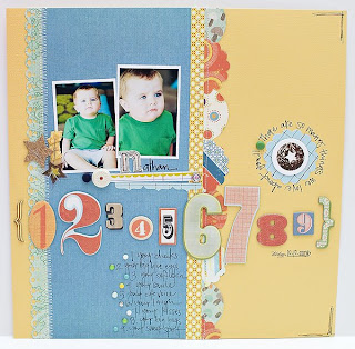
 I wanted to show you how you can get two different looks using the same layout as your inspiration. Again, I loved the punched circles and the strips of paper that Kelly used in her layout so I used those again... only I placed them vertically on my page instead of horizontally. When using the general layout or design of a page for your inspiration you can simply rotate everything by 90 degrees and you will end up with another "sketch" to use for you layout!

 I wanted to show you how you can get two different looks using the same layout as your inspiration. Again, I loved the punched circles and the strips of paper that Kelly used in her layout so I used those again... only I placed them vertically on my page instead of horizontally. When using the general layout or design of a page for your inspiration you can simply rotate everything by 90 degrees and you will end up with another "sketch" to use for you layout!
 Once I placed the strips and circles on my page it opened up a lot of possibilities for how I would place the rest of the elements on my page - photos, title, journaling etc. I already had my photos printed and I knew that I wanted to use the numbers and the title "There are so many things we love about you", so it was just a matter of playing around with it and moving things around until I liked it. At first I thought about placing the numbers in a vertical fashion going down the right side of the page (mimicking where the title is on the inspiration layout) but I just wasn't liking it so I moved them down under the photo and placed them horizontally. After adding all those numbers I didn't end up with a lot of room for my long title so I punched another circle and decided to just hand write it around the circle. Sometimes the title doesn't have to scream out at you... it can be small and subtle like this while the design elements take a more prominent presence.
To finish it off I added my journaling and some embellishments until it felt complete. It is fun to see that you can lift the same layout and get a completely different look. While both of my pages have the same general feeling to them because I used the same kit/color scheme and some of the same elements, they are both unique and different in their own way. Even when you aren't lifting someone you definitely don't need to feel like you have to reinvent the wheel every time you create a layout! If you have created a layout that you love, you can use the same basic design or "sketch" over and over, especially if you just rotate it like I did here.
The thing I love most about doing these lifts is that it makes scrapping super easy and it really takes away that stressful feeling of thinking you have to come up with something entirely new! Have fun doing your own lifts! Whether you lift someone in the gallery or you lift one of your own layouts, there are so many possibilities!

2 comments:
That looks really fantastic!
Greetings from Germany
i love your style Maggie!
Post a Comment