Showing posts with label layouts. Show all posts

September 29, 2010

Fashion Inspired Layout

Happy almost Thursday! :) Kelly N here with my fashion inspired layout. When I saw Kelly P's post yesterday, I was instantly inspired by the ruffle neckline on this shirt. I knew right away I wanted to try something similar on my layout.
Being the Mama to 2 boys, I knew the purple wouldn't work ;), but I thought I could pull off the "ruffle" look without it being too girly. I used my circle punch to punch a bunch of circles from various Elementary papers. Then, I simply layered the punches along the edge of the Window Seat paper from Documentary. Super simple to do and it's a really fun look. To make my fashion inspired page less girly, I added some masculine elements like buttons and an arrow. I added in the Sass banner and border stickers from the En Plein Air add-on along with bits of the Sass paper to finish the layout. Also, using more traditionally masculine colors lends a boy-ish feel to my page.

Don't forget to link your fashion inspired layouts to this thread on the message board! We can't wait to see what you come up with! :)

August 12, 2010

Insider Tips - use stamps for your title

Hello everyone!

I made a special layout for today's insider tips - I couldn't resist using my left over products from my Elk Lake & Adirondack add-ons :) I just LOVED playing with these two add-on kits, not only they match perfectly with my Main Kit, but the colors are exactly what I'm craving for at the moment :)

Here are a layout for my two of my best friends, a special gift for them : Amelie is an excellent cooker and Ben simply ADORES food :)

For this layout I used :

Elk Lake & Adirondack add-ons
Stamps : Tweets, Sewing Machine Set, Months stamps, Noah alphas
Raspberry Maya Mist
Punches : Bubbles border, Double Embossed Dotter Lace border , Photo Labels punch, Royal Butterfly
Foam squares


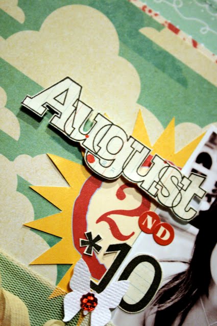
For my title, I simply combined one of Jenni Bowlin's journaling tags, the Months stamp and Noah alpha stamps to make my title : simply use different fonts, different ink colors, different elements to make a unique and urban background.
Feel free to mount one of the stamps with foam squares in order to add dimension to your layout.


Here I first stamped my label stamps that I got in a previous kit (available soon at the shop) that PERFECTLY matches my Photo Labels punch - could it be even more perfect?! So that means : you need to order that punch and then order the stamp soon available :)


Thank you and I'll share a layout I made inspired by Sasha on Saturday :D
Take care!
c

June 28, 2010

Design Team Layouts Inspired by..."Design Workshop" by Lisa Dickinson

I've long been a fan of Lisa Dickinson's clean, elegant style. Needless to say, I was excited when we decided that for July's kit, the Studio Calico Design Team would use inspiration from Lisa's book, Design Workshop, for one of their layouts. This e-book is full of color and classic designs. It was hard to choose just one concept to be inspired by!

For my own page, I was inspired by Lisa's concept of achieving unity through a grid. I've always been a fan of grids - they sound pretty formal, but you can make a grid out of anything - from circles, to lines, to butterflies! Here is my page, which I used a simple circle punch to create:


Kelly was also inspired by the idea of using a grid, which she achieved with cropping her photos and the more "decorative" square. Her page is quite different than mine, so you can see how inspiration can transfer from one style to the next! I love this kid's smile, but Kelly's page is just awesome:


Another of my favorite ideas Lisa had was to cluster accents - a favorite technique of mine, and one that Joy used so well on this page (and seriously, could this photo BE any cuter?):


Stephanie W. was also inspired by Lisa's idea for clustering accents, as well as her ability to layer items on the page (I love the page AND the shoes!):


Finally, one of my personal favorite design tips of Lisa's was to use memorabilia on your pages. This is such an important aspect of scrapbooking to me, and I love it when other's encourage it as well. Emily did just that, incorporating a piece her son wrote for school on her page (I love how his paper takes up the entire left page of this two-page spread):


Stay-tuned for more Design Workshop inspired layouts this week!

Don't forget to be inspired by other Ella eBooks, including the brand new Eight is Enough which features Studio Calico designers.

June 26, 2010

tutorial : stitched circles


(items from June's Partly Sunny and add-ons + lemon mist + mustard seed ink + tiny attacher + pinking sheers)

Hi all! I'm sneaking in on Kelly and Maggie's favorites weeks to give you a few pointers on one of my favorite techniques - stitching. More specifically - stitching circles. This is a technique that takes a bit of practice but it's well worth it - I love the sense of movement that large stitched circles can add to a background, and stitching smaller circles can add a lot of texture and detail to your page.


(Collage Press + Jenni Bowlin Studio)

Since stitching larger circles is definitely easier, let's work on that first. Both of the above pages have large circles stitched on the background. I started them the same way - by laying out a circle template and tracing the circles onto my background with pencil. I tend to use my Fiskars USX templates, but if you don't have something similar, head to your kitchen. You'll find a multitude of perfect circles in your cabinets - search through your plates, bowls and cups until you find one that's the right size.


You'll want to have a rough idea where your other elements will be - there's nothing worse than adding in your photos and patterned paper and realizing that all of your hard work is now hidden!


You'll also want to make sure that your circle is the right size to accommodate any elements that you're planning to arrange around it.


Once you've got your circles drawn in pencil, it's time to sew! Go SLOW. You can always speed up, but it's easier to get a feel for how you need to move the paper when you're maching is going slow. I use one hand to guide my paper - you just want to steer it gently, and be sure not to push or pull it. If you push or pull too hard you can pull your needle out of it's natural position for the stitch you've selected, and it's going to hop back to where it's supposed to be the second you stop applying pressure.


When that happens, you'll end up with odd lumps around your circle, as you can see in the biggest circle on this example. What you're aiming for is the circle in the middle - the lines are smooth, and you can't even see the pencil lines. The smallest circle shows an easy fix for a stitch job with a few mistakes - add a couple more circles and your mistakes will all even out. ;)


(Studio Calico Documentary + Cosmo Cricket Joy Ride chipboard - available in the shop on 6.27 at noon EST + tiny attacher)

Once you get comfortable with big circles, it's time to start experimenting with little ones. I started this card with a circle punch, and arranged strips of paper around it to make a sun.


You'll stitch around small circles with the same technique that you used for larger ones - but go even slower. And chances are, you're going to make mistakes. I rarely manage to get a good clean circle when I'm working in the under 3in diameter ranger. This was not one of those times. =)


So I went around a couple more times and called it good. ;)

I'm hoping to see more circles popping up in the gallery - please link me up if you give it a try!



June 19, 2010

Go forth and Be Bold

I hope that you guys were inspired by boldness this week.

Remember that the weekly challenge is due by tonight. Please post your link to the thread HERE:

Here are our examples of the bold challenge:


From My Pictures
I made a shadow box gift for my husband for Father's Day! I was inspired by Tina's bold esty picks! My husband is an avid photographer and uses a polaroid just like that one to take photos.


Here's Tina's BOLD example..she was also inspired by one of her Etsy picks as well. She used watercolors and a few stencils to create the bold background.

Here's a few links to some fun BOLD things:

BOLD Quotes

BOLD Photos

BOLD Art Prints

BOLD socks :D

BOLD Jewelry

June 17, 2010

Bold Member Inspiration

Here are some layouts that caught my eye in the Studio Calico gallery. These members made some bold design decisions, and created some great layouts!


by Ursala

I really like her bold use of that huge feather.
Very brave, and it works!


by Margrethe

I love the bold contrasting colors in this layout.
The black and white, and red and aqua that Margrethe chose catch your eye immediately.


by JenniferSanborn

Jennifer also used color in a bold way.
I love how she chose a bright green and worked it through the whole layout.
YUM YUM!


by Penny

I love the bold titlework in this layout by Penny.
Having the title take up a large amount of room is one great way to make a statement.


by Elise

I love how Elise used a large interesting photo with her title printed right on it to pull you in.
Adding embellishments on top of photos is one of my favorite layout treatments!


by Marit

Another bold use of photos is to cut the focal point out of the background.
This retro treatment hearkens back to the early days of scrapbooking, but Marit makes it work!

June 11, 2010

Member Inspiration - Documentary + Partly Sunny

It's official - Documentary is live and shipping! That means the gallery is filling up with fantastic layouts. Here's a few that caught my eye:


By MandieLou


By Tina A


By BrwnEyes525


by DPayne

So if you haven't picked any up yet, this is a great line for all of your summer projects...and when you do, make sure to link up to the gallery!

And, there have been a few fantastic layouts from our last kit, Partly Sunny, as well.


by DPayne


By Norcha


By Kimberlyaltga

xoxo,
Steph W

June 4, 2010

granny's cupboard

Partly Sunny shipping notices are showing up in inboxes all over the globe - so I thought we'd give Granny's Cupboard a proper send off. There are so many gorgeous pages in the member gallery and I'm going to share a few with you today. While these pages aren't summer themed, you can use the colors, designs and page ideas as a jumping off point to get your summer photos scrapped.


(by Linda Sobolewski)

I love how Linda used the wave of the scalloped envelope as a guide for her titlework - this design would look beautiful with a series of beach pictures. I could also see photos from an ice cream shop on this page - those colors would be perfect!


(by rmoliverio)

I love this multi photo design - it would work well for recapping a week of your summer, or for an activity where you have more than one photo you want to feature. And the topic? Perfect. Summer isn't all sunny days and running through the sprinkler -go ahead and capture the "but mom, I'm booooooooooooooooooooored" and "but it's too HOT to play outside" moments. They might be frustrating now, but I promise you'll look back at them and laugh (at least, that's what I tell myself! ;)


(by Nora Griffin)

How gorgeous is that masked off tree on Nora's background? It's a perfect accent for her page about family, but when I saw it, it reminded me that I need to get some photos of my littlest guy hanging out in the shade with the other little kids at his big brothers' ball games. It's only natural to head for the shade to rest and recharge on hot days - those quiet moments would make a great photo opportunity.


(by astrid)

This page by Astrid just looks like a sunny day, doesn't it?? Her design is perfect to feature that one great summer photo you've been hoarding - the subtle circle created with the clear buttons really brings the focus to the photograph, and ties all of the main elements together.


(by allieh)

I love the simplicity of Allie's design - it really lets her photo shine. This would be a perfect way to scrap any detail shot of summer - dirty toes, scraped knees, popsicle covered faces, wrinkle-y fingers after being in the pool too long.


(by qingmei)

I love the side by side photos here, and how Geralyn uses photographs from the same place at different times. This would work well for a this summer / last summer page - I'd love to do one of my littlest then and now on the swing. It would also work well for first day / last day of school photos, or for showing growth in your garden.


(by reeni)
I adore how this page records a new summer tradition - it has me making a list of our usual summertime traditions so that I can get them onto pages. What sorts of things do you do in the summer that you don't do other times? My boys and I love to take advantage of the lunch specials at the pizza place on our corner - something we can't do during the school year.

There's still a couple days left to make a page for our summer challenge - I hope this has inspired you to get scrapping!

May 31, 2010

challenge : scrap a summer photo

Hello, Studio Calico friends! =) Kelly and I are hosting the blog this week, and we are planning on bringing you a week of summertime inspiration. We're winding down the long Memorial Day weekend here in the US, which unofficially kicks off summer. School is almost (or already!) out, the weather is getting warmer, and we're spending more and more time outside.


(partly sunny + rec league,oa word stickers, tiny attacher, turquoise mist, large monarch double punch, photo label punch)

I made this page for the Partly Sunny gallery (and while the main kit has sold out, there are still add-ons available!)- the photo was taken less than three weeks ago. I love seeing how each season impacts our everyday routines - since this photo was taken, the jeans and long sleeves have been packed away and my boys are in full time shorts and sandals mode. Homework has been traded for sprinkler time, and the late nights are no longer a novelty. We're in full on summer mode.

Our challenge to you for this week is an easy one - scrap a summertime photo. Whether it's recent or an older shot, get a little piece of your summer captured on a page. Once you've finished your page, link it up on this thread and let us see it. We'll close the entries at midnight EST on Saturday, and draw a winner for a $5 gift certificate for everyone's favorite shop on Sunday. I'll be back with my summertime page later this week!

May 13, 2010

Member Spotlight


For this weeks member spotlight I chose Miss Rita. You can find her on the world wide web on her weblog Here's the Story and on the Studio Calico message board under the pseudonym rmoliverio. I chose Miss Rita from among the many wonderful Studio Calico members because I possess information about her that the rest of you ladies may not know. I know that she is a world class scraplifter!

I know that Miss Rita scraplifts in different ways. Some days she will just take an idea from a layout she sees and make it her own, and other days she will copy most of the layout. Rita chooses not to upload her layouts that she copies exactly, but I was able to obtain a few of them as evidence. I will also share a few of her inspired by layouts and original pieces.

What I love about Miss Rita is that not only is she an amazing artist in her own rite, but she also knows when to successfully use others ideas to quickly create some wonderful layouts with her own photos and journaling.

First though, I asked Miss Rita a few pressing questions:

1. What 3 items can you not live without?


My daily latte, cell phone and DVR. I'm cranky without my morning coffee and I can't remember the last time I watched a show live with commercials! For scrapping, it would be patterned paper, tiny alphas, and my exacto knife. I love using my exacto knife to cut out bits from my favorite patterned papers to use as embellishments.

2. What are your thoughts on scraplifting?

My approach to scraplifting has changed over the years. When I first started scrapbooking, almost all of my pages were lifted from a magazine or sketch book. It was a great way to try a lot of different techniques and styles without the fear of messing up. As I have become more immersed in this hobby, I have come to love the creative process as much as the finished product. There is something about pushing around the papers and embellishments on my desk and coming up with something I love on my own that just makes me happy. I know my creativity ebbs and flows, and scraplifting is a great way to get the creative process flowing when I'm in need of some inspiration. Sometimes it is just a little detail, and sometimes it is the whole layout. When I scrap at home, I am relaxed and it doesn't matter if it takes me one night or a whole week to feel like my page is complete. I tend to scraplift more when I'm scrapping away from home because I have this irrational fear of wasting my precious scrapping time, lol. I love knowing I can pull out my SC kit, my favorite DT layouts from the gallery and get to scrapping with my friends!

3. What's your favorite Studio Calico kit?

That's a toss up between Whodunit and Baker's Dozen, for very different reasons. Whodunit got me excited to create again after the busy holiday season. It seemed like those layouts just fell together perfectly. I love the colors and patterns in that kit! For Baker's Dozen, it was all about the embellishments! I loved the doilies and AC frames and made some of my very favorite layouts with that kit.

4. What are you listening to right now?

I'm old school all the way and mainly listen to the radio. My DH got me a Zune two years ago for Christmas and it still has the original songs he downloaded on it, lol. Wouldn't that playlist make a great scrapbook page? Some of my favorites right now are One Republic and Kings of Leon.

5. Any guilty pleasures?

Watching whole seasons of TV shows on Netflix. I'm addicted to the instant streaming feature and am watching the old seasons of Bones right now, one of my favorite shows. I caught a few episodes that I missed the first time around. I just added Buffy the Vampire Slayer to my instant queue...should that embarrass me?

6. Choose a layout that best represents you as a scrapbooker.


Here are 2 of Rita's CASE (or in her case, CASA(almost)


Rita used Jenn O's "perfect mix" for this gorgeous photo of her little sweetie. I love how she added a few pieces that personalized her work, but her basic layout replicates Jenn's design.


This layout is a CASE of Kelly N's "yard work." I love the addition of the Dear Lizzy chick that matched her title instead of a butterfly.


This layout "Preschool" was inspired by Lisa T's "eight" Rita liked how Lisa used the striped paper and recreated that feel on her own layout.

Rita used a few of the elements of Kimmithy's "The Fair" as inspiration in her "Circus" layout. She loves the way Kimmithy did her title, and felt like it went well with her theme. She also included several other elements from Kimmi's layout. When you look at the next to each other it is obvious that Rita was inspired by "The Fair," but "Circus" could also stand alone.

These last two are some of my favorites from Rita's gallery at Studio Calico.


This layout was for some of the NSD challenges at Studio Calico. I LOVE the color scheme and the white space. The textured cardstock with the bit of inking is fabulous too.


This last one has great colors too! I love the cutie photo of her oldest son, and how she cut out the stamped letters for her title!

Well, I hope you have enjoyed this short journey through Miss Rita's gallery. She has a LOT of layouts posted, so you should go and wander through her layouts. They are pretty awesome!