Showing posts with label technique. Show all posts

August 7, 2010

Blended Ink Tutorial

For my August Summer Camp gallery, I made a layout about bread in Switzerland. The journaling block is created using the blending tool by Tim Holtz and a bunch of Distress Inks. It's a pretty easy technique, one that takes a bit of practice, but can be easily mastered in just a few tries. I've put together a video tutorial to help show you how to do the technique on your own projects.


supplies used: blending tool, foam blenders, faded jeans, peeled paint,
and mustard seed distress inks (any distress inks can be used for this project).

Here's a close up of the technique.


I would love to see how you interpret this in your own layouts, it's really fun to see the unique results after each attempt. If you don't own the blending tool yet, it's very reasonable to purchase, and you can use the foam blenders for numerous applications if you stamp it off well.

July 22, 2010

insider tips : faux washi tape

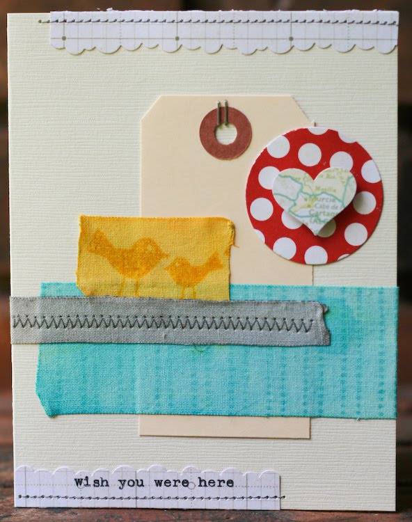
Happy Thursday, everyone! This week is flying by for me. Today, I want to share some faux washi tape inspiration with you. I love the look of washi tape, but have never been able to pick just which colors or patterns to get - and buying rolls adds up quickly! I've experimented with making my own with masking tape, mist and stamps, but was never happy with the results. Earlier this week, I came across this tutorial for making it using fabric tape that you find in the first aid aisle. The tutorial uses watercolor paint to color the tape, but I wanted to see if I could make it work with mist - and it did!

I found that the best way to get even color was to brush my tape with water first. I love this brush set - they are priced well and the brushes hold up beautifully over time. You can use the tape full size or cut it to a smaller width - I had no problem using my paper trimmer to cut it.


Next, I sprayed the tape with mist. I used hydrangea on this piece. After I misted, I used my paint brush again to spread the mist evenly. You could also leave it as is, and get a more of a gradient color wash - the point closest to where you sprayed would be the darkest, and it would fade from there. If your color is too dark, blot it with a paper towel and you can remove some of the mist. If you're happy with the color it's time to let it dry. It took about twenty minutes for my tape to dry completely, but if you're in a hurry, I'm sure a heat gun would speed up the process!

Now comes the fun part - adding patterns with stamps. The sky's the limit here - you can go for a tone on tone look, or experiment with something a little more bold. After I stamped, I used my tapes on a quick card - and of course I had to keep with our travel theme for the week. =)


(supply list : vanilla cardstock, jetset pp, window seat pp, girl's paperie pp from the july kit, hydrangea mist, lemon mist, charcoal mist, tumbled glass ink, mustard seed ink, journaling lines stamp, tweets stamps, tiny attacher, bumpy road border punch, foam adhesive, shipping tag, fiskars heart and circle punches, typewriter)

The best part of this? The roll of fabric tape cost me $2.79 - I had everything else on hand. Now I can have tape that matches any project for a fraction of what washi tape would cost. I can't wait to experiment more with this technique.

July 17, 2010

tutorial : building a mini


Hi all!! I'm here tonight with a tutorial on how I made the mini album in my Continental gallery. I've been holding these Fuji Instax Mini pics from our February trip to Kansas City, just waiting until the right kit came along. As soon as I saw this Making Memories packaging in the Magellan add-on, I knew it would make a perfect cover. The packaging had more of a faux suitcase shape, but I opted to trim it down into a rectangle. I then backed the opening in the front with a transparency and added a couple die cuts and Basic Grey studs to the outside.


Next, I spent some time thinking about how I wanted to construct the inside of the album. Since I was dealing with original photos, I wanted them to be protected - but I needed to keep the pages on a fairly small scale so they'd fit within the cover. Once I came across these divided page protectors (we keep them on hand for the boys' baseball and Pokemon cards), I know I could turn it into individual pages.


I began by cutting the page protector with my trimmer - I left one row of pockets intact, cutting about 1/2in beyond the dividing line. I repeated the cut on the other side of the middle row, which left me with two strips of three pockets. I then cut those strips into three pockets each - one divided page protector will give you six mini album pages.


My next step was to cut three pieces of kraft cardstock to 4x5inches. I scored them 1/2in from the edge and then added one to the back side of my album cover. I then used a hole punch to punch two holes through both the kraft cardstock and the cover.


Using the punched cardstock as my guide, I punched each of my page protectors as well as the two remaining pieces of kraft cardstock.


Since I knew the title page would show through the window in the front of the book, I laid it in place inside the album as I worked on it, and made sure to shut the album to see how it all looked before I stuck everything down! Once I'd finished, I wanted to hide the backs of the staples from my tiny attacher and the stitching, so I layered a second piece of kraft cardstock behind it. If you have additional journaling you'd like to add to your book, both the back of the title page and the back page of the album would be perfect - just stamp some journaling lines and write away!


Now came the fun part - working on the pages! I cut kraft cardstock to the same size as my Instax Mini pics and built from there. Each page got a label stamp stamped with pumice stone ink and punched out with my photo label punch, and a mix of products from the kit.


To bind the album, I simply stacked up all of my pages and threaded a length of twine through the two holes. I looped it around three times and then tied it off at the back of the album.


My boys have enjoyed flipping through this album - the size is perfect for little hands!!

July 15, 2010

Insider Tips : Create a White Wash on your papers

Hey there!

Today, I'm going to show you how to make a WHITE WASH on your patterned papers without having to use water.

Simply use GESSO and a plastic card (just like a customer card you get at EVERY STORE).


Take a bit of gesso on your card.


Apply randomly on your patterned paper.


Spread as fast as you can, as gesso dries pretty fast.

Now, hold your card tight and try to get rid of the gesso : the white wash effect is here!

You can also use your plastic card as a stamp : simply put more gesso on your card and draw shapes with it!

Here's one of my layout made with the Continental July kit.


and here, a mini album I taught in France. I used my card to apply both gesso and acrylic paints (I used Yellow, Turquoise and Red for this album).


Have a wonderful day!
:)

June 26, 2010

tutorial : stitched circles


(items from June's Partly Sunny and add-ons + lemon mist + mustard seed ink + tiny attacher + pinking sheers)

Hi all! I'm sneaking in on Kelly and Maggie's favorites weeks to give you a few pointers on one of my favorite techniques - stitching. More specifically - stitching circles. This is a technique that takes a bit of practice but it's well worth it - I love the sense of movement that large stitched circles can add to a background, and stitching smaller circles can add a lot of texture and detail to your page.


(Collage Press + Jenni Bowlin Studio)

Since stitching larger circles is definitely easier, let's work on that first. Both of the above pages have large circles stitched on the background. I started them the same way - by laying out a circle template and tracing the circles onto my background with pencil. I tend to use my Fiskars USX templates, but if you don't have something similar, head to your kitchen. You'll find a multitude of perfect circles in your cabinets - search through your plates, bowls and cups until you find one that's the right size.


You'll want to have a rough idea where your other elements will be - there's nothing worse than adding in your photos and patterned paper and realizing that all of your hard work is now hidden!


You'll also want to make sure that your circle is the right size to accommodate any elements that you're planning to arrange around it.


Once you've got your circles drawn in pencil, it's time to sew! Go SLOW. You can always speed up, but it's easier to get a feel for how you need to move the paper when you're maching is going slow. I use one hand to guide my paper - you just want to steer it gently, and be sure not to push or pull it. If you push or pull too hard you can pull your needle out of it's natural position for the stitch you've selected, and it's going to hop back to where it's supposed to be the second you stop applying pressure.


When that happens, you'll end up with odd lumps around your circle, as you can see in the biggest circle on this example. What you're aiming for is the circle in the middle - the lines are smooth, and you can't even see the pencil lines. The smallest circle shows an easy fix for a stitch job with a few mistakes - add a couple more circles and your mistakes will all even out. ;)


(Studio Calico Documentary + Cosmo Cricket Joy Ride chipboard - available in the shop on 6.27 at noon EST + tiny attacher)

Once you get comfortable with big circles, it's time to start experimenting with little ones. I started this card with a circle punch, and arranged strips of paper around it to make a sun.


You'll stitch around small circles with the same technique that you used for larger ones - but go even slower. And chances are, you're going to make mistakes. I rarely manage to get a good clean circle when I'm working in the under 3in diameter ranger. This was not one of those times. =)


So I went around a couple more times and called it good. ;)

I'm hoping to see more circles popping up in the gallery - please link me up if you give it a try!


May 11, 2010

How Shall We Be Inspired?

“To do exactly as your neighbors do is the only sensible rule.”

--Emily Post


Well hello good friends! Miss Emily here, thrilled to be hosting the blog today.

Today we will discuss various aspects of scraplifting. As Miss Joy mentioned yesterday, there are MANY ways to scraplift someone, but only ONE right way to credit your inspiration. Please, dear ladies, if you do scraplift someone, in ANY way, shape, or form, always give credit to your inspiration. And if luck would have it such, and you do not remember for the very life of you, please say something to the effect of, "I was inspired by someone and cannot for the very life of me remember who that might have been." At least you'd be acknowledging your idea was not your own.

This can be a sensitive issue. Neither Miss Joy nor I claim to be an expert, we've just been around for a while. Here's what we've concluded though:
  • Scraplifting is great for trying out new ideas.
  • If you don't feel comfortable sharing your scraplift online without giving credit to your inspiration, keep it to yourself. That's perfectly OK.
  • I submit and do assignments for magazines. Personally, I don't think it's right to submit anything that I've KNOWINGLY lifted a design from. I think elements, techniques, and color schemes are different. There was one time I had a layout that fit a call exactly and my layout was really different, but I'd gotten the idea from a layout by Shannon Taylor. I emailed her to be sure she wouldn't mind if I submitted. There wasn't an issue, the layout didn't get picked up. I've had others do the same for layouts I did that inspired them. I appreciate knowing this before I see something in a magazine that could have been inspired by my work. I know I didn't come up with the idea, but I appreciate someone acknowledging their work was inspired by me. There's a gray area for sketches, I'm really not sure what the rules are. I talked to Kelly Purkey about this exact thing, she said she was fine if I submitted a layout based on one of her sketches. Asking is always the best policy I believe, especially if you could benefit financially from that inspiration.
  • Always give credit to your inspiration piece. The first piece I ever scraplifted and posted in my gallery at Two Peas I attributed to "a Vicki Boutin." What fun it was to show it to her years later! She got a kick out of it, and I was relieved that I'd credited her way back when!

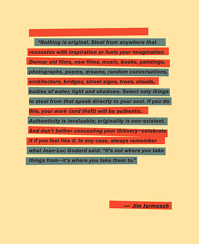
There really are no original ideas, but it sure is nice if you were inspired by someone or something to point the viewer in their general direction. Here is where I must post one of my favorite quotes about inspiration:


Now I must blush here and admit, I do not have a source for this lovely little piece of artwork. I pulled this off the web prior to my days of crediting correctly. Will you forgive me dear reader? I hope that is the case!

Some of the many ways you can scraplift include:
  • CASE (copy and steal exactly)
  • technique
  • design
  • use of a particular element
  • color scheme
  • title
  • journaling
  • topic
  • photo angle
  • creator's style
  • photo placement
  • journaling style
  • product choice
To illustrate some of these ways, I asked a few members of Studio Calico to help me out. Our first example comes from the British Isles. AllieH has a lovely minimalist style and it tickled my fancy to ask her to look for a TECHNIQUE to scraplift. She went on the hunt and discovered this layout in the gallery of Donna (dmbd). She admired the color scheme as well as the all the fun little bits that Donna always adds, but in the end, it was the way Donna had cropped her photo in a circle that led Allie to choose that particular technique to lift. Now cropping your photo in a circle is not something Donna made up, but the way she did it on this particular layout spoke to Allie, who was then inspired to do the same technique on her layout, so she's going to give Donna the credit she deserves for the inspiration. Allie comments that she will definitely try new techniques because of this challenge. Thank you Allie for such a lovely example of technique lifting.


My next example comes from the wide open plains of the Midwestern United States. I asked Kelly (baylorgrad) if she would lift a specific ELEMENT from another member's layout. She fell in love with the look of this layout by our own DT member, Ms. Stephanie Howell. The element she chose was the photo. She found the printing of your photo directly onto textured cardstock to be rather intriguing. So she did just that. She played around with the idea, settling on a larger photo, just like Stephanie's, added minimal embellishments, and let the photo do the talking. She said that this lift forced her to think outside the box, and she ended up with a gorgeous layout. Is Stephanie the first person to ever print a photo directly onto cardstock? No, but what Steph did sparked an idea in Kelly's head, so by giving Stephanie credit for that particular inspiration, she's made Steph's day. Being scraplifted is a huge compliment.


Jen from Down Under played right into my hands for the next example. She'd commented on this layout I'd done for NSD, saying, "Oh I LOVE this Emily! I think I saw it over at the Crate Paper blog? I fell head over heels when I saw it and now I must lift it ;) love, love, love!" How could I resist asking her to do just that? So gentle readers, Jen's lift is an example of DESIGN lifting. Note how she kept the design quite similar, three photos in a row, title to the lower left of the row. She however made it very much her own by changing up the floral element a bit, adding tabs, journaling down the right side of the photos, a tag as the base of her title, and some fun swirls of baker's twine, to name just a few of her adaptations.


Now I, as the original creator, must not claim credit either. I used this sketch by the talented Becky Fleck, which she created for the Scrapbook and Cards Today blog, as my inspiration piece:

There was something in my original layout that appealed to Jen, but she made it very much her own, and when posting this layout to any gallery, giving credit for the inspiration would something like this, "I was inspired by Emily's layout, which was based off a sketch by Becky Fleck, who created her sketch for the Scrapbook and Cards Today NSD challenge." Yes, dear readers, it can be a bit tricky giving credit where credit is due, but it makes those credited so very grateful.

My final example comes from France, where Francine (scrappyfran) was asked to pick a layout that inspired her color selections. I am fully aware, kind friends, that this is not the first time blue and yellow have been paired together. HOWEVER, if you see a layout that has a rather elegant pairing of colors and that inspires you to create your own, please, share the inspiration piece as a courtesy. Francine's inspiration comes from this lovely layout by ania-maria. Francine picked this particular color scheme because she said it reminded her of Spring and Summer and just made her feel happy. She notes that she normally doesn't use the blue/yellow combination, but the color combination works smashingly well in both layouts. Since doing this lift, Francine has decided that she'll try using color schemes that she wouldn't normally gravitate toward. And she also found out that she enjoyed matching the color scheme of the photo, something that she normally doesn't do. In the end, the two layouts look nothing alike, but it would be proper for Francine to acknowledge the color inspiration.

It is with much gratitude that I end this post. I appreciate the examples these fine members have created of scraplifting. I end with a quote from Jen, I love how she put it, I couldn't say it any better:
In general, I don't like doing lifts. I feel like I'm cheating, which I know is ridiculous! But as I was working on this page I was subconsciously thinking of other layouts I have in mind which would work great with this design! When I'm doing a layout I feel like so much of my time is wasted on trying to come up with a design I'm happy with, it's really the hardest part of scrapping for me. Lifting really is a time saver, giving me more time for more layouts!
So scraplift away, and please, cite your sources!

April 22, 2010

Insider Tips - dye your tags using Maya Mists!
Hey everyone! :)

You know how much my Maya Mists? Well, I wanted to show you a new way to dye paper tags : I think you might like it! :)

We're going to make a layout and this is what I used for my layout :

Simply choose a cardstock that is the same color as one of your favorite alphas and glue all the letters, words, sentences you want onto your cardstock (you probably want to cut the cardstock first before adhering all the chipboards, otherwise might be a pain to cut afterwards).


Grab your kraft sheet, 2 tags and 2 small zip lock bags.


Spray Maya Mist in each plastic bag (one color per bag).


Open and put one of the tags inside a plastic bag. Use your finger to make the ink move onto the tag.


Use your heat gun to dry each tag.

Once your tag is dry and ready to use, you can also fold it and put it back into the same color bag.

All the wrinkles will get bolder and darker because of the ink. Use your heat gun to dry again.

You can use your tags the way you want. I like to use them as a new way to focuse on the photos.


Extra item I can't live without and that I used for this layout :
Enjoy!
Céline