May 29, 2009
Pinwheels Pinwheels Pinwheels!
I have made them before, but still had to find directions to remind myself how to make them. They are so darn easy. Maybe this time the directions will stick. I *do* have brain sapping young children though. Perhaps I will have to bookmark my own post, lol.
To start your pinwheel, you need one piece of patterned paper. Double sided is preferred, because you will see both sides.
For this pinwheel, I trimmed my paper to 3 inches by 3 inches.
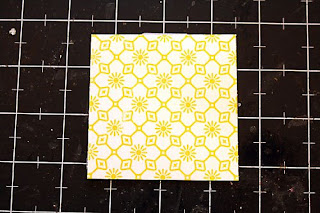
After I was finished, I put a little dot in the center of the square. With this one I just eyeballed it because the pattern in the paper made it easy to guess.
After you make your mark, take a ruler and place it on the diagonal.
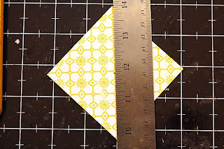
Using a blade, trim down the line, stopping at about 1/4 inch from the dot in the center. You don't want to cut your square in half. Don't have a blade? For the pinwheels I made for my layout, I put my square in my paper trimmer.
When you are finished with one side, trim the other diagonal, until your square looks like this:
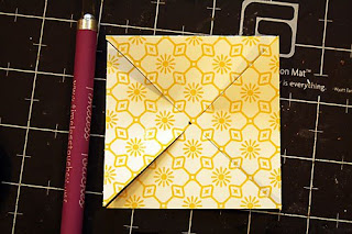
Next is the fun part.
Now if I could have found a way to show you how to do this without including my hands, I may have done it, for I inherited my mother's man hands. They ain't pretty. I did manage to hide a burn mark near my thumb, though. Yesterday I was grocery shopping while hungry (NEVER do that!) and as I was headed for the clerk I walked right by the rotisserie chicken. Well, the wafting smells of delicious chicken could not be ignored, so I reached in for a bird to take home for dinner. However.... the stinkin' heat lamp they were under totally reached out and grabbed me as I tried to remove chicken licken from the table! I swear it did. But I took her anyway.... and she was GOOD.
Anyway.... my hands. Don't look.
You are going to take one corner of your trimmings on each side of the square and fold it towards the center. I folded the one on the left, but I'm a lefty. You can choose either side, it doesn't matter. Just put a little dot of glue or a glue dot under the tip and press it down over the dot you penciled on the center of your square.
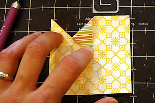
For this next image, gosh darn it if my pointer finger on my man hands looks retarded. And the photo is blurry. Good grief. But I wanted to show you the next step. You can choose to pull down the left corner, or the right corner of your triangle. But whatever side you choose, you need to do that on each corner of your triangle, adhering it in the center. This image shows you the second triangle pulled down, from the left.
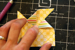
Repeat on all four sides until all four corners are in the middle. To make it clean, I also punched a little flower out of paper and added a Basic Grey half pearl. But you don't have to do that.
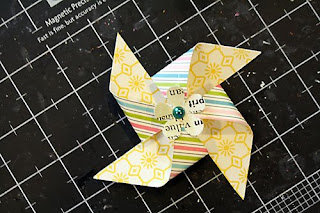
Voila! A perfectly easy and perfectly made pinwheel to decorate your summer projects.
Check out what some of the DT members did with their pinwheel creations this month:
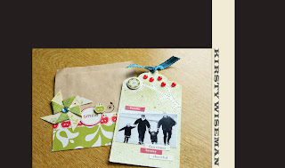
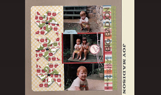
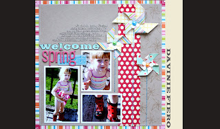
And here's mine! If you look closely, I made my pinwheels going both ways, depending on how I folded down the corners. I also made two sizes. The big ones were made with 3 inch squares, and the smaller one was a 2 inch square.
Are you inspired now? I'm sure you are itching to make a pinwheel now, aren't you? How about if I issue you a challenge? Okay.
Here's the challenge:
Put a pinwheel on a project. Create your own pinwheel, add it to your next project, and link it to me on this thread. You have until Saturday the 6th at midnight PST (because I am PST, woot!).
On Sunday morning I will draw a name, and the winner will get one of these:
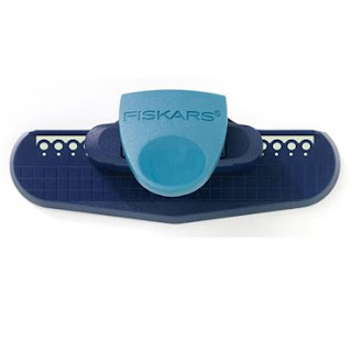
That's the Effervescence punch. I know you have been wanting to try it out! Now get to work! A card, a layout, a wall hanging, it doesn't matter. It just needs to have a handmade pinwheel on it.
Have a great weekend! I'm headed to Portland to take my kiddos to the zoo!
Davinie
May 28, 2009
in the mini mood.
the mood strikes me to make a mini album, and i get busy lol.
and since i pretty much only scrap with my SC kits, sometimes i have to improvise.
no kit in this month's kit?
no problem!!
just gather what you see here...-chipboard packaging or shape that you dig
-your fave scissors
-trusty glue stick (i use Tombow brand, but whatever you have on hand is great)
-smidge of sandpaper from my husband's stash
-whichever paper you would like to cover your mini in
-a scrap piece of chipboard
-your Basic Grey file set...which, for a distresser like myself, is a definite must have and all-around go-to tool.
ok...now, take that smidge of sandpaper and sand the sheen off of the packaging. it allows the glue to adhere better, which as a result is better for your paper to stick to.
next, trace lightly around the paper with a pencil...don't worry if you goof and it isn't a perfect trace.
grab your scissors and cut around your outline on the paper. but don't just cut ON the line...oh no! cut OUTSIDE of the line, so that you are actually cutting it bigger than your tracing. again, perfection not required.
flip your paper over and adhere it to the chipboard. see how mine is nice and off center/raggedy? no matter! the only time that would matter is if you were using something like ledger or graph paper, and you wanted it to line up properly on the cover. it's nice to use a print that is random enough to be forgiving the first time you play. oh, and you would have of course taken the buttons out of the packaging, lol...this is a spare set i have, so pretend you don't see them, ok?
now...here is the fun part! i'm right handed, so i hold the chipboard in my left hand and sand with my right. the key is this: MAKE SURE YOU HOLD THE CHIPBOARD AS NEAR TO THE EDGE AS POSSIBLE!! this will prevent any unwanted bending, but it will jeopardize a freshly manicured hand. notice i have no polish on my fingernails...if i did, it is likely that it would be a fantastic abstract pattern when i was done sanding, lol. see how i file right along the edge? you can see the outline of the chipboard as it turns white from the sanding...this is a good thing! also notice my trusty BG file...yes it's creased, and yes it's a bit beat up...but it keeps on ticking! if you don't have one handy, an emery board will do as well...just try to use one of the thicker ones, as it will be tricky to use the thin.
now just keep sanding all along the edges...all the way around. you will notice the paper starts to break away from the chipboard where you are sanding...again, a good thing. the sanding of the paper/chipboard/glue interface helps them to bond/mesh/fuse together. after years of using this method, i have NEVER had the paper lift off of a cover...it just doesn't happen, lol. see why you didn't have to fret about perfect trimming?? after i sand off all of the edges, i go back around and sand a bit more until i get the desired distressed effect i'm looking for.
after you do the front cover, flip it over and do the back! i wait until i have both sides covered before i start decorating...it's just easier to hold in my hand that way. then, grab your spare piece of chipboard and trace around the original front cover. this will be your back cover...do the same steps to cover it, only you don't have to sand the surface as it will already be matte and should accept the glue stick with open arms. again, IF IT ISN'T PERFECTLY MATCHED WITH THE FRONT, NO BIGGIE!!
Reveal Night Winners!!!
Joanne said...
do I see some doodle-type paper? Oh, this looks awesome - what a cool giveaway!
May 27, 2009 2:59 PM
~*~ Stephanie ~*~ said...
Oh FANTASTIC!! I love this kit!!
May 26, 2009 4:58 PM
Please send an email to info@studiocalico.com within 24 hours of this post to claim your prize.
May 26, 2009
May 25, 2009
meet me at the Soda Fountain.
- gorgeous papers...the Cosmo Cricket Early Bird line is divine. the new SC papers are out of this world. add to that a few delectable pieces of Collage Press and you're hitting a home run outta the park every single time.
- fabulous alphas...between the BG chip letters in the Main, and the AC Thickers in the add-ons the options are neverending!
- stamps, stamps, STAMPS...looking for the best alpha EVER? look no further...Cherry Pop is going to rock your world. seriously...perfect size. perfect font. perfect everything. look for it's numerical counterpart in Shirley Temple!!!
- back to the paper. those Cosmo papers with the red and yellow polka dots on the 'B' sides are ones that i think i shall need in my stash FOR LIFE. perfect yellow and perfect red...not too bright.
- you know i can't pass up a piece of ledger, so the Jenni Bowlin chip buttons just make me smile.
there are a million other reasons to love this month's offerings, but i think the pic above sums up my fave part of the kit.
don't you think, lol?!
(i was chatting with Nic S. and Joy...professing my obsessive love for this alpha stamp set, claiming that i could use it to tattoo my arm, lol. so they dared me...teehee.)
May 23, 2009
Up close and personal
Fear not my friends as there are little lens attachments you can buy that will turn your fave lens into your new super fave lens. I discovered these for my 50mm lens the other day on an online auction shop for a meagre £10 ($13) and these babies will turn my 50mm lens into something of a phenomena.... and an extra feature to what already is a superb lens. The beauty of this discovery is that you don't lose clarity or comprise on quality of your shots.
So, instead of taking just whimsical shots of my garden favourites, I can now get uber close and enjoy what mother nature intended us to see up close and personal. A standard 50mm lens would only give you a certain focal length appreciation of your subject and on a non full frame camera its more likely to be 7-80mm instead of 50mm - no chance of a close up shot at all. So in these series of 3 photos you can begin to appreciate what a cheap addition to your lens collection can do for your photography practice.
The first picture is a general quick snapshot that many of us might take in the garden. Just a general snap.....mmm, okay!Use the 50mm lens to get in as tight as you cant like this picture but to get in even tighter you add the macro attachment to your lens and whoa! A bugs eye view of your fave flora and fauna!Those lilacs sure look pretty up close.... you would NEVER get this close with a 50mm lens, ever.
Also try out viewing a peony in all its unfurling glory. Standing back with your camera and you get a view of the whole garden - not very inspirng is it?Using your 50mm maximum best and you get a lovely shotbut get in close with the macro attachment and hey presto - breathtaking mother nature!Hope you manage to bag these attachments and if you do - share with us your macro world.
May 22, 2009
friday sneak love
Enticing, no? :)
May 21, 2009
through my lens...
It's all about gardening for me right now. I also purchased a new lens last month that I'm learning to play with. I'm so in love with this new addition, the Cannon 100mm 2.8. I agree with what Scarlet mentioned in her interview about the lens..it is quite heavy but I'm quickly learning how to manage.
I wanted to shout a quick congrats to Lisa (bluestardesign) for her stellar layout! What a great honor to be the most favorited among such a talented bunch of scrappers. Get those creations in the gallery! Who know's who will be the most favorited next month!
May 19, 2009
New Feature - Favorite Layout of the Month!
This layout has been added into your favorites....well, not just your favorites, the SC community as a whole, more than any other layout in the month of April.
Each month, we'll announce the layout that has been added as a favorite layout the most number of times. The winner will receive a $15 gift card to be used on any new purchase at Studio Calico. It can be any type of layout, card, whatever, and can be made with a Studio Calico kit or other items from your stash.
Don't delay, start uploading today to increase your chances to win!
May 18, 2009
The world in our eyes
Some of us wear rose tinted glasses and some of us see the world for what it is.
But when we see the world through a camera it becomes a consuming obsession to make it appear creative, mystical, abstract, dramatic, calm and whole plethora of other artistic adjectives.
Tina Azmus and I want to share our world though our cameras "eyes" this week in ways that will test your photographic skills and thus promoting a unique catalogue of pictures that can reflect your personality/emotions in a single snap. Im so excited because Tina's photos are awe inspiring, for me alone, as it is :)
So. This weekend gone by I went to test out my new camera whilst out for a walk with my mini Dachs, Eddy. I was in a particularly bad mood which forced me to lose my patience. That meant that I didn't want to wait around and faff with my settings (I usually shoot in manual). Instead I set my camera to Aperture priority, got down low, angled my camera, clicked and hoped for the best.
Im positively delighted with the results of our woodland walk pictures and will probably scrap these to journal recent emotional events because had I not of been feeling that way, I don't think id have had the notion to try out these perspectives with so much zest.
At this point of my walk it was sunny and I wanted to sap up the cheery feeling of this flower.I wanted to feel as calm as the lake
I wanted to feel clean of any bad feeling
It felt good to be nestled amongst bright, sunny flowers besides a dirt track
I wanted to stretch out and go to a place where I could shake off the anger
And I felt re-energised the moment we set off to go back home.
The lesson I learned was not only to appreciate jaunty and angular shots but also a novel way of coaching myself to use more journalling as I am really bad at expressing myself on layouts. Its about time I vented those feelings by producing a mini which I shall share with you towards the end of this week.
You will totally begin to appreciate the world through my eyes and so Im wondering if you might care to join in with me so I can see the world through your eyes? Perhaps take a walk in your garden, down your street, in your workplace - wherever; and relish the mood you are in. If you're grouchy, giddy, calm, nonplussed - anything, Im certain you will find things to photograph to reflect your mood. You don't have to make a mini, perhaps a page will do. All participants will be in with a chance to win a free 6 class download based on Design principles which works with all manner of mediums including scrapbooking, photography and card making.
May 17, 2009
pattern play
Judging from the gallery, it looks like this kit certainly brought out the play in all of you. Here are some picks from the Playground gallery.
LAH924
kimberlyatlga
Heidi Sonboul
Elisa:
Valerie's LO has been removed for publication.
May 16, 2009
More inspiration for Jenn's challenge!
A Challenge!!
Post your layouts in the gallery (by say...Friday, May 22nd) and you just never know what could happen! A link back to your layout in this post's comments might even be beneficial!! ;)