June 30, 2009

stumbling through the july kit

I love love love looking through the DT offerings each month and stumbling over all the little genius details that each of the girls add. Join me as we stumble through this months offerings :D

emilie 1

emilie 2

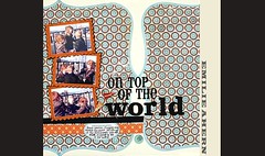
I love how emily used her hole punch to punch out the edges of the stamp stamp.

april

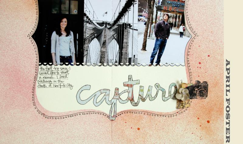
April made the genius move of connecting her photos with the apron punch. I also love how she cut out her title from the MM acetate paper.

scarlet

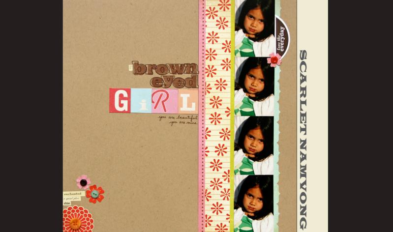
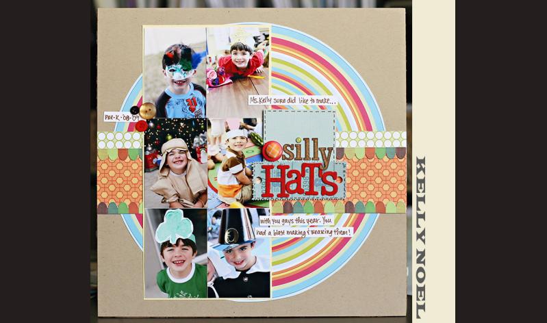
I had to look at this layout twice in order to figure out what scarlet did with her letters. I am going to HAVE to try this technique out ASAP.

dav 2

dav 1

I just loved the little "scene" that Dav made with her title, and then I saw the stitching on the clouds....just amazing!!

emily

I totally stumbled over the holes that Emily made and sewed through on her layout! Genius!

jen

I love the stitching on this layout! But even more than that, I just love how she doubled up her cardstock, and rounded just that ONE corner!

kelly

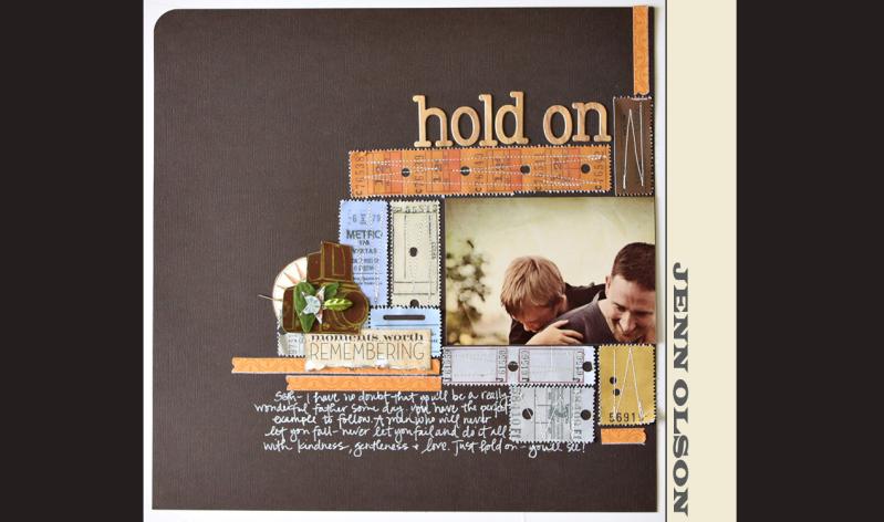
I love how kelly painted the woodgrained letters, red. It totally took the layout in a different direction.

kirsty

In this mini album, Kirsty used doodled squares to her pages. I love the added interest these make without overpowering anything!

maggie

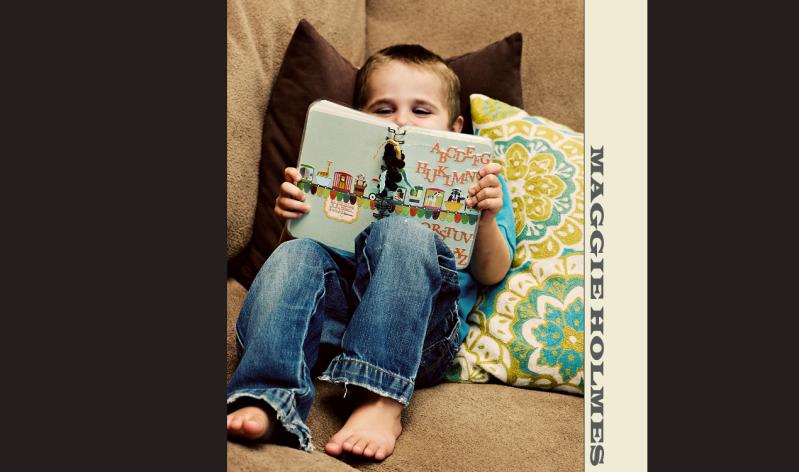
I love what Maggie did with the K&Co. animal alphabet. Such a great idea!

nic h

nic h 2

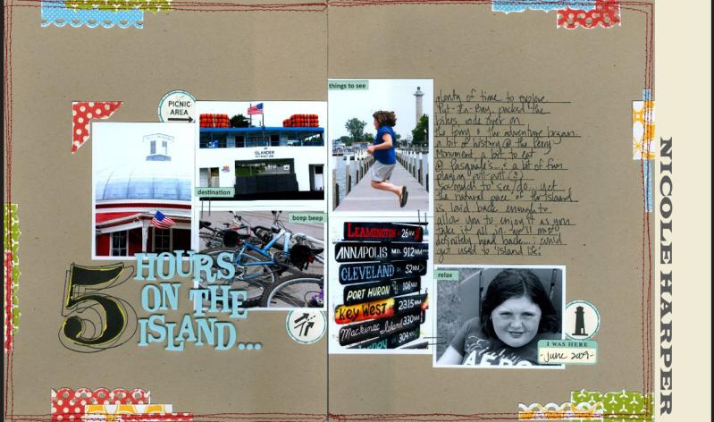
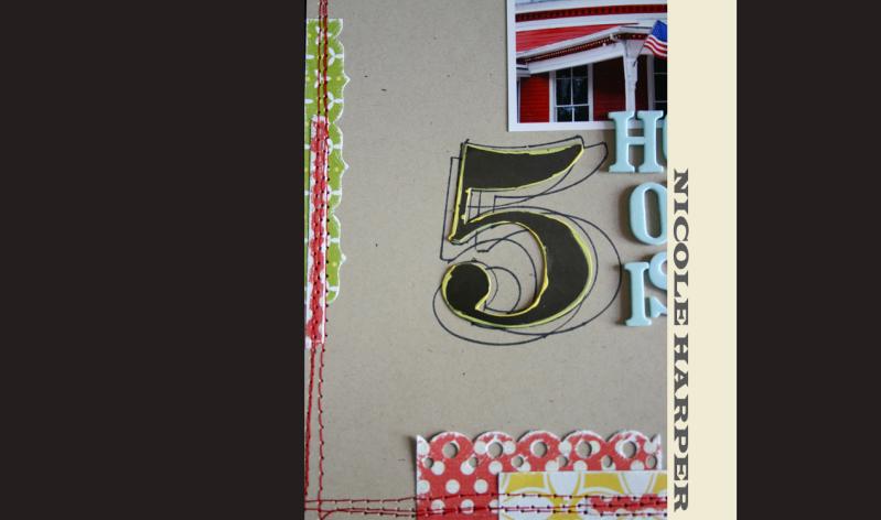
Nik H. professed hardship over this 2 page layout, but you can't tell by looking at it. I LOVE the little strips of paper on the edges. But even more than that, I love how she traced the MM number over and over and used it for her title!

nic s 2

nic s

I really love how Nic S. created a bunch of flowers on this girlie page with very few REAL flowers.

stephanie

stephanie 2

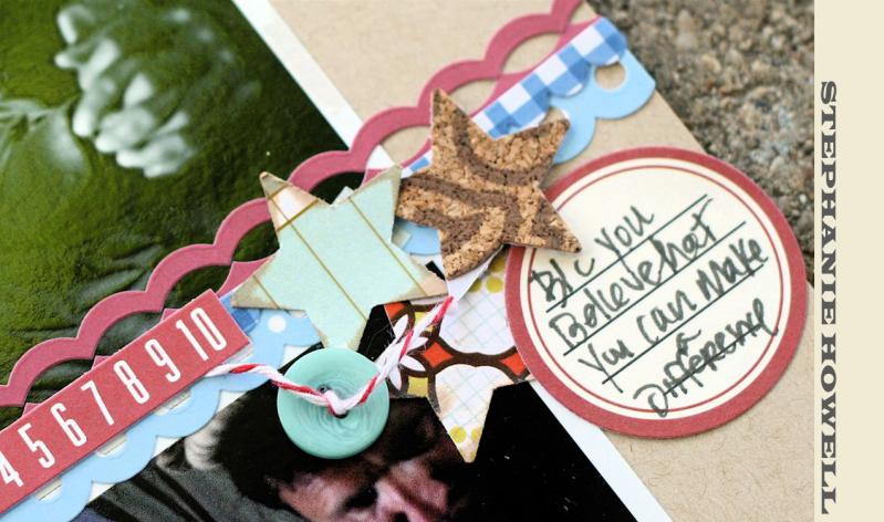
Stephanie rocked this sweet layout about her husband's military career! I love the way she punched out the stars, especially the ones out of cork letters.

tina a

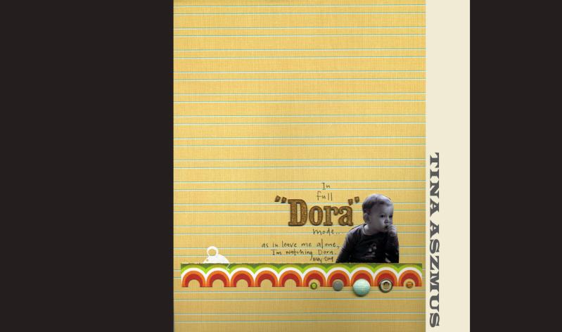
I love how Tina A. cut out the circle paper, and added the brads! Perfecto!

tina c

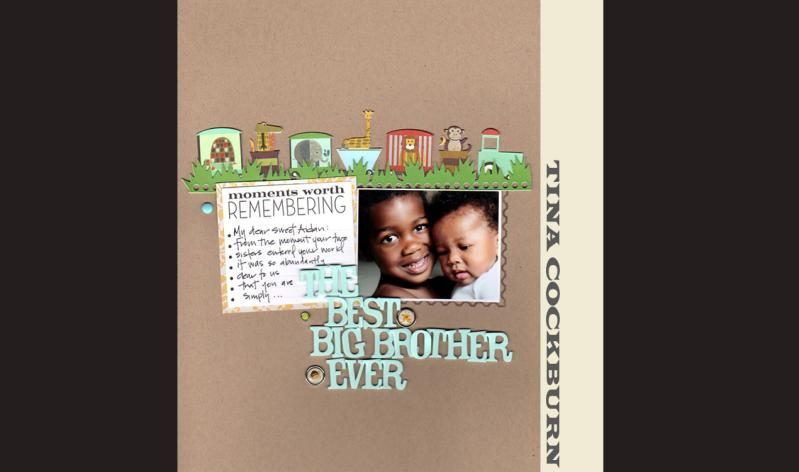
Both Tina's rocked the brads. I just love how Tina C. placed her brads, random, but perfectly!

july g's picks

this was by far the most fun i've had yet, selecting and arranging g's picks. hope you likey.

June 29, 2009

Stumbling

My sister called me one day and said she'd been spending a lot of time stumbling that week. I had to admit I laughed. She's not necessarily a clumsy person, but I have saved her life a few times from passing cars, so that's what I imagined had been happening that past week.

She asked if I had been to www.stumbleupon.com and proceeded to explain to me the idea behind the website, I'll just quote them directly,
StumbleUpon helps you discover and share great websites. As you click Stumble!, we deliver high-quality pages matched to your personal preferences. These pages have been explicitly recommended by your friends or one of 6 million+ other websurfers with interests similar to you. Rating these sites you like automatically shares them with like-minded people – and helps you discover great sites your friends recommend.
It sounded like a good idea, she said it was highly addicting, but at the TIME SINK red flag went up and I never thought further on the subject.

Until last week...

I needed a kick start. I remembered how she'd explained StumbleUpon and thought I'd give it a try, hoping that I'd see something that might give my creativity a boost. It was really easy to sign up and get started, I thought I'd walk you through the process.

First thing you'll do is sign up for an account with user name and password, then you'll be directed to pick your areas of interest. There are over 200 and some of them overlap, you'll start to notice. I just started clicking the boxes, here's a screen shot to prove it :)


I was almost done with the categories when this drop down window appeared. You can only choose 127 areas of interest, so be judicious in your selection :)


Once I'd made sure I liked my 127 selections, I hit the "Save Now & Stumble" button and away I went. This was the first page that showed up and I was a little confused. So I just started clicking the green squares, they'd pop up just a bit and the tune that was playing would change slightly. I realized it was probably a result of my interest in "music." Sure enough, I could create musical patterns just by popping up or flattening the green blocks. It was fun, but not the inspiration I was looking for at the moment (i.e. TIME SINK).


So in the upper left corner of the screen, there's a button that says, "Stumble." I figured that's the button I needed to push to move on. This page came up next, a result of my interest in nutrition I'm sure. I bet you could come up with a layout using this inspiration, but it didn't jump start me, although I did eat much healthier on Friday. :)

I pushed the "Stumble" button again, and it took me to a blog called "The Positivity Blog." It was at this point I realized I could definitely use this as a scrapbooking tool. Lots of amazing ideas from this blog alone could translate themselves into pages. AND there was a really cool graphic element on the page that I stashed away in my head to use one day as well. Very much worth the time spent.

I stumbled again and found a blog where they superimposed WWII photos onto modern-day ones of the exact same scene. Pretty interesting, but I decided to stumble one more time and found a website of creative advertisements, one of which I pulled off for your view pleasure. This is an entrance/exit for a train station in Switzerland (recognize it Hera?) where they've made life sized replica of a Mini Cooper that looks like a whole bunch of people are coming out of it. Clever!

Total time spent: less than 15 minutes.
Ideas: numerous.

StumbleUpon records all your stumbles, so if you want to go back you can easily find what you were looking for the next time. There are tutorials on how to use the application, I am sure I haven't even skimmed the surface.

Joy and I will be doing some stumbling this week and we're asking you to join us. While you're waiting for your July kits, we challenge you to use StumbleUpon to find some sort of inspiration and create a layout or card. Post it to gallery and link us here to share your work. We will be doing the same thing and posting our layouts at the end of the blogging week. We'll be highlighting some of your work on the last day as well!

Reveal Night Winners!!!!

The winners of the online subscriptions to Scrapbook Trends Magazine are.......

lauren said...

What a FANTASTIC giveaway! This would make my summer! SC rocks! :)

June 26, 2009 11:32 AM

Ginnie said...

Thank you so much for an opportunity to win Scrapbook Trends. . . one of my favourite publications of all times. I always find the colourful layouts so inspirational!

Blessings!

June 26, 2009 6:53 PM

Please email info@studiocalico.com to claim your prize.

June 28, 2009

Photography Week Final Installment

Thanks for joining us this week! I hope that you had fun and learned some helpful techniques that you can use in your photography!

We wanted to finish off the week with a bang so I am giving away a spot in my next Online Photography Workshop!

I just finished teaching my second one and I have to agree with the students when they say that it goes by too quickly! (It seems like that is the story of my life lately though! :) ) I always have so much fun teaching these fantastic students and the best part is seeing how much progress they make throughout the course! It is awesome!

Here's what some of my students are saying. (Watch for a new testimonials section on my workshop blog coming soon!)

"I just opened my mailbox and there was our last lesson. I am feeling so ambivalent about opening it. I am excited to see what new you have to teach us but I am sad its the last lesson already. I just want to say (and I know this sentiment has already been expressed by many) that I wish this were not over and that I thank you from the bottom of my heart for so freely sharing not only the cogent basic instructions but also the the tips that short-cut a lot of the learning curve and get us loving our cameras - and not being intimidated by them. You could have been proprietary about the knowledge you acquired through your own study and hard work, but you are just the opposite.


I have such a long way to go to rough tune and gradually fine tune my photos but already I am reaping such pleasing rewards that it spurs me to keep taking, keep improving. Almost all of my shots are already such an improvement over those immediately pre-course. Really, I just can't express how grateful I am for this course, your style of teaching and your gentle, encouraging style of critique!


I am so sad this course is almost over. If you do plan additional courses in the future, I am pretty sure you will have a large audience among former students - me included.


Thanks Maggie."


Carol B


...........


"Let me just say I see a major difference in my pictures as far as exposure and lighting goes. I had the composition down, but needed/still need help with my exposure and knowing what to do in different light situations. Today, I took the kids to the pool and was able to get some bright happy photos without being overexposed and even was able to catch my son jumping mid-air into the pool with no motion blur. I've really enjoyed working in manual and am happy/relieved to find that its not as intimidating as I thought. Thanks so much Maggie for the great guidance, and all you participants that post your work so I can learn from it. Looking forward to these last few lessons! Have a great week everyone!"


Barbara roberts


............


"This is so much fun! I absolutley can not believe after 4 weeks I am shooting in manual and loving what I see! You are amazing Maggie!!!"


Adrienne Banaszynski


To enter the drawing for a free spot in my next class, all you have to do is leave a comment here. I will be draw a winner Monday July 8th so you have plenty of time to enter.... one entry per person please. The next class is getting quite full but there are a few spots left if you are interested in getting in. I will be doing one more workshop later this year and more next year, so if you don't get in, you can get in to one of the next ones. You can find all of the details and updates about my online workshop here.

June 26, 2009

Hand Stitching - With Davinie!

Hi All! I have created a video tutorial to show you how to hand stitch the way that I do. Enjoy! Let me know if you have any questions! And be nice! lol

Hand Stitching Tutorial

Davinie

Photography Week Installment 3

Hi there! It's me again... bringing you some more fun photography tips to help you kick it up a notch!!

Perspective

When taking pictures, there is always the option of shooting your subject from straight on and at eye level. This is something that we all do a lot and often makes for great images. But, it is always fun to change it up a little and try shooting from a different perspective or point of view. When doing this you have to be willing to get up high or crouch down low (or even lay right on the ground like I often do). Others might think you are a little crazy at the time but when they see the images, they will be glad you did it!

Changing your perspective also helps you to capture parts of the image in a different way and makes you see things differently..... like the wall in the image below.....

and like the yellow lines on the ground in this image. If I was standing at eye level to him, you would not see the yellow lines like this and shooting it this way makes the image more interesting and fun!


Changing my perspective in this image allowed me to get the blue lines in the foreground and it also frames him and the photo perfectly. Again, standing in the usual spot - at eye level and shooting straight on would have produced a nice image but this one ended up being a favorite because of the unique perspective.

In this case, shooting from down low allowed me to add some texture, color and lines to the image in the tree and the wall.... again things that would not have been in the image had I just shot straight on.


And finally, shooting from a different perspective in this one helped add to the playful nature of the photo. It helps to highlight her feet well and also makes it very clear to the viewer that they are the focal point of the image.


As you can see, I really love to shoot from a low perspective lately and this is a comment element in my photography. But, remember that you can also shoot from above and get some great "bird's eye" type of shots that way as well.

Mostly I encourage you to just go for it and have fun trying different perspectives. There is no right or wrong and you will never know which point of view is the most effective for a particular image unless you get moving around and try a bunch of different things. I promise that it will help to infuse a lot of added interest to your images!


Reveal Night Giveaway


Leave a comment here for your chance to win! A winner will be chosen randomly at Midnight EST on June 28.

June 24, 2009

Photography Week Installment 2

Hi there everyone! Maggie here.......

I am so excited to be cohosting the blog this week with the lovely Tina! And I am equally excited about the topic we will be talking about -- Photography! I am sure you know that it is a HUGE passion of mine and so of course I never tire of talking about it! :)

Photo Angles/Tilt

Today I am talking a bit about photo angles and tilt. This is one of the most common topics that I receive emails about. People often wonder if I do this in camera or in photoshop after the fact. And they also wonder if there is a certain formula or correct degree of tilt that I use.

99% of the time I create the tilt in camera while I am shooting. A few years back when I saw some other photographers doing this I absolutely loved it. I loved the added interest that it gives a photo and so I decided to start trying it myself. At first I had to make a very conscious effort to achieve this effect and to do it in a pleasing way. I admit it may even feel a little awkward at first if you are used to shooting all of your images with a normal straight horizon line (no tilt). Eventually it just became a part of my natural shooting style and so now I do it without even thinking about it.

The side to which you tilt your camera is just a matter of personal preference. I typically tilt my camera so that the subject's head is tilting toward the right, but there are others that do it the opposite way and that is fine too. This is just what feels and looks natural to me. (kind of like how some people are left handed and some right - there is no right or wrong here.)


I don't follow a certain angle degree when I do this, but you can see in the 3 photos above that it is just a slight tilt - enough that it shows and that it looks like it is on purpose, but not too much. The most common mistake people make when using this technique is tilting too much. In this case, a little goes a long way and it can definitely be easy to overdo it like in the image below.

My only real "rule" for tilting is not to overdo it like this. My general rule of thumb is that you do not want the subject to look like they are about to fall over. You also don't want to confuse the viewer as to whether the photo should be viewed horizontally or vertically. I always say that when you look at the image, if you feel like you have to turn your head to get the proper view, then you have overdone the tilt. In the image above I do find that I want to turn my head to the right in order to see it properly... and so I think it is too much. (the first image is the same image with a natural and pleasing tilt and it just looks so much better - again enough to add some interest but not too much.)

And my last comment is that sometimes even the tiniest little tilt is enough and also there are times when you don't need any tilt at all. The image below shows just a tiny little bit of tilt and I shot it this way because there was already enough interest in the composition of the image (texture, colors, etc.).


I hope this helps to answer some of your questions about how I achieve the look of photo angles/tilt. Have fun trying this out in your own photography! I bet you will love it!!

Photography Week!

Well, now that it's Wednesday (eeek - sorry!) it's more like Photography Four Days! But I promise me and my co-host, Maggie Holmes, will cram a ton of great photography stuff into the next several days. So let's get started, shall we?

Converting Black & White Photos in Photoshop

I know I covered this during my last week in late March/early April, but I'm hoping to take things a bit further. My preferred method of conversion is with Gradient Map. I use a Mac and have PS4 but this method should work for older versions of Photoshop and may also work the same way in PSE (but I don't know because I don't have PSE).

I usually begin with a photo in color and edit it in color first. Then, once my color version has been edited and saved with its new file name (leaving the original SOOC image intact), I convert that edited color image to B&W with the Gradient Map (Image>Adjustments>Gradient Map):


See that little white/black box there on the bottom left of my screen? That should actually be black/white. Make sure those two boxes are black/white or you'll get the inverse in your conversion. If there are any other colors there, you'll get a Warhol-esque result.

You'll see that your image is now B&W and that the Gradient Map dialog box is up:

If you like this result, you're done! If it's too contrasty for your taste and you want to play around with the lights, darks and mid-tones, click directly on the black-to-white gradient and another larger gradient dialog box will pop up:

To lighten mid-tones, click on the bottom right slider, the white one. When you click on it, a small diamond-shaped marker will appear in the middle of the bottom two sliders. Click directly on that smaller marker and drag it to the left a bit and release. Note that the results of moving the slider will not appear until you release the click:


I usually drag the middle marker to around 45 then release to see the results. (That wee little middle slider is very persnickety. If you don't click right on it and B&W hell breaks loose all over your photo, just click "Cancel" in the large dialog box and start over again by clicking on the gradient in the smaller box.)

Next, you can move that white slider at bottom right to brighten highlights.

Move that white slider over to 99 or 98 and release to see the result. If you want less or more effect, drag and move to the left some more. When you're done, click "ok" on the larger dialogue box and then "ok" on the smaller box and you're done! Just save your B&W conversion to a new name and voila!

Here's my original edited color image:

Here's with the straight Gradient Map conversion:

And here's the gradient conversion with some adjustments to mid-tones and highlights:

If you still wanted any additional tweaks to your conversion, Curves or Levels would be your best options.

And if you'd like to share any of your own B&W conversions using this process of one of your own favorite methods, please post them in the SC gallery. I'd love to see what you do and how you do it. Who knows? There might just be a prize involved!

To see more about the different methods for converting your color photos to B&W, see my previous post here. And if you have any questions about photo editing or photography, speak up! We'd love to hear from you.

Stay tuned for a post from the super fabulous Maggie!

June 20, 2009

last of the leftovers.

here's a quick card I did for a friend using some of my leftover bits.
I hope you've been inspired to use those pieces from past kits. They need love too. :)
happy weekend!
Tina

June 18, 2009

Tutorial: Border Punches

Hey everyone. It’s Kelly here to show you some fun things to do with border punches. Have you seen the assortment of punches in the SC supply store? Lots to choose from and each add such a neat touch to your projects!

First things first, a lot of people are confused on just how to use their border punches when they use them for the first time. It’s really simple once someone shows you how. First, just back your paper up into the punch, so it is straight along the edge like this:

Push the lever down till you hear the paper punch, then slide your paper down making sure (this is KEY!) that the design you’ve punched matches up with the design printed on the punch itself. Here is how it should look:
Here is how it should NOT look. ;)

Now, you’ve got it down…just keep punching and sliding the paper down being sure to match it to the design printed on the punch. Do this over and over until your entire border is punched. Trim border to your desired width using your paper trimmer and voila! You’ve got a fun border!

Now that you’ve got the basics down, try and look beyond borders with these punches. There are so many creative ways you can use them. Take a look at this card…a pretty basic card, but check out the dimension you get when you layer two punched borders atop each other. Just punch one border and trim to the desired size, then punch another the same size. Adhere the first border to your project and then use pop dots to adhere the second border to add that neat dimensional look.


Here I used the scalloped edge punch to punch a border. Then simply used ribbon to weave in and out of each hole.

I trimmed the ribbon and adhered the loose ends to the back of the border.

Finally, I adhered the border to my card for a fun detailed look.


How about using the weaving border punch to create a monogram for your project? I simply punched a long strip of border, then cut it into 3 pieces. I weaved the yellow ribbon in and out of the slits and adhered the loose ends to the back of the border strip.


Finally, I simply arranged the border strips into the shape of my letter, in this case the letter K, and adhered them down.


Here’s an idea for adding a fun treatment to your title. I simply adhered sticker letters to a piece of white cardstock for my title block.


Then I used the Boundary Waters punch on the title block the same way as above in the first tutorial. And now there’s a wave going right through my title. Note: This only works for some titles…some letters don’t read very well when you punch them in half. J


I hope you all have enjoyed learning about different ways to use border punches! I can’t wait to see what you come up with!