September 30, 2009

Tutorial - Fabric Flowers

Hi there! I am sneaking in this week to share another tutorial with you and this time we are making fabric flowers. I made these to go on a t-shirt that I was embellishing for my daughter, but you could do so many things with them.......

include them on a layout
use them to make a card for someone special
make them into hair clips
put them on a headband
use them on a necklace
use them in your art journal
spice up a boring scrapbook album cover.....

etc, etc.... you get the idea right? endless possibilities!

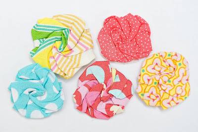
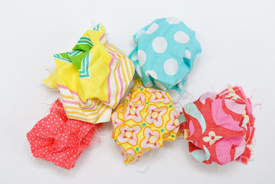
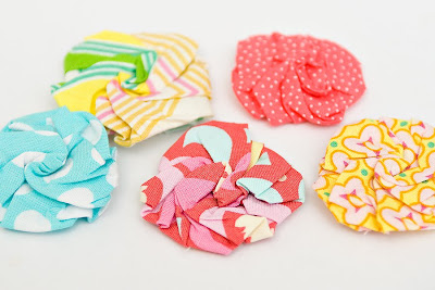
I will start by showing you the finished product
so you can see what we are making and then we will dive right in!

Aren't they cute? You have probably seen them before. And I want to point out that I definitely do not take the credit for making these up..... they have probably been around for years, even decades. So, all I am doing is passing along the info while also giving a shout out to the fabulous person that did come up with this -- whoever you are! Thank you!

Step #1
Cut your fabric into squares.
(I apologize for not having a picture of this step. I guess I got too excited & moved on before I could get one. oops!) Your squares can be any size depending on how big you want your flowers to be. Mine ranged from about 3.5" square to 5" square. I also want to point out that my squares were not perfectly square and they still came out fine. Some were a bit more rectangular because I was using scraps..... it will still work.

Step #2
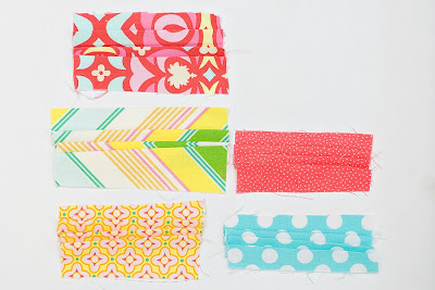
Next you will want to fold pleats on the squares. You will create 3 pleats on each square. It doesn't matter if they are going away from you or toward you, just stay consistent so they all go the same way. I tried to space my pleats pretty evenly so they are spread across the square and not all toward one side. But again, you can see that I wasn't perfect with it and it all turned out fine.


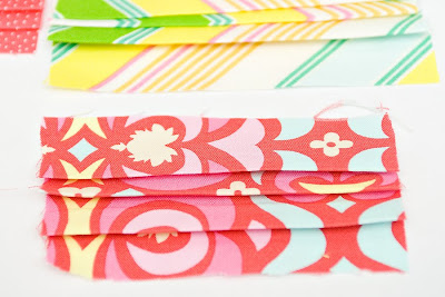
Iron the pleats into place so they are nice and flat and will stay in place. Here is a close up of the pleats so you can see it a little better. (now it looks like a rectangle)


Step #3
Use a sewing machine to stitch down both sides of the rectangles. You want to stay pretty close to the edge (about 1/4") and you can use matching thread if you want, but it won't end up showing so you can also just use white like I did.

Step #4
Now you will rotate the rectangles 90 degrees and fold 3 pleats in the other direction.
Again you will want to iron them down. This time around they won't want to stay as flat so you will want to use a pin to hold the pleats in place until you get them stitched down.

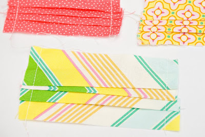
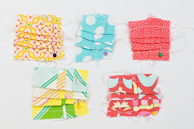
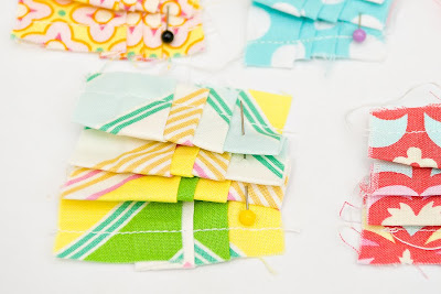
Here is a close up of my rectangles pleated in the other direction and pinned in place.
(now they look like squares again.)

Step #5
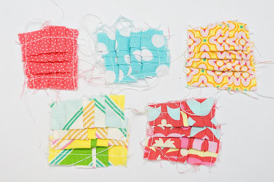
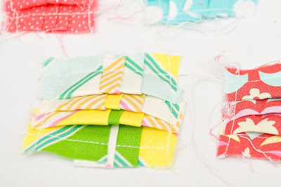
Stitch down both sides again with a sewing machine. I found that the pleats go through the machine more easily if they are positioned with the pleats folded toward you like this.
Again, you can see that mine are far from perfect... some are crooked and some look far from being square but it is all good!


Step #6
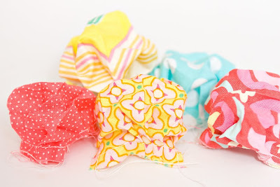
Next you want to turn them into little puffs by opening them up and pushing the fabric up from the back. Basically you are ruining all of those beautiful pleats you just created by pushing them up and out. If you turned them over they almost look like little bags that you could fill with something.


Step #7
Next is the trickiest part. You will hold onto the bottom of the puff with one hand and use the other hand to pinch the top of the puff in the center. Then twist your hands in opposite directions until you can't twist the fabric any further. Once you have it twisted you will smash it and make it flat. You will want to make sure your iron is hot and ready so you can iron it into place so it will stay in the new flower shape. You also want to make sure that you tuck in all of the raw edges at the back of the flower so they don't show.

You can see that mine are a little different in size and they are also not all perfectly round. This is because they weren't perfectly square, which I think adds to the hand-made beauty of them.

A final tip is that you may want to use a matching thread to stitch the folds of the flower in place a little bit. You can do it discreetly so the stitches don't show and it will ensure that the flower doesn't lose its shape.

I will be back to share what I did with these in another post. For now I will let you get creating and dreaming up all of the fun projects that you will use them on! Have fun!


May Flaum Signed My Yearbook! (and an oops)


One of the things I love about Reveal Night is seeing what the DT came up with using the same exact things. I'm always floored at how the exact same kit produce so many different layouts! Well according to the extremely talented May Flaum, it's all about your individual style and how you decide to use the products provided you. I know that the kit club concept has stepped up my own personal scrapbooking abilities, having to use certain products makes me look for different ways to put them together. May has taken kits from a number of kit clubs out there right now and designed a class that helps you maximize your own style using your kits. The class is called Adventures in Scrapbooking: Using Kits, and you can read the exact description of her class here at Big Picture Scrapbooking. Here's what May had to say about working with her Studio Calico kit:

What can I say about Studio Calico kits? I am never sure what I will get, but I know that it’ll be fun, fresh, include stuff I’ve never seen before, and be loads of fun. As a crafter who lives and bleeds in kraft, I’m clearly attracted to the kindred spirits at S.C. I love working with neutral cardstocks like cream & kraft and then pumping up the color and funk with papers and embellishments. This October kit has been so great to work with, and I can’t wait to be able to share my layouts with my Big Picture Students.

The YEARBOOK kit is featured in the final week of class, and I can’t think of a better way to close out class than with this super fab October kit. I’m having so much fun with it – I can’t stop creating! It’s been a pleasure putting this all together and I can’t wait to get started with all the kit loving students who will join me.

Class starts November 5

For sneaks and updates, be sure to visit May's blog: http://mayflaum.wordpress.com/


And totally changing gears…do you ever make mistakes on layouts? What do you do? Throw a kicking and screaming fit? Toss it and start over? What if it's the last thing you had to do to finish your layout?

I just wanted to share what I did on my Pencil Proliferation page. I make mistakes all the time, but they usually force me to come up with creative solutions for hiding them :) That's what happened with this page. I left the journaling until the end, a big no-no in my book, but I'd added so many things that I was flat out of room for telling the story. See where the scroll is?

See how the scroll covers up some words? :) I had enough space for two lines of text and I totally totally totally messed up the wording. I used the word "far" two times within in five words of each other. It's a silly thing, but it would have bugged me every time I read it. I usually prewrite my journaling, and I had for this page, but I decided to go all renegade and change it up AS I was writing it in with my pen. I got to the end of the line and realized I hated what I'd done! But I had no intentions of redoing the whole page. I thought about moving the number strip up, but that would have messed up the balance. Then the idea of the scroll hit. I'd already done all the journaling I needed to about this particular habit of my son's on my blog. So I sized a document in Photoshop to the dimensions I'd need to print on my small notebook paper, copied the text from my blog, printed it out on the notebook paper, and smartly glued the whole scroll onto my layout. And you can't tell because of how I photographed the layout. Sneaky, yes? The scrolled notebook paper fits the topic, I covered up a mistake, and I journaled all that I wanted to, without having to start over again. It's a happy thing! So the next time you make a mistake, don't panic, just look for a creative way to hide it.


September 29, 2009

Inspiration Tuesday

Here at Studio Calico, we like to share the things that inspire us. Now, most of you know that I am not a veteran scrapbooker, I'm still a novice, so I see things a little differently than most of our talented Design Team. Before I started hanging out with these talented ladies, I hardly ever looked twice at magazine ads, fonts or design elements. April set out to educate me and has worked hard over the last two years to point out different types of design styles and include me in lots of conversations about product usage in an effort to bring me up to speed. Just recently, I've started to really grasp these lessons and am learning to think with the creative side of my brain, not just the logical side!

A couple of months ago, Emily posted about a website that she had found and become addicted to....anything that Emily likes usually appeals to me, so I investigated. I'm now addicted to StumbleUpon too! Here is how it works, you go in and fill out a list of your interests, they use your preferences to deliver high-quality pages that are matched to your interests. If you haven't checked it out, I highly recommend it. Here are a couple of inspirational things that I Stumbled Upon:


The layers in this photo are amazing. It reminds me of some of the amazing work that our DT members do layering different elements on their layouts. I also love the way that the colors pop in comparison to the dark undertones of the background.


This picture reminded me of something that you would find on the some of the papers that we have featured over the past two years. I love the little deer and the mushrooms on the right side. Orange is also my favorite color, so I am always drawn to anything that is orange.

Something else that April has introduced me to is Etsy. I'd never heard of it before, and once again, I'm addicted. I just like to go to the site and tool around, looking at different things and dreaming about being able to create yummy goodness like that on my own. My friends and family are also happy that I have found this particular gem as the quality of the gifts that they receive on their birthdays and at Christmas has greatly improved!

I'll leave you with one last image that I found on Etsy. It's not an image of a product, it's a font that I saw advertising custom orders.


I never noticed things like fonts before, but this one really made me stop and smile. It just looks so fun and whimsical.

Well, that's all for me today. Emily will be posting tomorrow....I won't steal her thunder by telling you what she will be posting about, you'll just have to tune in and find out!

Have a good night!

September 28, 2009

Monday Blog Challenge

Try not to groan...I hate Mondays as much as the next person, so let's spice it up just a little! Emily and I have the blog this week and we've got lots of fun stuff planned....first order of business....a challenge!!!

Here is your mission should you choose to accept it:

Make a layout or a card that includes at least one of the following:
An SC sticker from your brown paper bags
An SC promo card
A packed with love card
A stamp backer
An SC sticker wrapper from your trims

Your submission must also include:
Twine, Scrapper's Floss or String
You must use at least one of the exclusive SC Stamps

You have until Saturday at midnight for this challenge.

On Sunday, we'll draw a name for a $5.00 gift certificate to Studio Calico.

Make sure to link all of your projects to this thread to be entered into the drawing. I've been mulling this one over for a while, so I hope that you take the challenge and create something unbelievable! I'll be posting a layout later this week and Emily is working on a project as well!

Happy Creating!


I've been mulling this one over for a while, I hope that you accept the challenge.....I can't wait to see what you come up with!

September 27, 2009

Reveal Night Winner!

Congrats to Mandee, winner of the Bella Blvd giveaway.

Blogger MandeeM said...

well, i love the colors of fall, but the spring is the best around here. the weather is getting good, not too hot, and everything is in bloom... such a lucious time of year. a new beginning of life.

September 26, 2009 11:08 PM

Delete

Please send an email to info@studiocalico.com with your contact information within 24 hours to claim your prize.


Layout of the Week

The layout of the week is brought to you by Briana Johnson (brianaj).
Each week, the layout in the gallery is linked, so you can add it to your favorites easily.

(layout removed for publication)

This layout has been added to your favorites more than any other layout in the SC community gallery for the week of 9/20-9/26.

Congratulations Briana! Because of this you have won a $10 gift card to be used on any new purchase at Studio Calico.

Want a chance to win next week? Be sure to upload your projects to the SC gallery, and support your community by adding special projects that catch your eye into your favorites! It could be YOU next week!

Please note, winners are not allowed to win more than once in a four-week period.
Winners are not limited to those using Studio Calico kits.

September 26, 2009

Sneaky Sneaky...

I always think it's so much fun to see all the kit sneaks in one spot. I did a little blog hopping this evening and gathered some sneaks for you to oooh and aaaah over. :)
Enjoy and I'm sure you all are dying to see the complete projects and so am I...one more day! :)

Mine:
Tina A's:
Steph's:

Nicole S:


Nicole H:


Jenn's:
Emily's:


Davinie's:

April's:


Have a happy Sunday!! :)

Reveal Night Giveaway

For a chance to win this fabulous prize pack from Bella Blvd, just leave a comment here telling us what your favorite season is.

Mine's Fall, in case you're wondering :)

Tutorial: Handcut Titles

From the time I was in elementary school, I was practicing the art of handcut-titles. Remember those bubble-letters we used to draw? And, those posters for pep rallies? Well, handcutting titles is really no different.


All you need is 4 supplies:
To begin, choose your patterned paper. A lighter color is easiest to work with.


Next, write your title word(s) lightly with the pencil. You'll want to write the letters larger enough to cut around. (I've written this a little darker than typical, so you could see it in the photo.)


Using scissors, cut around the pencil lines leaving about a 1/4" on each side. At this point, it's easy to see if your letters are a bit off, so if an "L" is too short, just cut it taller, or if a "C" is too flat, round it out a bit more. Here, my "r" was too narrow, so I cut over a bit to compensate.


To finish the title word, cut inside the letters using an exacto knife and self-healing mat, then erase the pencil lines.


Now the title is ready for your layout!


A few more ideas for hand-cut titles:
  • Before erasing the pencil lines, hand-stitch or sew over them to accentuate the word.
  • Before gluing the title to the layout, add a layer of glossy accents.
  • Handcut a title from cardstock or lightly patterned paper, then stamp directly onto the title before adhering to the page.
  • Trace around the outside of the letters with a black journaling pen to make them stand out.

September 24, 2009

Insider Tips...


Do you always print out your photos before you begin a layout? To be honest, sometimes I don't. Probably about 30% of the time, I start with the design (laying out the papers & embellishments). Then I like to figure out where and how the photos would fit best into my design. In the layout above, I knew I wanted to use that SC text paper, but I also knew that with my clean style that I couldn't have it be too overwhelming. That's where the torn paper came in giving just a "peek" of the text paper. Those Sassafrass hot air balloons were just begging to be handcut and I had this idea for a layout as soon as I saw them.

Now, I'm definitely a jump right in & start cutting kind of girl. I don't like to hem haw around too much about where things will go or panic about only having one sheet of a certain paper. I know that makes a lot of scrapbookers uncomfortable, but I always figure I'll just try and make it work one way or another. :) After I cut those balloons out and used pop dots to adhere them and added some other details to the layout, I was ready to add the photos. Most of the time if I have 3 photos I want to use, I will print them out in a smaller wallet size. This time I wanted to balance out the balloons and knew that regular rectangular photos weren't going to work here. That's when I decided to make the photos into circles. I think it adds a neat look to this layout and lends something that regular photos wouldn't have. After I adhered the circular photos, I finished it off with little bits of the text paper to balance the two sides.

If you always start scrapping with photos already printed and in hand, I totally recommend switching it up from time to time and starting with the design first. You might be surprised what you come up with! If you give it a try, be sure to link here so I can see! It's almost the weekend...yay! :)

September 23, 2009

Outside Inspiration: Fall

So, this is the first week of Autumn...so hard for me to believe, because here in Florida, it's STILL 90+ degrees outside! ugh. But, I hear some Northerners had a chance of snow yesterday! Crazy! Anyhow, fall brings rich warm colors, fun new textures and a whole lot of new inspiration. Check out this owl print from Gracious Home...this would be super simple to recreate and oh so cute!

I'm in love with this neat tree pillow from CB2...


Ruffles seem to be big in fall fashion this season...ruffles would be so fun to try on your next layout!
This pillow might just end up in my Crate & Barrel cart very soon! ;) Those are felt cirlces stitched onto the pillow. Such a fun textured look!


More inspiration from Crate & Barrel...the colors in this rug just scream fall. Love the addition of the pink in there.

Hopefully, this has given you some inspiration for Kirsty's fall layout challenge this week. Have fun! :)

September 21, 2009

This weeks challenge and last weeks participants

Its me, Kirsty, again (oh no - OH YES!).
Last weeks challenge was, admittedly, a stinker. No patterned paper, no embellishments and use of a handful of basics like paint, mists and pens, punches and plain cardstocks.... **snigger*** However you all did good and rose the task with spirit and mucky fingers. Here are a few that caught our eye but if you want to check out everyone's work in full click on this link HERE to take you to the thread from the Studes forum.

Penny's bold take on the challenge certainly has a hypnotic effect - those blues!

Reeni' focuses on those mists that we have all become so crazy about - she made them into bubbles to match the theme of her photo

Cannycrafter clearly made an impact with the photos but cutting 27 of them into butterflies! Clever!

Simple yet striking - I wish I could pull that off at times and here JenniferL nailed it beautifully

and finally this little smasher by *Audi* made excellent use of the lack of supplies here.... I love this one muchly


So, now then................
This weeks challenge is more sedate-ish. Kelly and I have decided we ought to celebrate Autumn - sigh, this time of year is truly amazing. This leaves it wide open to how you come up with something special for us all to delight in. But (always a but) Id love to see you use 5 key products (add more if you wish, but definitely use the 5 key supplies listed below). After enjoying Emily's 5 product challenge the other week, I thought why not make the challenges somewhat limited but also resourceful and fun (or not fun, in some cases). So whilst I conjure up a creation of my own here is a checklist of the 5 items to use:

Eyelets (lets resurrect those little blighters)
Floss
Alphas
Patterned paper pieces no bigger than 4 inch square
Paint swooshes

Again, feel free to add extra supplies but make sure the above 5 are on there somewhere.

Im off to create - I shall be back forthwith.