December 31, 2009

tutorial : snow frosted background

Happy New Year's Eve! I'm popping in here today with a tutorial to help you add a layer of frost to your winter layouts.

The January kit, Whodunit, has a gorgeous color scheme that is awesome for any season - but I wanted to make it even *more* winter-y for a page featuring my older boys sledding with friends. I started my page by drawing a border 1in in from the outside of my 12x12 cardstock, and then punching squares of various patterned papers from the kit and arranging them in rows inside my square. I used a square punch from Fiskars, but you could simply use your trimmer to cut squares if you don't have a punch. I attached each square of patterned paper to my background using just a bit of adhesive in the middle of the square.


Now, I'm loving this color scheme, but it's a bit spring-y for what I'm going for. I could have left out the greens and yellows, but I really liked the pattern that those pieces added. I knew a wash of white paint could tone down the colors and give me the effect I wanted. I used Manila paint by Making Memories, but Claudine Hellmuth's Blank Canvas paint would work just as well. I love these brushes - the set is inexpensive and they are *much* nicer than the brushes I used to pick up at my local craft store! I put a glob of paint on a paper plate and then soaked my brush in water. I dabbed the brush in the paint and then brushed it across the plate a couple times to remove the excess paint and water. Remember - you can always ADD more paint to the background, but you can't take it away - you'll want to start with very little paint on the brush. If you get a spot that looks too watery, press a paper towel over the top to soak up the excess.


I brushed my watered down paint across the background, adding more paint and water as my brush got dry. I ended up doing two coats to get the shading that I wanted. I painted a little outside my block of squares on all sides to give the piece a nice border. While the paint was still wet, I sprayed the whole background with Silver Plated Maya Mist - the Iridescent Pearl would give you a similar effect. It didn't add any color, but it *did* add a frosty shimmer. Since I only adhered each square in the middle, the water in the paint warped each piece a bit, giving the background some dimension. I hadn't planned on this, but really loved the effect.


I love the star stamps that came with the main kit, and wanted to work them into my design. I laid my photos and journaling block onto my page so I had an idea of what areas would be covered, and then added a couple of stars to each row. I stamped with silver pigment ink and embossed them with clear embossing powder - the stamping is subtle, but adds an extra bit of shimmer and interest to the background.
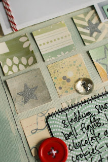


I cut the scallop sticker from the sticker sheet in half and added it to the top left and bottom left of my square of blocks and then I stitched a border with grey thread. I stamped the journaling stamp with black ink on blue patterned paper twice, and cut each block out. I used one whole to hold my journaling, and cut the top off another and used it as a date tab at the top of my page. I took advantage of the white space in my larger photo and layered the smaller one on top of it, and then added them to my page with foam adhesive. I wrapped the photo with red baker's twine and finished the layout with a few button accents, and a label sticker embellished with star rubons.


While I've used this white washing technique to get a snowy look, it can also be used to unify *any* collection of patterned papers. This would be a great way to use up a bunch of scraps that don't quite match. You could also add a twist to it by using a bolder mist over the top of your background. I hope you get a chance to try this technique, and please link me up if you do!!

December 30, 2009

Crazy amounts of talent from our newest Design Team additions!!!

hi everyone...Nicole H. here.

i just wanted to take a quick second to point out my favorites from our newest Design Team Members' first galleries at SC...i had a hard time, but narrowed it down to these four.

The colors on Susan's layout here jump right out on my screen and draw me in. that bold piece of the red polka dot paper, bordered by the grey herringbone cut into strips sucks me right in! plus, that fun photo of her is too darn cute. Waleska work never fails to compel me to look closely at every detail on her pages. she packs such a punch on her 8.5x11 layouts by using what seem like the perfect amount of product EVERY TIME.
i think it's the photo on Stephanie W.'s layout here that drew me in initially...but then i started noticing the subtle misting, and the flashes of color here and there...and i just fell in love with this one.


LOVE that Kimmi did a layout about herself! LOVE that she mixed the fonts in her title. LOVE that she used the glassine envelope that her vintage letter decal came in to hold a note about herself. actually, i guess i LOVE it all.
Sasha wasn't able to start her gallery with this month's kit, but that just leaves me eager to see her work next month. i often get lost in the details of her work...in a good way that keep provoking 'a-ha moments'.
looking forward to many more layouts like these, that urge me to saunter over to my desk and create something...this is just the beginning!!
:)

December 29, 2009

tuesday inspiration- vintage finds in your scraproom

today i thought i'd use vintage finds as my inspiration post.
i wanted to share some ideas for repurposing in your craft room.
my personal belief is that newer isn't always better. ;)
i prefer things with a history, things i can give new meaning.

so, here you go...i'll share some of my favorites and i'll be more than happy to answer any of your questions in the comments section!


use a vintage bed spring to hang art, ephemera, layouts, or inspiration


no need to only store your albums on shelves. use locker baskets and milk crates!


an old paper company piece is the perfect place to store my alpha stickers.
look for unusual small pieces of storage/furniture...these are great for small embellishments.


milkglass and colored glass pieces are perfectly suited for small embellishments and tools:


old tins work for adhesive storage:


and who knew that glass floral frogs held pens so well?


wire baskets make a good home for punches:


and i love collecting old muffin tins. my odds and ends live there. things i don't want to forget about when making a page.


vintage dish-drying racks hold layouts:


and plate racks can hold them too.


sewing machine drawers hold journaling tablets, and glues (to the left)


this old stamp holder holds my maya mists (which are all still in a bag since my move...HA!)


and a vintage (reproduction in my case) dress form displays my crystal stick pins and beautiful blossoms.


hope you enjoyed my post today!
xo


stephanie (h)

Kickin' off twenty ten with a bang !

g's picks were fun this month... lots of great stuff. hope you enjoy!

the song is for april by the way... her 2nd true love is jason

December 28, 2009

Reveal Night Winner!

The winner of the prize from PixiePetals is....................

TerrieAllison said...

I love the star stamps. I plan on using them alot. Merry Christmas and Happy New Year to all.

December 26, 2009 3:51 PM


Please send an email to info@studiocalico.com within 24 hours to claim your prize. Include the name of your prize, your name, and address, please.

New Year, New Challenge heading your way.

Hi everyone!!

Nik H. here...hosting the blog this week with Steph H. Wanted to get the challenge up early, so that LOTS of people can join in...hopefully with the holidays, you can squeeze in a bit of 'you' time and do something crafty!

For this week, with 2010 staring us straight in the face, we thought we would challenge you to do a layout about what the new year has in store for you and/or your family. Hopes, dreams, wishes, resolutions, good ideas, intentions, milestones...you name it. We want to hear about/see what you have in mind for the new year...and don't be afraid to journal your hearts out, because I know that sometimes it's less intimidating to write down your goals without actually speaking them, if that makes sense.

We'll start a thread for everyone to post to...and will choose a winner at the end of the week. (hopefully by then, we'll both have had time to whip something up for this ourselves!) What better way to start off your crafty New Year than with some SC Cash?!

Looking forward to your work as always...some of our best inspiration comes from our members, so we'd love to see as many of you as possible join in on this one!

:)

December 27, 2009

Layout of the Week

The layout of the week is brought to you by Jill Sprott.
Each week, the layout in the gallery is linked, so you can add it to your favorites easily.


This layout has been added to your favorites more than any other layout in the SC community gallery for the week of 12/20 - 12/26.

Congratulations Jill! Because of this you have won a $10 gift card to be used on any new purchase at Studio Calico.

Want a chance to win next week? Be sure to upload your projects to the SC gallery, and support your community by adding special projects that catch your eye into your favorites! It could be YOU next week!

Please note, winners are not allowed to win more than once in a four-week period.
Winners are not limited to those using Studio Calico kits.

December 26, 2009

Some Studio Calico sneak peeks and Christmas Card photo inspiration

It's the day after Christmas! Did you brave the crowds today? I wasn't going to, but did just manage to get in and out of the store, restocked with wrapping paper at 50% off. I just couldn't help myself!

I know that Christmas is over, but as I prepare to start thinking about packing things away, I thought I'd take advantage of some of the items in the next kit from Studio Calico and get a head start on next year.

Take a peek:


These are Studio Calico stamps at their finest! Stamps are from the main kit and the "with a Candlestick" add-on. Aren't they fun? I've already trimmed them out and bagged them up so I'll be all set when December hits next year. I don't know about you, but I know my list is always long and the time is always short. This will help take the edge off.

Be sure to check in Sunday morning if you are a subscriber, to take advantage of those add-ons, and again at midnight! If you haven't already heard, the January kit is fabulous! You can check out sneaks here.

Speaking of sneaks, I created my layout for the challenge this week, to use your holiday cards, but I used the January kit to create it, so I can't share the whole thing. Just a sneak:


What do you think of that punch on the yellow? It's a holiday punch from Martha Stewart.... it reminds me of my favorite punch, the scallop sentiment, and the Apron Lace, AND the embossed scallop punches, all mixed together. Let me know what you think and I'll ask April to add it to the shop. I like it a lot.


Anyway, you still have time time to participate in the challenge! You have until midnight PST to link your layout or project to the challenge post. I hope you'll have a chance to play along!

Davinie

Inspiration from our dear Studio Calico members

Christmas is over and with all the photos we took, we desperately NEED to scrap real soon! But do you know what we definitely need? INSPIRATION from our dear SC members! :)

Here are some of my favorites from the Orchestra kit gallery, so much inspiration from you guys, thank you! You've made an amazing work using this month's kit! Some of those layouts are just from the regular gallery but oh dear! how wonderful they are! Keep up coming the great work, we want to see your fantastic work in the gallery!

Layout by Chelseavn


Layout by Jill Sprott (using the Orchestra kit)
I love the way she used these stamps (which I can't live without now)


Layout by dismommy (using the Orchestra kit)

Layout by dmbd (using the Orchestra kit)
Mini album by Chelseavn

Keep up the great work, ladies!
céline

December 25, 2009

Reveal Night Giveaway


Want to win this fabulous prize by PixiePetals that coordinates with the January kit?

Just leave a comment here letting us know your favorite item from the Whodunit kit or add-ons.

December 23, 2009

Ode to my Mom :)

Hello everyone!

I know everyone is getting ready for Christmas but I thought you wouldn't mind seeing the cute gift I made my mom using the amazing Printers Tray project kit :)

I know it's quite difficult sometimes to find Christmas gifts for our loved ones, especially if they keep telling you they don't need anything! Well, there's one thing they always need : LOVE!

So, I thought I would work on a project to make my mom happy and I know she's going to like it :)

Ok so this is what you might need to make this project :

First of all, you need to cut twelve 2,5x3,5" pieces of paper into your favorite patterned papers (one piece for each little window).


My photos are a little bit smaller than the ATC's size as I've been having problems with my printer but, in a way, I like it better like this as I managed to mount them on patterned papers and it looks good too.
You'll see that, on another ATC, I used this clear acrylic butterfly as a mask with my Charcoal mist. You just need to use a baby wipe to clean your butterfly afterwards.


Here's a very clean design, not to get a too overwhelm and busy design on all of my ATC's.


For this one, I just cut stripes of papers, glue it on my ATC and sprayed some mist on top of it all. Then you can use a heat gun to make it dry faster, if you don't like to wait (just like me). Cutting the chipboard button can add interest to your design, as you're working in frames.


Those tiny flowers are just too cute for words!


You can use tiny embellishments on your alphas as well.


This is what I was explaining earlier with the butterfly clear acrylic. Doesn't it look cool? Simply outline it with a white pen, write a bit of journaling inside the shape and ta-da!

Here, I cut a flash card in two and work on two ATC's frame at a time, in order to match the design a little bit.

And this is what it looks like in my artroom vintage wall! :) Too bad I'm giving it to my mom because I think it looks great on my black&white vintage wallpaper :D but that'd be the reason to get me another Printer's tray :)

I hope you liked it, girls, that you got as much inspiration as you can :)

Merci! :)

Céline

Inspiration

hey everyone!

Lately, I've been very inspired by home decor and have found many interesting blogs that posted amazing pictures of houses, appartments and such from around the globe.

What I usually do is get inspiration from color combos, materials, textures, prints from whatever I see.

I found this AMAZING bed blanket on Anthropolgie. Don't you just love it? I'd LOVE to be able to get one like this in France...oh well. :)
Anyway, it's easy to be inspired by the amazing colors here or the patterns...or...wouldn't you like to create a 100% FABRIC layout or mini album inspired by this color palette? Oh my! I already wanna scrap right now! :)

I found this incredible box furniture on the decor8 blog (one of my favorite websites ever!). I WANT THIS so bad!
I thought it would be easy to be inspired by such a furniture : imagine creating a double-page layout, with squares, photos, pockets, and all layered on top of each other. Wouldn't that be cool? especially that the color palette is simply amazing.


Well, THIS could be sooo much fun to make, don't you think? Love the colors, love the idea, love the flowers and would love to have this on my couch! :) (found on the Anthropolgie website).

Well, I hope you got inspiration from Home Decor and if you have any pictures you'd like to share, feel free to post it in the comments : I would LOVE to see what inspires you! :)

love,
Céline